Hello! It’s time for another color challenge at CAS Colours & Sketches! Louise, our challenge hostess, is getting into a Christmas mood, and she has picked a color combo that’s a step off from the traditional red and green and mixed it with a great metallic.
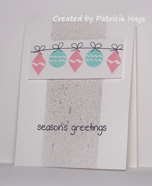
I”ll be honest, I had a hard time figuring out what to do with this color combo, but finally I got it together and came up with this card. I’ve used the current sketch from The Crooked Stamper Sketch Challenge for my layout. I used some scrap paper to mask off the middle vertical strip area and blasted it with a pewter-colored pearl mist. In real life, it’s very shimmery! I’ve added a second photo below to help show off the shimmer. Although our CC&S color challenges use the names of Stampin’ Up colors, any company’s products can be used so long as the colors match closely. So I’ve played into the shimmer concept and used Brilliance ink in colors similar to the other two challenge colors to stamp a few Christmas ornaments. The ornament panel is attached to the card with dimensional adhesive. Even though the colors were a bit out of my comfort zone at first, I’m pleased with how the card turned out.


Thanks for stopping by today! I hope you’ll join us over at CAS Colours & Sketches with your own take on these colors! You have until 6:00 p.m. Eastern time Wednesday, November 25 to link your card at the challenge website. Also, we’re looking to add some new members to our design team in 2016, so if this is something you’re interested in, be sure to add the letters “DT” to your name when you link your card, and play along in next week’s sketch challenge, too!
Supplies:
Stamps: Holiday Baubles (Sweet ‘n Sassy Stamps)
Cardstock: Pure Luxury White (Gina K. Designs)
Ink: Peacock and Aurora Brilliance three-color ink pads (Tsukineko); Tuxedo Black (Memento)
Other: pewter Perfect Pearls Mist (Ranger); dimensionals (SU)
3 Responses to “CAS Colours & Sketches #151”
Sorry, the comment form is closed at this time.


Ooooh, nice. I’m all about non-traditional colors. And your use of Brilliance ink was … brilliant. (I crack myself up.)
Thanks so much for playing my sketch challenge!
This is FABulous Patricia. I’m glad I wasn’t the only one who struggled with the colours & well done on getting them festive, it just wouldn’t work for me. Love the layout too. Thanks for having me as GD at CC&S. Hugs Bev x
Oooo I seem to have challenged you ladies this time, but I just love this card so guess it was worth it! The shimmer adds a touch of sparkle and the little row of ornaments is very pretty, this is a super contemporary Christmas card, Patricia and it looks fab in the DT gallery
Louise