It’s a busy time of year, but we’re squeezing in one more challenge at Cards in Envy for the next two weeks.   This time our theme is “Let it Snow”.  Any images depicting snow, snowflakes, snowmen, etc. are suitable for the challenge.  Just remember to keep your card A2 sized (4.25″ x 5.5″) and flat enough to be mailed at the regular first-class postage rate.

I have to confess that I was running short on time before I needed to present my design team sample, so instead of making a card with a big snowy scene like I really wanted to do, I’ve simply used the Christmas card that my family is sending out this year… which, I must admit, is a revisit of a card I made earlier this year.  I’ve made a few changes, mainly to the color scheme.  This time I’ve heat embossed the sentiment in silver to coordinate with the silver snowflake eyelet.  I’m sharing two photos here; the second one does a little better job of showing the silver shimmer mist that I sprayed on the ivory layer.  In real life, when the light catches it just right, it really glistens.

CIE 12-21-2015

CIE 12-21-2105 2

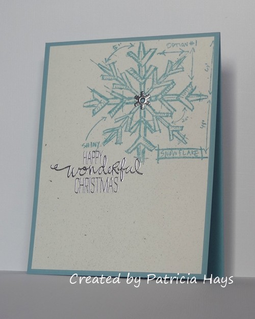
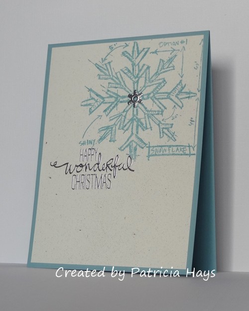
I actually did the Christmas cards in two different shades of blue because I didn’t have quite enough of each color to make all of the card bases I needed.  On the bright side, I did not need to buy any new materials right before Christmas to make the cards this year!  And it felt good to use a lot of those snowflake eyelets – I’ve had them for a very long time!

Shopping Our Stash also has the “Let it Snow” theme going on, so I’m going to enter this card into their challenge.

The Cards in Envy team has come up with some other great snowy ideas, so be sure to check them out!  We hope you’ll share your own snowy card with us before the challenge closes.  You have until 7:00 p.m. Eastern time Sunday, January 3, 2016 to link your card at the challenge post.  Thanks for stopping by today!

Supplies:
Stamps: Christmas Blueprint (Tim Holtz); Wondrous Wreath (Stampin’ Up)
Cardstock: Baja Breeze (Stampin’ Up); Pure Luxury Ivory (Gina K. Designs)
Ink: Baja Breeze (SU); silver (ColorBox)
Other: silver embossing powder, pewter Perfect Pearls Mist (Ranger); snowflake eyelet (source unknown)

I have just a very simple little card to share this time, created for the December Crooked Stamper Sketch Challenge.  I’ve been so busy with Christmas preparations that I almost let this challenge slip by me!  Leslie, the CSSC creator, participates from time to time at CAS Colours & Sketches so I like to reciprocate the favor and play along in her challenges, too.

This card was created mainly with retired Stampin’ Up products. The focal panel shows off one of my oldest Stampin’ Up stamp sets.  I added an extra bit of color by sponging the top and bottom edges of the panel before matting it with coordinating solid color cardstock.  The sentiment is also a retired stamp, but it’s not quite as old as the floral border stamps.  I wasn’t sure if the white border on the challenge graphic was part of the card, so I left it off, keeping my card very clean and simple in design.  It was a quick and easy card to make!

CSSC Dec 2015

I have to admit that it was nice doing something that wasn’t wintry for a change.  Don’t get me wrong, I love the Christmas season, but by this time of year I tend to grow a little tired of crafting for it.

Thanks for stopping by today!  Comments are always welcome and appreciated.

All supplies are from Stampin’ Up.
Stamps: Border Builders, Birthday Whimsy
Cardstock: Bashful Blue, Certainly Celery, So Saffron
Ink: Bashful Blue, Certainly Celery, So Saffron
Other: sponge

We’re getting into the holiday spirit again this week at CAS Colours & Sketches.  This time we’re asking our challenge participants to choose one of our sketch challenges from 2015 and turn it into a holiday card.

I’ve gone back to Challenge #111 for my card.  I love the interesting angles in this sketch.  I’ve used some designer paper and paired it with two coordinating solid colors and a white main panel.  As much as I like the scripty font of this stamp set, I don’t remember to use it very often.  But the holiday sentiment fit perfectly in the space here.  Once again, I’ve turned the sketch on its side and manipulated the triangles a little differently, but you can still see how the card was inspired by the sketch.

CASCAS154

I’m going to enter this card into the current challenge at Addicted to Stamps and More.

We’d love to have you join in our challenge at CC&S!  Check out the Sketch Challenges Archives tab, pick one of the sketches from 2015, and make a holiday card.  You have until 6:00 p.m. Eastern time Wednesday, December 16 to link your card at the challenge site.  Thanks for visiting today!

Supplies:
Stamps: So Happy (Avery Elle)
Cardstock: Old Olive, Whisper White, Cherry Cobbler (Stampin’ Up); designer paper from Fruitcake collection (Basic Grey)
Ink: Cherry Cobbler (SU)

Hello there!  The first Monday of the month brings a new challenge at Cards in Envy.  For the next two weeks, we’d like to see cards based on the theme of “Very Vintage Christmas”.  So long as it’s vintage looking and Christmassy, it’ll work.  Be sure that your card is A2 sized (4.25″ x 5.5″) and has no lumpy, bumpy embellishments more than 1/4″ thick.

Some people create vintage styled cards that are gorgeous.  Unfortunately for me, I am not one of them.  I’m just not comfortable with the style.  But that’s why this is called a “challenge”, so I forged on with it anyway.  None of my Christmas stamp images looked particularly vintage to me, so I browsed through my designer papers, and I found a print of sheet music for a song called “The Christmas Tree”.  I looked back over my Christmas tree stamps, and something about the sketchiness of my blueprint stamps seemed a bit vintage to me.  I decided to try combining the stamp with the designer paper.  Since the stamp image is nearly the size of a card front, I had the thought of stamping the image on the designer paper.  I gave the image some translucent color with colored pencils blended with odorless mineral spirits, and I sponged the edges of the paper to add to the vintage look.  I added a mat, tilted to give some extra visual interest, attached it to a base of textured cardstock, and ended up with a card that I think is OK.  It doesn’t show well in the photo, but the star was colored with a gold pencil.

CIE 12-7-2015

I’m entering this card into the Holiday challenge at Addicted to Stamps and More.

How will you do vintage?  Share your work with us at the Cards in Envy site by 7:00 p.m. Eastern time Sunday, December 20.  Be sure to check out what the rest of the design team has made and give them some blog love, too!  Thanks for stopping by today!

Supplies:
Stamps: Christmas Blueprint (Tim Holtz)
Cardstock: Real Red textured, Mellow Moss (Stampin’ Up); designer paper from Very Merry Christmas 6″ x 6″ paper pad (Echo Park)
Ink: Vintage Sepia (VersaFine)
Other: Premier colored pencils (Prismacolor); odorless mineral spirits (Hampton Arts); sponge

Hello!  It’s December, which means that Christmas is just a few short weeks away!  If you’ve been playing along with us at 52 Christmas Card Throwdown throughout the year, you should have a nice stash of holiday cards ready to send to your loved ones.  To close out the year, we’re having just one challenge in December, but it starts today and lasts until December 18.  We’re inviting our challenge participants to create a card using any one of our challenges from 2015.

I’ve gone back to the start of the year with our January sketch challenge.  I’ve turned the sketch 90° on its side and put the fold at the top edge of the card.  The ornament is raised up from the card front with dimensional adhesive.  Since the sentiment was going to be stamped on a darker cardstock color, I chose a lighter shade of red than I did for the ornament, so that the two reds would end up as a close match. The gold cording is an older SU item that was retired quite some time ago. It’s a pretty simple and straightforward card, so I’ll stop chatting and share it:

52CCT 12-05-2015

There have been about 50 challenges at 52CCT this year – which one will you choose?  Be sure to link your card at the 52CCT site by 7:00 p.m. Eastern time Friday, December 18.  We enjoy seeing what our challenge participants create!  Many thanks to everyone who plays along with us.

All supplies for today’s card are from Stampin’ Up:
Stamps: Delightful Decorations, Wondrous Wreath
Cardstock: Whisper White, Cherry Cobbler, Crumb Cake, Season of Style designer series paper
Ink: Cherry Cobbler, Real Red
Other: ornament punch, gold cording, dimensionals

Hello!  Today I’m sharing the card I made for my younger son’s recent birthday.

Those of you who know me well know that my son plays the bass drum in his high school’s marching band.  You may also know that I’ve been searching for band-related stamps since my older son first started in marching band in 2009.  So when I finally found a set a few months ago, I just had to get it.  I’ve kept it hidden away until I needed it for this occasion.  I colored the drummer to resemble my son in his band uniform as closely as possible.  I did take the liberty of adding blue to the drum, to help set it off visually from the drummer.  I had the current Paper Players challenge in mind as I made the card.   It’s a tic-tac-toe challenge this week, and I’ve gone straight across the middle of their board with something blue (the card base and the coloring of the drummer boy), something sparkly or shiny (the shiny silver star), and embossing (the musical score background).

PP273

I’ll admit that I was worried that my son might find the image a bit childish looking.  After all, he’s 17 years old.  LOL  To his credit, if he was offended, he didn’t say anything about it to me.  He did seem pleased about the personalization, and his girlfriend seemed to like the card, too.  As far as I’m concerned, that’s a win!

Thanks for stopping by today!

Supplies:
Stamps: Band Camp (WPlus9 for Simon Says Stamp)
Cardstock: Brilliant Blue, Basic Black, Silver Foil (Stampin’ Up)
Ink: Tuxedo Black (Memento)
Other: Band Camp die (WPlus9 for SSS); Nesting Starburst die (QuicKutz); markers (Copic); Allegro embossing folder (ProvoCraft); silver paint pen (Zig)

Hello!  It’s time for a new challenge at CAS Colours & Sketches.  The first challenge of the month is always a color challenge, but during the month of December, we’re doing something a little different.  This week, we’d like for our challenge participants to choose any of our color challenge combinations from 2015 and use it to make a Christmas or holiday card.

I’m revisiting Challenge #125 for my card – Crushed Curry, Elegant Eggplant, and Garden Green.  I also reworked a card I’d made last fall.  The golden yellow and the green lent themselves easily to a Christmassy feel, but then I had to work in the purple, too.  I started by stamping the tree, covering the image with a mask, and masking off a horizontal strip for the sentiment.  Then I dipped an old toothbrush (appropriated for crafting purposes only!) into yellow ink and spritzed it over the card.  I repeated that process with green ink.  (It’s a messy but fun and quick process.  I did wear a disposable glove so my fingers and thumb wouldn’t turn colorful, LOL!  I also covered my work area with scrap paper.)  I let the ink dry for a few minutes, and then removed the masks and used purple ink to stamp the sentiment.  To help set off the sentiment area, I made tiny dots with a purple marker near the edges of the area, using a ruler to space the dots evenly.  I added some purple and yellow enamel dots to decorate the tree, and finally I rounded the corners of the card for a finishing touch.  I don’t often make one-layer cards, but I like how the masking gives the illusion of the tree being set above the sentiment area and the splattered background.  The enamel dots give some actual dimension.

CASCAS153

CC&S color153-001

I’ve decided to play along in the current challenges at Addicted to Stamps and More and Addicted to CAS, too.

Which of our approximately 25 color combinations from 2015 will you use?  You can check all of them out on the CAS Colours & Sketches blog using the Color Challenges Archive tab.  Be sure to see what the rest of the design team has made, too!  Then link your card to the challenge site by 7:00 p.m. Eastern time Wednesday, December 9.  We’d love to see what you come up with!  Thanks for stopping by today.

Supplies are from Stampin’ Up unless otherwise noted.
Stamps: Season of Joy, Christmas Greetings
Cardstock: Pure Luxury White (Gina K. Designs)
Ink: Garden Green, Crushed Curry, Elegant Eggplant
Other: corner rounder, Garden Green and Crushed Curry ink refills, Elegant Eggplant marker, Regals candy dots

Today’s card is a quick and easy one for the current challenge at CAS(E) this Sketch!  Congratulations to their site for reaching the milestone of 150 challenges!  My card is kind of a way of thanking them for all the fun challenges.  I don’t always have the time to participate, but I do love having a sketch to use as a springboard for my creativity.

There really isn’t a lot to say about this card – it’s just a die-cut word, some Prima flowers, and a few pearls put together following the sketch.  The cardstock used for the sentiment matched the white Primas better in real life than it shows in the photo.  Oh well.  Since there’s no stamping involved here, the card also qualifies for the current challenge at Shopping Our Stash.

CTS150

Here’s wishing the CAS(E) this Sketch! crew all the best for their next 150 challenges!  Thanks for stopping by today!

Supplies:
Stamps: none
Cardstock: Blushing Bride, Naturals White (Stampin’ Up)
Ink: none
Other: Olivia alphabet dies (ProvoCraft); flowers (Prima Marketing); half pearls (KaiserCraft)

© 2019 Suffusion theme by Sayontan Sinha