Hello there!  The fourth Saturday of the month means it’s technique time at 52 Christmas Card Throwdown.  This week we’d like to see stenciling on a Christmas or wintry card.

This challenge was more difficult for me than I thought it would be.  I do have a few stencils, but none of them are Christmasy.  So it took me a while to figure out how I was going to meet this challenge.  I finally decided to sponge ink over the stencil to create a background for one of my blueprint stamps.  I stamped the image first.  Then I masked it, fixed the stencil in place, and sponged two shades of brown ink around the image.  After I carefully removed the stencil and the mask, I colored the image with my Copics.  I debated whether to use a red or a green mat for the image, and picked the red because it looked better against the kraft card base.

52CCT 02-27-2016

The current challenge at Addicted to Stamps and More is “Make Your Mark”, so I’m going to throw my card into the proverbial ring over there.

I’m really looking forward to seeing what our challenge participants at 52CCT create this week!  Be sure to link your card at the challenge post by 7:00 p.m. Eastern time Friday, March 4.  Thanks for stopping by today!

Supplies:
Stamp: Christmas Blueprint 2 (Tim Holtz)
Cardstock: Kraft, Real Red (Stampin’ Up); Pure Luxury Ivory (Gina K. Designs)
Ink: Early Espresso, Crumb Cake (SU)
Other: Burlap stencil (Tim Holtz); markers (Copic); sponge

I feel like I’ve gone into a rut of only creating cards for design team work, and not participating in as many of the other online challenges as I would like. After lunch today I told myself I was going to break out of that and try something new.  I saw that the Less is More challenge that’s ending in a little while was to use texture.  So I decided to give it a go.

Over the last few years I’ve seen a number of cards that use embossing paste for texture, and I like the way they look.  Unfortunately, embossing paste is not easy to find in the few craft stores in my area.  I’d read that drywall compound can be used in its place.  So a while ago when we were doing some small home repairs, I scooped some drywall compound out of the big bucket my husband had bought, and put it and a damp paper towel in a small container and set it aside in my craft room.  This afternoon it took me a few minutes to remember where I’d put that small container, but when I found it, I was glad to see that compound was still moist enough to be workable.  I decided to use a floral stencil with the compound.  Since the compound is white, I chose to put it on ivory cardstock for a subtle difference in color.  I had a sheet of ivory cardstock already cut in half, so I cut it to give me a piece 4″ x 5.25″ for the main panel of my card.  I planned out where to lay the stencil to allow for a sentiment.  On the actual stencil, the short flower on the right of my card is actually on the left side of the stencil, with the tallest flower in the middle of the stencil.  I knew I could move the stencil around, and putting the smallest flower on the right gave me room for the sentiment I wanted to use.  I stamped the sentiment in the corner before adding the floral design.  I used washi tape to hold the stencil in place and to mask off areas where I didn’t want the compound to go.  Then I set the panel aside for a while to allow the compound to dry.  That didn’t take as long as I thought it would, so that was a nice surprise.  However… when I picked up the panel to dry fit it to the card base, I realized I’d made an oops.  Instead of working with the 4″ x 5.25″ piece of cardstock I’d cut, I’d used the other half.  After saying “Oh, crap!” a few times, and figuring I didn’t have enough time before the challenge closes to try it again, I knew I’d have to trim down the piece.  I held my breath while doing it because I was afraid the compound would crack, but thankfully, it held.  Unfortunately, trimming it down left me with less margins around the design than I would have liked.  But I guess it still looks OK.  I made a last-minute decision to round the opposing corners of the panel and the card base, to soften the look a bit.  In the end I think the card turned out all right, considering I wasn’t sure how the compound was going to behave.

LIM264

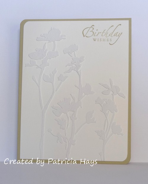
I’m thinking I’m going to have to play with this technique again some time!  Thanks for stopping by today.

Supplies:
Stamps: Sincere Salutations (Stampin’ Up)
Cardstock: River Rock (SU); Pure Luxury Ivory (Gina K. Designs)
Ink: River Rock (SU)
Other: Wildflower stencil (Tim Holtz); drywall compound (source unknown); corner rounder punch (EK Success)

Hi there!  February may be almost over, but we still have one more challenge for you at CAS Colours & Sketches before the month runs out.  This time we have a sketch challenge for your consideration.

My older son celebrated his birthday earlier this month, so I used this sketch with some scraps of designer paper to create his birthday card.  Stef, our challenge hostess, has said that we can substitute any shape in place of the flower on the sketch, so I’ve used a birthday present.  This gift package stamp is actually from a Christmas-themed stamp set, but I think the image works just as well for birthdays, too.  I chose a polka-dotted print for the wrapping paper on the gift, with a coordinating solid color for the ribbon and bow.  I have to admit that the fussy cutting was pretty tedious, especially around the loops and tails of the bow.  Strips of two additional coordinating designer papers were put to use for my banner elements.  A simple sentiment finished off the card.

CASCAS162

sketch 162

Be sure to check out what the rest of the CC&S Design Team and our February guest designer have made.  Then make your own card following the sketch and link it to the challenge site by 6:00 p.m. Eastern time Wednesday, March 2.  We’d love to have you join in the fun and creativity with us!  Thanks for stopping by today!

Supplies:
Stamps: Bows and Holly, So Much to Say (Lawn Fawn)
Cardstock: Bashful Blue (Stampin’ Up); scraps of designer paper from Oxford 6″ x 6″ paper pad (Basic Grey)
Ink: Tuxedo Black (Memento)

Greetings!  It’s Saturday, which means it’s time for another challenge at 52 Christmas Card Throwdown.  This week we’re asking our participants to create a card with the theme of Christmas baking.  Cookies, cakes, pies… if you can bake it, it’ll be suitable for our challenge!

Ever since my sons were little, we’ve baked cookies to leave for Santa with a glass of milk.  So it seemed only natural for me to tap into that idea for my card.  I knew I had a designer paper with gingerbread men and candies on it, so I chose that for the background of my card.  It also has some characters that look like Santa.  Or maybe they are elves.  I’m not sure.  Anyway…  I stamped the cookies, plate, and glass onto scraps of white cardstock, colored them, and fussy cut them out.  I used a die to cut the “table” from a scrap of brown designer paper.  It’s actually a very large speech balloon die, but I liked the shallowness of the oval it made, so I used it anyway, trimmed off the tail, and positioned the glass of milk over where the tail was.   I wanted the word “Santa” to stand out in my sentiment, so I die cut the letters from a scrap of deep red designer paper.  The focal panel didn’t look quite right just put down on top of the busy designer paper, so I chose a more subtle pattern on a red background for a mat, which also helps tie in the die cut letters in the sentiment.  Bonus:  the mat also contains the word “Santa”.

52CCT 02-20-2016

The Happy Little Stampers Christmas challenge for February is to make a card using elements from their tic-tac-toe grid.  I’m entering my card there in the hopes that it has enough “Santa” to count for the white/Santa/red line in the grid.

And now it’s your turn to show us what you can create!  We’d love it if you joined our challenge this week.  You have until 7:00 pm Eastern time Friday, February 26 to link your card at the 52CCT site. Thanks for stopping by today!

Supplies:
Stamps: Milk and Cookies, Jesse’s ABCs (Lawn Fawn)
Cardstock: Pure Luxury White (Gina K. Designs); designer papers from Nordic Holiday and Blush 6″ x 6″ paper pads (Basic Grey)
Ink: Tuxedo Black (Memento)
Other: markers (Copic); Bounce alphabet dies (Sizzix); Speech Trio dies (Mama Elephant)

Hello!  It’s the third Thursday of the month, which means it’s time for a new color challenge at CAS Colours & Sketches.  This week we have a monochromatic scheme with a metallic highlight.  That sounds interesting, doesn’t it?

I decided to go the floral route with the two purples in the challenge colors.  I considered stamping the flowers, but in the end I chose to punch them from cardstock and use silver brads for the centers to get in more of the metallic color.  I stamped and heat embossed the sentiment with silver ink and silver embossing powder, and then arranged the punched flowers around it.  The layout for the card comes from this week’s Freshly Made Sketches challenge.

CASCAS161

CC&S color161-001

Thanks for stopping by today!  I hope you’ll join us over at CAS Colours & Sketches with your own take on these colors!  You have until 6:00 p.m. Eastern time Wednesday, February 24 to link your card at the challenge website.

Supplies are from Stampin’ Up unless otherwise noted:
Stamps: Best Blossoms
Cardstock: Wisteria Wonder, Elegant Eggplant, Very Vanilla, Silver Foil
Ink: Silver (ColorBox)
Other: Spring Bouquet flower punch; silver mini brads (Making Memories); silver embossing powder (Ranger); small scallop border die (Papertrey Ink)

Hello!  It’s the third Monday of the month, which means it’s time for a new challenge at Cards in Envy.  This time we have a color challenge for you – “Tickled Pink”.  You can make your card for any occasion or theme you like, featuring the color pink, with no lumpy, bumpy embellishments that would prevent the card from being mailed at the first class postage rate.

I actually made two “twin” cards for this challenge, so that my family could send one to my parents and one to my husbands’ parents for Valentine’s Day.  The layout for this card comes from the current Freshly Made Sketches challenge.  I’ve used scraps of two different designer papers for the crossed strips elements.  The heart was cut from white cardstock, embossed using one of my favorite embossing folders, and then sponged with pink ink to highlight the embossing and to give a little definition to the edges of the heart.  A few scrap cardstock shims attached to the back of the heart help to raise it over the crossed strips.  The sentiment banner is attached with dimensional adhesive so it can “float” above the heart.  Since these cards were given from my family, I didn’t want the sentiment to read “I love you”, so I stamped the “love you” from one stamp and the “we” from a different stamp in the same set.

CIE 02-15-2016

If you need additional inspiration, please go check out the Cards in Envy site and see what the rest of the design team has made.  Then create your own pink card following our challenge guidelines and share it with us on the Cards in Envy site by 7:00 p.m. Eastern time Sunday, March 6.  We’d love to have you play along with us!  Thanks for stopping by today.

Supplies:
Stamps: Love ‘n Breakfast (Lawn Fawn)
Cardstock: Pretty in Pink, Berry Bliss designer series paper (Stampin’ Up); Pure Luxury White (Gina K. Designs)
Ink: Pretty in Pink (SU)
Other: heart die (Sizzix); stitched rectangle dies (Lawn Fawn); Victoria embossing folder (ProvoCraft); dimensionals (SU); sponge

Hello!  This week is color challenge week at 52 Christmas Card Throwdown.  Our hostess, April, has given us the challenge of creating Christmas or wintry cards using the colors blue, cream, and gold.

I thought for a while about how I could best use these colors, and decided to give a second try to a card design I first used last fall.  I wanted to change it to a landscape-oriented card, but the image is a bit large to do that and allow a decent border around it on an A2 sized card.  Oh well.  I stamped the ornament image on watercolor paper with gold pigment ink and then heat embossed it with gold embossing powder.  I’d used detail embossing powder on my previous card, which didn’t work out very well, so I tried my regular embossing powder this time.  The end result was better, although still not great.  (After a little testing, I think the problem is my gold ink pad.)  I used a couple of drops of Brilliant Blue reinker plus a bit of water to watercolor the image.  The embossing resisted the ink and water and also acted as a barrier to prevent the color from spreading outside of the image.  A shiny gold mat and a matching blue card base later, and my card was finished.

52CCT 02-13-2016

 
Now it’s your turn to show us what you can make with these colors!  If you need more inspiration first, go visit the 52CCT site and see what the rest of the design team has created.  Be sure to link your card at the 52CCT site by 7:00 p.m. Eastern time on Friday, February 19.  We look forward to having you join us!

Supplies:
Stamp: Christmas Blueprint 2 (Tim Holtz)
Cardstock: Brilliant Blue, Gold Foil (Stampin’ Up); watercolor paper (Artist’s Loft)
Ink: Gold (ColorBox)
Other: Brilliant Blue reinker (SU); gold embossing powder (Ranger)

Hello again!  This week at CAS Colours & Sketches we have a simple little sketch challenge up for the offering.

My husband celebrated his birthday last week, so my sample card for the challenge is the card I made for him.  I stretched the square sketch into a rectangle, and I used stars in place of the circles on the sketch.  The stamp I used for them actually has three stars together, but to add more interest to the card, I’ve used silver star-shaped brads to cover up the smallest stamped stars.  I also added a couple of clear rhinestones for a little more shine.  Punching the opposing corners at an angle also gives a little extra visual interest, tying in with the angles in the stars and the overall masculine feel of the card.

CASCAS160

sketch 160

What will you do with this sketch?  There are so many possibilities!  I hope you’ll try out something and share what you create with us!  Link your work to the CAS Colours & Sketches blog by 6:00 p.m. Eastern time Wednesday, February 17.

Supplies:
Stamps: Starring You (Stampin’ Up); Cake & Candles (Avery Elle)
Cardstock: Blue Bayou, Sahara Sand (SU)
Ink: Baja Breeze (SU)
Other: rhinestones, tag corner punch (SU); star brads (The Paper Studio)

Hello!  It’s the first Saturday in February, and that means it’s time for a new sketch challenge at 52 Christmas Card Throwdown.  April, our challenge hostess, has come up with a rather simple one that should be easy for most people.  Although she’s used a tree on the sketch, any festive shape can be used.

I’ve decided to go wintry rather than specifically Christmassy, so I’ve used one of my favorite snowman images in place of the tree element.  Some cute snowman patterned paper fills in the vertical strip element.  Although I adore this snowman print, I don’t use it too often because it’s difficult matching colors to it.  But I think I came pretty close, and I guess a little contrast isn’t necessarily a bad thing.  I’ve used some shims of scrap cardstock behind the snowman to give him a little bit of dimension off the background of the card.

52CCT 02-06-2016

Check out what the rest of the 52CCT team has created this week.  Then have fun with the sketch and share your own card with us at the challenge site!  You have until 7:00 p.m. Eastern time Friday, February 12 to link your card.  Thanks for stopping by today!

Supplies:
Stamps: Be Jolly (Avery Elle)
Cardstock: Bordering Blue, Cherry Cobbler (Stampin’ Up); Pure Luxury Ivory (Gina K. Designs); designer paper from Winter Wonderland paper pack (Lizzie Anne Designs)
Ink: Tuxedo Black (Memento)
Other: Be Jolly die (Avery Elle); markers (Copic)

Hello there!  I hope February has gotten off to a good start for you.  A new month means a new hostess for our challenges at CAS Colours & SketchesStef has some fun ideas planned for us, so I hope you’ll consider playing along with us and showing us your CAS skills.

The first Thursday of the month means its color challenge time.  I have to confess that I struggled for a while with this one.  The pinks didn’t bother me, but the orange combined with them threw me for a bit of a loop.  After a few unsuccessful attempts playing with the inks in these colors, I decided to keep it simpler and just go with good old fashioned stamping.  I’m going to need to make several birthday cards this month, so that’s how I chose the theme of my card.  I stamped the presents in each of the challenge colors.  Actually, it’s just one present stamp, but I “shortened” it by not inking it all the way to the bottom for the orange and the darker pink present.  The sentiment is stamped with the darker pink ink, the additional banner is made from a scrap of orange cardstock, and the card base is the lighter pink color.  The layout for my card is from the current Freshly Made Sketches challenge, but I’ve squashed it into a landscape-oriented rectangle.

CASCAS159

CC&S color159-001All in all, I think the card came together all right.  It’s not my most favorite card I’ve ever made, but it’s certainly not the worst, either.

Be sure to check out what the rest of the CAS Colours & Sketches design team did with these colors.   Then show us what you can make with them!  You can link your creation to the challenge blog until 6:00 p.m. Eastern time Wednesday, February 10.  Thanks for stopping by today!

Supplies:
Stamps: Birthday Whimsy (Stampin’ Up)
Cardstock: Pink Pirouette, Pumpkin Pie, Whisper White (SU)
Ink: Pink Pirouette, Pumpkin Pie, Melon Mambo (SU)
Other: Dimensional Banner die (My Favorite Things)

Hello!  It’s challenge introduction day at Cards in Envy!  We are starting to get into a Valentine mood with the theme of “From the Heart”.  Cards for this challenge should feature anything pertaining to hearts or love.  Be sure to make your card A2 sized (4.25″ x 5.5″) and thin enough to be mailed at the standard first class postage rate.

I’ve used the layout from the current CAS(E) this Sketch! challenge for my card.  I kept pretty true to the cloud idea of the sketch graphic, and used die-cut clouds as a backdrop for this cute little angel image.  I stamped the angel on a piece of scrap cardstock, colored him, fussy cut him, added some shimmer to his wings, and adhered him in place on a cloud of his very own. As soon as the sentiment was stamped, I was done.  Pretty easy!

CIE 02-01-2016

If you need additional inspiration, please go check out the Cards in Envy site and see what the rest of the design team has made.  Then share your work with us on the Cards in Envy site by 7:00 p.m. Eastern time Sunday, February 14.  We’d love to have you play along with us!

Supplies:
Stamps: Love From Above (Mama Elephant)
Cardstock: Bashful Blue (Stampin’ Up); Pure Luxury White (Gina K. Designs)
Ink: Tuxedo Black (Memento)
Other: Clouds dies (Sweet ‘n Sassy Stamps); markers (Copic); Wink of Stella pen (Zig)

© 2019 Suffusion theme by Sayontan Sinha