Hello! This week is color challenge week at 52 Christmas Card Throwdown. Our hostess, April, has given us the challenge of creating Christmas or wintry cards using the colors blue, cream, and gold.
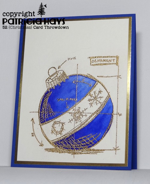
I thought for a while about how I could best use these colors, and decided to give a second try to a card design I first used last fall. I wanted to change it to a landscape-oriented card, but the image is a bit large to do that and allow a decent border around it on an A2 sized card. Oh well. I stamped the ornament image on watercolor paper with gold pigment ink and then heat embossed it with gold embossing powder. I’d used detail embossing powder on my previous card, which didn’t work out very well, so I tried my regular embossing powder this time. The end result was better, although still not great. (After a little testing, I think the problem is my gold ink pad.) I used a couple of drops of Brilliant Blue reinker plus a bit of water to watercolor the image. The embossing resisted the ink and water and also acted as a barrier to prevent the color from spreading outside of the image. A shiny gold mat and a matching blue card base later, and my card was finished.

Now it’s your turn to show us what you can make with these colors! If you need more inspiration first, go visit the 52CCT site and see what the rest of the design team has created. Be sure to link your card at the 52CCT site by 7:00 p.m. Eastern time on Friday, February 19. We look forward to having you join us!
Supplies:
Stamp: Christmas Blueprint 2 (Tim Holtz)
Cardstock: Brilliant Blue, Gold Foil (Stampin’ Up); watercolor paper (Artist’s Loft)
Ink: Gold (ColorBox)
Other: Brilliant Blue reinker (SU); gold embossing powder (Ranger)


