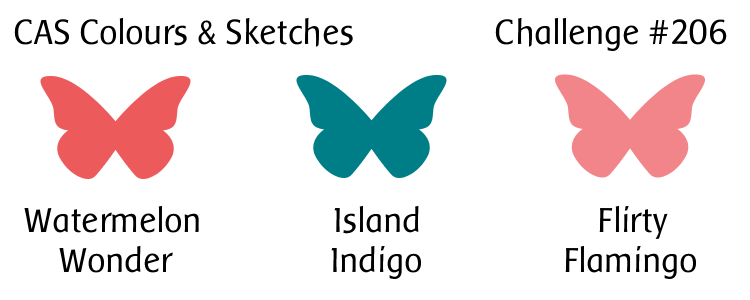
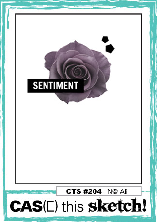
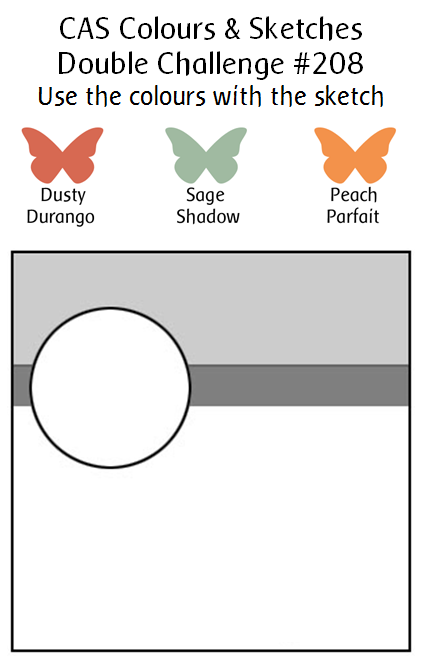
Hello there!  Since January has five Tuesdays, that means it’s time for a double challenge at CAS Colours & Sketches!  This week we’re asking our challenge participants to combine the given colors with the given sketch.  Sounds like fun, right?  We’ve decided to put a little twist into it this year.  We’ve dubbed our double challenges “Timeless Tuesday”, which means we’re reaching back into the archives for some retired colors and a previous CC&S sketch.

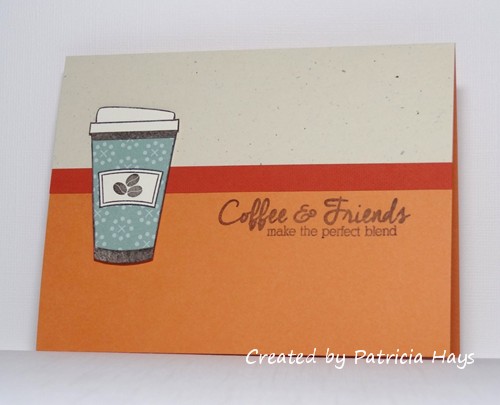
One of my sweet design team members at CC&S sent me a stamp set for Christmas, and I’ve been remiss about thanking her properly for it, so I figured what better way to do that than to make a card with it.  🙂  It seemed to play pretty well both into this week’s sketch and colors.  I stamped the coffee cup twice, once onto ivory cardstock and once onto a scrap of sage green designer paper.  I fussy cut them both to give the cup a green design.  The label/sleeve was created in the same manner and attached to the green cup.  I decided to use the lighter of the other two challenge colors for my card base.  I originally planned to stamp the sentiment on a narrow strip of the darker color.  I didn’t want that narrow strip to look too plain, so I stamped it with a subtle linen-look stamp, but it doesn’t really show in the photo.  Then I decided if I stamped the sentiment on the strip, the strip would seem too wide in proportion to the other elements of the card.  So I cut the strip to make it narrower, and stamped the sentiment below it.  The coffee cup is raised up from the background with some shims of scrap cardstock, so there’s a bit of dimension to the card.

CASCAS208

double 208

Be sure to check out what the rest of the CC&S Design Team has made.  Then get your craft on and link your own card to our challenge post!  You have until 7:00 p.m. Eastern time Monday, February 6 to share your card with us.  We’d love to see what you can do with our double challenge!

Supplies:
Stamps: I LOVE Coffee (Uniko); Linen (SU)
Cardstock: Peach Parfait, Dusty Durango, Naturals Ivory, Very Vanilla, Autumn Vine designer paper (Stampin’ Up)
Ink: Peach Parfait, Early Espresso (SU)

Hello!  We have a fun sketch challenge for you this week at CAS Colours & Sketches and I hope our participants like it as much as I do!  I think it’s a pretty versatile one.

I’m trying to get some more love-themed cards made to donate to Send A Smile 4 Kids before Valentine’s Day, so that helped determine what I was going to do with the sketch.  I originally planned to do something with different shades of pink cardstock, using a light pink for most of the card and using a darker pink for the curved part of the sketch.  When I was looking through my folder of light pink cardstock, I found a scrap of of some coordinating background paper I’d made a few years ago.  For that project, I’d splattered pink ink over some textured white cardstock and then sprayed it with gold pearl mist.  I decided to cut hearts from this and use them to decorate the curved part of the sketch.  To give the hearts better definition from the pink card base, I backed them with a scrap of brushed gold cardstock.  A simple sentiment in gold ink finished off the card.  The pink panels are raised up with shims of scrap cardstock so they are a little higher than the hearts.

CASCAS207

sketch 207

I’m going to enter this into the current challenge at Shopping Our Stash, where they’re asking their participants to use gold on their cards, and the current Uniko Studio challenge, “Anything Goes, with an optional twist of love”.


Be sure to visit the CAS Colours & Sketches blog to see the terrific cards the rest of the design team has made.  I’m sure they’d love it if you left them comments, too.  Then show us what you can do with this sketch!  Link your card to the CC&S site by 6:00 p.m. Eastern time Monday, January 30.  Thanks for stopping by today!

Supplies:
Stamp: Short & Sweet (Stampin’ Up)
Cardstock: Pink Pirouette, Brushed Gold, Whisper White textured (SU)
Ink: Gold (ColorBox)
Other: Stitched Rectangle die, heart die (Lawn Fawn); Landscape Trio die (Mama Elephant); Pink Pirouette ink refill (SU); Heirloom Gold Perfect Pearls Mist (Ranger)

Hello!  It’s time for a new challenge at Christmas Card Throwdown.  Although we’ve changed from a weekly challenge to a bi-monthly one, we’re keeping the same rotation of the different types of challenges… which means this time we have a color challenge for you.  It’s an interesting one that departs from the typical red and green frequently seen at holiday time.

I decided to create a little scene on my card.  To keep it from getting too bulky with layers, I started out by cutting a card base from watercolor paper and painting a wash of aqua on it.  While that dried, I worked on the front panel.  The triptych die fit into the stitched rectangle die I used for the card front, so I was able to simultaneously cut them from a piece of ivory cardstock.  Then I cut the triptych die again from brown cardstock for my tree.  I used white shimmer paint to create “snow” at the base of the watercolor wash, and I stamped a sentiment on the card front.  When the paint was dry, I glued the ivory panel to the front of the card.  Then I carefully inlaid the brown pieces into the ivory panel.  I had run the brown cardstock through my Xyron machine before I die cut it so I didn’t have to try to fiddle with adding adhesive to the intricate tree branches.

52CCT 01-21-2017

Thanks for stopping by today!  Now it’s your turn to show us what you can make with these colors.  If you need more inspiration first, go visit the CCT site and see what the rest of the design team has created.  Be sure to link your card at the CCT site by 7:00 p.m. Eastern time on Friday, February 3.  We look forward to having you join us!

Supplies:
Stamp: Holiday Script (Lizzie Anne Designs for Gourmet Rubber Stamps)
Cardstock: Pure Luxury Ivory (Gina K. Designs); Soft Suede (Stampin’ Up); watercolor paper (Artist’s Loft)
Ink: Soft Suede (SU)
Other: Narrow Tree Triptych die (Poppystamps); stitched rectangle die (Lawn Fawn); Coastal Cabana reinker (SU); Frost White shimmer ink (Tsukineko)

Hello!  I’m afraid I’m late again today with my post for this week’s challenge at CAS Colours & Sketches.  I was away for several days helping my parents, and am still trying to get back into the swing of things at home.

This week we have a color challenge for you.  Even though the one color in the trio is a rather bluish green, the colors still spoke “flowers” to me.  I decided to use a long-retired stamp set for my focal image.  The blossoms combine two stamps designed to work together, so that was the perfect way to get in both of the pink colors of the challenge.  The layout for the focal panel is based on the current sketch at CAS(E) this Sketch!; I hope they don’t mind that I’ve added a couple layers beneath it.

CASCAS206

CC&S color206-001

I’m really looking forward to seeing what our challenge participants at CC&S create this week!  Be sure to link your card at the challenge post by 6:00 p.m. Eastern time Monday, January 23.  Thanks for stopping by today!

Supplies:
Stamps: Watercolor Garden II (Stampin’ Up); Everyday Messages (Stampendous)
Cardstock: Flirty Flamingo, Island Indigo (SU); Pure Luxury Ivory (Gina K. Designs)
Ink: Flirty Flamingo, Island Indigo, Watermelon Wonder (SU)

Yikes!  I’m a little late today with my post for this week’s challenge at CAS Colours & Sketches.  I made a card yesterday but I wasn’t very happy with it.  As I was trying to fall asleep last night, another idea popped up in my mind.  So I got up this morning and gave it a try… and as luck would have it, it didn’t go quite as easily as I’d hoped.  But anyway…

I wanted to combine this week’s sketch challenge with the ombre challenge at Less is More and the “hello” challenge at AAA Cards.  My first card had a large flourish that I inked in three shades of blue, but I just wasn’t pleased with the overall look of it.  For my second attempt, I thought of using the sentiment “hello, sunshine” with my sunburst stencil.  I used two different shades of yellow to ink the stencil design, layering the darker shade to make it bolder toward the center of the design and fading out the lighter shade toward the edges.  Then I went to my stamps, looking for what I thought was a “hello, sunshine” stamp… and was disappointed to discover that the stamp only says “sunshine”, and it’s made to be used with a “hello” die.  At that point I thought, “My ‘hello’ die is going to look too big.  I have alphabet stamps, so I can spell out the sentiment with them.”  That didn’t go too badly, other than trying to position an apostrophe stamp for the comma… until I stamped the sentiment.  The first two times, the sentiment came out splotchy and messy looking.  So I cleaned the stamps and tried again.  That was slightly better but the letters still looked fuzzy.  So I figured I’d try my “hello” die anyway.  It turned out that the die filled up some of the tiny areas of the stencil that didn’t ink up well.  So I went with it, using textured cardstock for the die cut.  And finally the card came together.

CASCAS205

sketch 205


Despite all the troubles I had putting this card together, it’s still a lot better than my first card!

I hope you’ll have better luck creating a card with this sketch, and that you’ll share it with us at CC&S!  You have until 6:00 p.m. Eastern time Monday, January 16 to link your card there.  Thanks for stopping by today!

Supplies:
Stamps: none
Cardstock: Solar White (Neenah); Summer Sun textured (Stampin’ Up)
Ink: Summer Sun, Daffodil Delight (SU)
Other: Simply Said Hello die (Avery Elle); Rays stencil (Tim Holtz)

Hello!  The new year has brought some changes to the 52 Christmas Card Throwdown blog.  The biggest is that we’ve decided to switch to a twice-monthly challenge format, offering challenges on the first and third Saturdays of each month.  That’s made it necessary for a name change to Christmas Card Throwdown.  We also have a bunch of new design team members, and I hope you’ll join me in welcoming them by visiting their blogs and leaving comments for them.

We’re starting off with a sketch challenge.  It’s actually quite similar to one I put together for CAS Colours & Sketches a few years ago.  🙂  I wouldn’t be surprised, though, if someone else in the crafting world had based a challenge on something like it before I did it!  Still, even with the sketch being familiar, I had a really hard time coming up with a card I liked for the CCT challenge.  I tossed several ideas around in my head, and got one card made but then didn’t like it once it was all assembled.  So I went back to the proverbial drawing board and looked through my Christmassy designer papers.  I found one with ornaments, and a light bulb went off in my head because I knew I had a stamp set with similarly-shaped ornaments.  I turned the sketch on its side, elongated it into a rectangle, and put the fold of my card at the top.  I used the rock-n-roll technique to ink the ornament stamp, which provided me with the darker edges to the stamped image.  I used dimensional adhesive to attach the ornament to the card for a little extra interest.

52CCT 01-07-2017


We hope you’ll enjoy our new blog format and challenges this year!  Now it’s time for you to check out all the challenge details at the CCT site, and visit the rest of the design team members’ blogs for more inspiration.  Then create your own card and link it at the CCT site by 7:00 pm Eastern time Friday, January 20.  Thanks for stopping by my blog today!

Supplies:
Stamp: Delightful Decorations (Stampin’ Up)
Cardstock: Gumball Green, Whisper White (SU); designer paper from Very Merry Christmas 6×6 paper pad (Echo Park)
Ink: Riding Hood Red, Cherry Cobbler (SU)
Other: ornament punch, dimensionals (SU)

Hello!  Welcome to the start of a new year of challenges at CAS Colours & Sketches!  We’re back from our holiday break with a few changes to our schedule.  We’ll be presenting challenges on Tuesdays now, and the challenges will end on Monday evenings.  We’ll be announcing our Weekly Winners on Fridays.

Karen is our challenge host for January and she’s starting us off with some pretty pastels.  In the challenge writeup, Karen says the colors make her think of winter – and I think that with the right images, they would give a frosty feel.  But I’ve given them a springtime flair with a couple of butterflies.  I’ve used one of my newest dies to cut the butterflies and their path.  When I bought the die, I failed to notice that it isn’t quite the width of a standard A2 card, so I’ve mounted the cut to a rectangular die-cut panel.  I cut the two butterflies again from the other two challenge colors and glued them into place.  I thought the flowing letters of this sentiment stamp coordinated well with the shape of the die cut.  A few tiny rhinestones add the finishing touch.  The picture doesn’t show very well that the butterflies are slightly raised from the rest of the card front, but I’m hoping that’s enough dimension to qualify my card for the current challenge at Less is More.

CASCAS204

CC&S color204-001

Be sure to stop by the challenge blog and welcome our newest Design Team members and our Guest Designer!  Then create your own card using these colors, and link it to the challenge site by 6:00 p.m. Eastern time Monday, January 9.  We’d love to have you join us!  Thanks for stopping by today.

Supplies:
Stamp: Everyday Greetings Collection (Wordsworth)
Cardstock: Soft Sky, Pink Pirouette, Pale Plum (Stampin’ Up); Solar White (Neenah)
Ink: Soft Sky (SU)
Other: Happy Butterfly Sash die (Poppystamps); Stitched Rectangle die (Lawn Fawn); rhinestones (Recollections)

© 2019 Suffusion theme by Sayontan Sinha