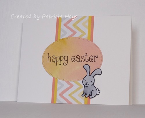
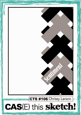
Hello!  The current challenge at The Paper Players has been intriguing me all week.  It’s to create a clean and simple styled card and incorporate watercoloring into it.  Since the challenge closes this afternoon, I figured this morning it was now or never if I wanted to join in.  The current CAS(E) this Sketch! layout seemed to lend itself well to including a watercolored background so I’ve combined the two challenges in today’s card.  I started off with a wash of green ink on watercolor paper, which turned out pretty light, but that was OK because I didn’t want it to obscure the image.  Once it was dry, I stamped the holly image.  Then I used a damp paintbrush to trace over the lines, blending in all the little shading lines and softening the edges of the image.  I stamped a cherry colored ink pad on acetate and used the ink from there to color in the berries.  I accidentally tapped the brush over the cardstock as I was finishing up the berries, splattering a bit of the watered-down red ink near the bottom edge of the watercolor paper.  So I made a last-minute decision to add some more splatters randomly over and around the image.  I chose a green cardstock for the base and here’s the final result:

CTS120

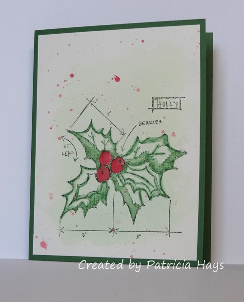
I realize it probably seems a little weird to have a Christmasy design in April, but none of the previous ideas I had came together very well for me.  It still makes a good card for me to stockpile for Operation Write Home.  Since there’s no sentiment on it, the person who chooses to send it can use it for any occasion during the holiday season.  And Christmas Eve is just 8 months away from today!

Thanks for stopping by my blog today.  All comments are read and appreciated!  (Well, not the spam comments.  They are read, but they are not appreciated unless the content or grammar strikes my funny bone – like the poorly worded one that talked about testing traffic lights.  LOL!)

Supplies:
Stamp: Christmas Blueprint 4 (Tim Holtz)
Cardstock: Garden Green (Stampin’ Up); watercolor paper (Artist’s Loft)
Ink: Garden Green, Cherry Cobbler (SU)
Other: paintbrush

Hello!  It’s the third Monday of the month, which means it’s time for a new challenge at Cards in Envy.  This time we have a color challenge for you – “Pretty in Pink”.

I wanted to use the current sketch from CAS(E) this Sketch! for the layout of my card.  The vase of flowers in the inspiration photo at Addicted to Stamps and More nudged me in the direction of using pink flowers on my card, and the creamy white table and chairs inspired me to choose ivory for my card base.  I looked through my stamp sets to figure out which one to use, and found this one that I hadn’t used for a long time.  I thought it might work well with some of my stash of Prima flowers, so I went through them and found these that were just the right size, with the bonus of the darker ones matching the dark pink cardstock perfectly.  The rediscovered stamp set and flowers tie into the current Shopping Our Stash challenge.  The current challenge at Retro Rubber is to use brads, so I looked through my horde of brads and found these little green ones that would work as the centers of the flowers.  So I was able to combine all the challenges together and came up with this:

CIE 04-20-2015

RRBC12

Now that I’ve completed my card for this challenge, I have the Psychedelic Furs song “Pretty in Pink” running through my head, and I’m tempted to see if I can find the Molly Ringwald movie on Netflix.  Ah, the 1980s.  Good times!  🙂

If you need additional inspiration, please go check out the Cards in Envy site and see what the rest of the design team has made.  Then create your own pink card following our challenge guidelines and share it with us on the Cards in Envy site by 7:00 p.m. Eastern time Sunday, May 3.  You can make your card  for any occasion or theme you like, so long as the dominant color is pink, it’s A2 sized, and that there are no lumpy, bumpy embellishments that would prevent the card from being mailed at the first class postage rate.  We’d love to have you play along with us!  Thanks for stopping by today.

Edited on April 24, 2015:  Thank you to the Addicted to Stamps and More team for naming me as an Honourable Addict for their challenge!  What a sweet surprise!

Edited on April 26, 2015:  Thank you also to the Retro Rubber Mod Squad for selecting my card as one of their Fab Five!  What a happy way for my week to start!

Supplies:
Stamps: Artfully Asian, Three Little Words (Stampin’ Up)
Cardstock: Pure Luxury Ivory (Gina K. Designs); Pink Passion, Pink Pirouette (SU)
Ink: Wild Wasabi, Pink Passion (SU)
Other: marker (Copic); flowers (Prima); brads (Recollections)

This is a pretty quick and simple card I made to combine the current CAS(E) this Sketch! layout with the current Clear It Out challenge to use yellow things.  I’ve cut this doily die from some textured sunshiny yellow cardstock and used the same color ink for the sentiment.  A couple matching brads hold the banner in place.

CTS118

Thanks for stopping by!

Supplies:
Stamp: In My Heart (Mama Elephant)
Cardstock: Pure Luxury White (Gina K. Designs); Summer Sun textured (Stampin’ Up)
Ink: Summer Sun (SU)
Other: For the Record 2, Documented die (Sizzix); Dimensional Banner die (My Favorite Things); brads (Making Memories)

I have just a quick post tonight to share the card I’ve made for the CAS(E) this Sketch! challenge that ends tomorrow morning.  I’ll admit I took a bit of liberty with the sketch by turning it 90° and adding a few panels, but I think you can still see the basics of the sketch within the focal panel.  I felt like the card looked too plain with just the focal panel on the base, so I added a punch of color with the textured red mat.  After I’d stamped the images on the ivory focal panel, I had a “DUH!” moment where I realized I needed white for the milk.  So I stamped all the elements on a scrap of white cardstock, colored them, fussy cut them, and then adhered them to the focal panel.  The straw in the milk glass took a little bit of finagling with my x-acto knife, but I finally got it to look kind of realistic.

CTS117

Since I used a die to cut the focal panel, I’m going to submit this into the current challenge at The Paper Players.  I’m also entering this into the “Anything Goes” challenge at Clear It Out challenge blog.

Thanks for stopping by today!  Comments are always read and appreciated!

Supplies:
Stamps: Milk and Cookies (Lawn Fawn)
Cardstock: Crumb Cake, Early Espresso, Real Red Core’dinations (Stampin’ Up); Pure Luxury White and Ivory (Gina K. Designs)
Ink: Tuxedo Black (Memento)
Other: markers (Copic); Stitched Journaling Card die (Lawn Fawn)

Hello!  Can you believe it’s April already?  Even though we’re still having some chilly nights with near-freezing low temperatures here in Virginia, the afternoons this week have been warmer and more spring-like.  The grass is turning green again and my daffodils are starting to bloom.

Louise is our CC&S challenge hostess for the month of April, and the colors she has chosen for this week’s challenge are certainly appropriate for this time of year.  She’s asking us to create a card with monochromatic shades of green.  I’ve used the CAS(E) this Sketch! layout for my card.  I knew I wanted to make my card suitable for Operation Write Home, so I opted for a cute crocodile image that had a neutral sentiment that isn’t particular to any occasion.  After I colored and fussy cut the crocodile, I nestled him in some die-cut grass.  The “sky” behind him is a scrap of designer paper with a green print.

CASCAS118

Be sure to go see what the rest of the CC&S Design Team has made – and check out the new look of our challenge blog!  Then create your own CAS styled card using this week’s color scheme and link it at the CC&S site.  We’d love to see what you can do!

Edited on April 6, 2015:  Thank you to the CAS(E) this Sketch! Design Team for naming my card as an Honorable Mention for their challenge!  This is a first for me, and I’m very honored!

Supplies:
Stamps: Critters Down Under (Lawn Fawn)
Cardstock: Wild Wasabi, Certainly Celery, Garden Green, Certainly Celery Patterns designer paper (Stampin’ Up); Pure Luxury White (Gina K. Designs)
Ink: Tuxedo Black (Memento)
Other: markers (Copic); Grassy Border die (Lawn Fawn)

This week at CAS Colours & Sketches we have some bright, fresh, springtimey colors for you to use in creating a clean and simple styled card.  Sadly, I needed to make a sympathy card so I’ve used the challenge colors for it.  I’ve also used this week’s sketch from CAS(E) this Sketch!.  I don’t think I can say much else without thinking about why I had to make a sympathy card, and that will get me crying again, so here’s the card:

CASCAS116

Thanks for stopping by today.  Remember to hug the people you love.

All supplies for this card are from Stampin’ Up.
Stamps: Roses in Winter, Thoughts & Prayers
Cardstock: Daffodil Delight, Strawberry Slush, Very Vanilla
Ink: Strawberry Slush, Wild Wasabi
Other: Beautiful Wings die, pearls

Hello!  I have just a quick post tonight to share a card I made combining several online challenges.  The current Lawnscaping challenge is to use dots and/or stripes.  I’ve used a stripey paper and a dotty paper for that.  At Retro Rubber Challenge blog, they are inviting their participants to use older stamps (at least a year old) and to incorporate a tag on their project.  The butterfly and the sentiment are from two of my older Lawn Fawn stamp sets.  As I was starting to put the tag on the card front, I noticed how much the card was resembling the current sketch at CAS(E) this Sketch!  So I thought about what to do for the trio of banner elements, and decided to use these really old snap/rivet things I have.  Anyone else remember them?  On a card they look like brads, but they attach like eyelets.  Yes, I had some fun pounding them with my hammer, LOL.  Even though the colors and patterns aren’t my usual thing, I kinda like the way the card came together.

101- butterfly tag

RRBC09

Thanks for stopping by!  All comments are read and appreciated… well, except the spam comments – they’re read, but not appreciated.  Unless they’re so bizarre that they make me laugh.  I can always appreciate a good laugh! LOL

Supplies:
Stamps: Flutter By, Sophie’s Sentiments (Lawn Fawn)
Cardstock: Naturals White (Stampin’ Up); designer papers from Bright Side Petite Paper Pack (Lawn Fawn)
Ink: Tuxedo Black (Memento)
Other: markers (Copic); tag corner punch, Calypso Coral twine (SU); Lemon twine (Really Reasonable Ribbon); eyelet and snaps (source unknown)

Hello!  It’s time for a new month of challenges at CAS Colours & Sketches!  One of our newest design team members, Jane, is our hostess this month and she has some fun challenge ideas in store for us!

As always, we start the month with a color challenge.  I’ve decided to combine the colors with the CAS(E) this Sketch! challenge that ends this morning. I had the worst time trying to get the colors to show true in the photo, so you’re going to have to take my word for it that “thanks” and the flower are a deep blackberry purple and that the “for all you do” is stamped in dark mossy green.  It was fun getting some use out of one of my old Cuttlebug alphabet die sets for this card!

CASCAS114

colors #114

I’m also entering this card in the Clear it Out challenge, where the theme this week is  “Anything Goes”.

How will you use these colors?  Be sure to check out the CC&S blog to see what the rest of the design team has made.  Once you’ve made your own card, be sure to link it at the challenge post by 1:00 p.m. Eastern time Wednesday, March 11.  We’d love to have you join us!  Thanks for stopping by today.

Supplies:
Stamps: Handwritten Notes (Avery Elle)
Cardstock: Naturals White, Lost Lagoon, Blackberry Bliss, Mossy Meadow (Stampin’ Up)
Ink: Mossy Meadow (SU)
Other: Olivia alphabet die (ProvoCraft)

Hello!  I recently discovered a new-to-me cardmaking challenge called Flashback Friday.  The main idea of this challenge is to use products that you’ve had for at least a year.  Goodness knows I have LOTS of items that fall under that description, LOL!  So I thought I’d give this week’s challenge a shot and try to remember to check into it each week.

This week Flashback Friday has a theme of “Geometrical”.  That played nicely into the current sketch at CAS(E) this Sketch! with its large oval.  I’m trying to finish up a box of cards to send to Operation Write Home and wanted to get one more Easter card in there before their Easter deadline.  So I saw the oval as an Easter egg shape and cut one from designer paper.  When I used to dye Easter eggs, I’d always do at least one each year where I’d dip one end of the egg in one color dye and the other end in a different color.  That’s the effect I was going for with this designer paper.  For the vertical band element of the sketch (a rectangle – another geometric shape!) I used a coordinating designer paper from the same package, and matted it with two solid colors of cardstock.  I stamped the bunny on a scrap of white cardstock, colored him, fussy cut him, and attached him with dimensional adhesive to take the place of the heart element of the sketch.  It makes for a rather simple looking card, but I think it turned out pretty cute.

CTS111

The designer papers and the white card base are my newest items used here; I’ve had them for about 13 months.

That’s it for today.  Thanks for stopping by!  I’ll be back tomorrow to introduce a new challenge at CAS Colours and Sketches.

Supplies:
Stamps: Happy Easter (Lawn Fawn)
Cardstock: Pure Luxury White (Gina K. Designs); Crisp Cantaloupe, Daffodil Delight, Watercolor Wonder designer series paper (Stampin’ Up)
Ink: Tuxedo Black (Memento)
Other: markers (Copic); Pierced Oval Stax die (My Favorite Things); dimensionals (SU)

Hello, and Happy Valentine’s Day!  I hope you’re able to spend the day with someone you love.  At 52 {Christmas} Card Throwdown, we’re sharing our love of the Christmas season.  This week’s challenge is a color challenge with some very classic colors:  white, silver, and grey.

There’s a fairly popular saying that “the third time’s the charm”, and that seemed to be true as I was trying to make a card for this challenge.  My first attempt involved heat embossing, which didn’t turn out too well.  My second attempt probably would have worked out all right, but I started getting impatient and felt like it was a bit too much to fuss with.  I had this week’s challenge from CAS(E) this Sketch! in the back of my mind, so I decided to combine the sketch with the 52{C}CT colors.  I ended up rotating the sketch 180° so that my card makes it upside-down from the way it’s drawn.  I did that because the snowflake image I chose has words written around it, blueprint style.  In order to keep the words right side up, but to have the image going off the corner like the sketch shows, the beginning of the word “shiny” was likely going to be off the edge of the cardstock – and I just couldn’t have “hiny” showing on a Christmas card, right?!  As it worked out, the “real” sentiment on the card almost obscures it, but if you look closely and read it all together, it’s “Happy wonderful shiny Christmas”.  LOL.  My shiny silver element for the card is the eyelet in the middle of the snowflake.  I also sprayed the white cardstock with some pewter shimmer mist, but because the mist is so fine, I wasn’t able to capture the shimmer in my photo.  So the cardstock just looks speckled.

52CCT 02-14-2015

Now it’s your turn to show us what you can make with these colors!  If you need more inspiration first, go visit the 52{C}CT site and see what the rest of the design team has created.  Be sure to link your card at the 52{C}CT site by 7:00 p.m. Eastern time on Friday, February 20.  We look forward to having you join us!

Supplies:
Stamps: Christmas Blueprint (Tim Holtz); Wondrous Wreath (Stampin’ Up)
Cardstock: Smoky Slate (SU); Pure Luxury White (Gina K. Designs)
Ink: Smoky Slate, Basic Gray (SU)
Other: pewter Perfect Pearls Mist (Ranger); snowflake eyelet (source unknown)

Hello!  I’ve made a couple more cards using the sketch from this week’s CAS(E) this Sketch! challenge.  This time I used one of my Mama Elephant stamp sets.  I know, the characters don’t have mouths, but I still think they are adorable.  It felt good to use some more of my older Basic Grey papers, too.  I used the mirror image of the sketch for the Cupid card so it wouldn’t look like he was shooting his arrow off the edge of the card.  It doesn’t show well in the photos, but I added some sparkle to the angel’s and Cupid’s wings with a glitter pen.

CTS109 loved

CTS109 heart day

Thanks for stopping by today!  Comments are always welcome and appreciated.

Supplies:
Stamps: Love from Above (Mama Elephant)
Cardstock: Almost Amethyst (Stampin’ Up); Pure Luxury White (Gina K. Designs); designer papers from Sugar Rush 6″ x 6″ pad (Basic Grey)
Ink: Tuxedo Black (Memento)
Other: Stitched Scalloped Borders die (Lawn Fawn); Wink of Stella pen (Zig)

Here’s a quick card I made combining the Lawnscaping challenge that ends tomorrow night with the CAS(E) this Sketch! challenge that ends Thursday morning.  I actually used the sketch in mirror reverse.  I’m not sure yet if I’ll give this card to my husband for Valentine’s Day or if it will go in my stash for Operation Write Home.

99 - CAS

Thanks for giving my card a closer look!  Comments are always appreciated – I do read every single one!

Supplies:
Stamps: Love ‘n Breakfast (Lawn Fawn)
Cardstock: Going Gray, Real Red (Stampin’ Up); Pure Luxury White (Gina K. Designs); designer paper from Sugar Rush 6″ x 6″ paper pad (Basic Grey)
Ink: Tuxedo Black (Memento)
Other: markers (Copic)

Hello there!  It’s time for a new challenge at Cards in Envy – where we make cards that fit in envelopes!  Cards for our challenges should be A2 sized (4.25″ x 5.5″) and have no lumpy, bumpy embellishments more than 1/4″ thick, so that the cards can be mailed at the standard first-class postage rate.  For the next two weeks, we’re focusing on the theme of “Hearts All a Flutter”.  We’d like to see your cards that have two or more hearts on them.

I think our previous “Going Gray” challenge was giving me subliminal messages when I was working on my card for this challenge.  The card follows the current CAS(E) this Sketch! layout.  The bunny tag is raised up from the card base with dimensional adhesive.  I tried to keep the card gender-neutral and age-neutral so it would be a versatile one for Operation Write Home.

CIE 02-02-2015

We hope you’ll have fun with this challenge and share your heartfelt card with us at Cards in Envy!  Link your card to our challenge post by 7:00 p.m. Eastern time Sunday, February 15.  Happy crafting!

Supplies:
Stamps: My Silly Valentine, Belinda’s Borders (Lawn Fawn)
Cardstock: Pure Luxury White (Gina K. Designs); Smoky Slate (Stampin’ Up)
Ink: Smoky Slate, Basic Gray (SU)
Other: markers (Copic); dimensionals, tag corner punch (SU); cherry twine (Really Reasonable Ribbon)

Hello, and happy Saturday to you!  I hope your weekend has gotten off to a good start.

This week is theme week at 52 {Christmas} Card Throwdown.  Deborah, our hostess, has chosen the cheery theme of bells.  That made picking stamps to use an easy task for me, because I have only two stamp sets with bells, and I used one of them last week!  So I’ve used my other set for today’s card.  This is a “golden oldie” stamp set that I’ve owned for at least 10 years!  🙂 The layout for this card was inspired by the current CAS(E) this Sketch! challenge.  Unfortunately, the card didn’t come together quite the way I wanted it to.  I knew I wanted to heat emboss the bells and the sentiment.  Because the cardstock tends to get a bit warped when it’s heated, I planned to do my stamping and embossing, and then trim down the wonkiness.  I had originally planned to trim enough to add a layer of gold cardstock between the main panel and the card base.  Unfortunately, the two bells below the sentiment ended up too low for me to do that.  So, to add a little more definition to the main panel, I’ve added some cardstock shims beneath it to give it more separation from the card base.

52CCT 01-17-2015

What kind of bells will you use on your card?  If you need more ideas, check out what the rest of the 52{C}CT design team has made.  Then share your Christmas or winter card with us at the site by Friday, January 23.  We’d love to have you join us!

Supplies:
Stamps: A Greeting for all Reasons, Christmas Greetings (Stampin’ Up)
Cardstock: Very Vanilla (SU)
Ink: gold (ColorBox)
Other: gold embossing powder (Ranger)

Hello!  This week at CAS – Colours and Sketches we have another color challenge for you.  Once again, it’s using a metallic along with two other colors.

I’ve combined the color challenge with the CAS(E) this Sketch! challenge that will be closing later this morning.  Well, it’s a kind of loose interpretation, but the card layout was definitely inspired by the sketch.  And it’s their 100th sketch – what a milestone!  I had these heat embossed die cut stars left over from a different project, and it was nice to put them to use here.  It doesn’t show well in the photo, but the words “make a wish” are also heat embossed.

CASCAS101

Be sure to check out what the rest of the CC&S Design Team has done with these colors!  Then share your own card with us by linking it to the challenge post by 1:00 p.m. Eastern time Wednesday, November 26.  We’d love to have you join us!

Supplies:
Stamps: Cake & Candles (Avery Elle)
Cardstock: Lost Lagoon, Smoky Slate, Whisper White, Whisper White textured (Stampin’ Up)
Ink: Lost Lagoon (SU); silver (ColorBox)
Other: Bracket Edge die (My Favorite Things); star die (Sweet ‘n Sassy Stamps); silver embossing powder (Ranger)

© 2019 Suffusion theme by Sayontan Sinha