Hello there, and happy Saturday to you! It’s time for another theme challenge at 52 {Christmas} Card Throwdown: Christmas windows. The perspective can be either looking into the window or looking out from the window. So long as the window is the main focus of the card, it’s good.
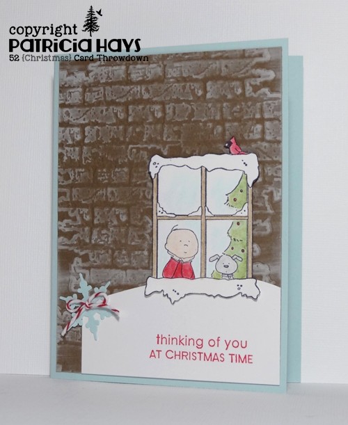
I’ve owned this cute rubber stamp of a boy and his dog looking out a window for… um… let’s just say a pretty long time. Even though I think it’s adorable, I’ve always been rather intimidated by it because I worry that my coloring skills won’t do it justice. Well, this challenge provided me with the opportunity to push myself past that fear. I guess I did OK. One of the reasons the stamp has bothered me is that there is no background to the window – so that way, the user can choose to put it on whatever type of building he or she pleases. I decided the easiest thing to do would be to add it to cardstock embossed with the brick embossing folder. I highlighted the bricks with a few swipes of my white ink pad. I was trying to follow the current Freshly Made Sketches challenge for the layout, so I tried making the one rectangular element into a snowdrift up against the side of the building, under the window. I put a few scrap cardstock shims behind the window to give it some dimension, but in hindsight I’m not entirely sure that was the best idea. Then there was the horizontal twine-like element of the sketch. The realist in me couldn’t figure out a logical reason for that in my scene. So I opted to just add a simple little bow to the snowflake, which takes the place of the button-like sketch element. The sentiment is made up from two different stamps. Since it seems to me like the boy is looking out of the window, perhaps missing somebody who is far away, it made me think of kids whose parents are stationed overseas with the military. Even though it’s too late to send this card to Operation Write Home to be used this holiday season, it’ll keep for next year.


Go check out the other design team members’ windows – this is one time where it’s okay to be a “peeping Tom”, LOL! 🙂 Then create your own card featuring a Christmas window and share it with us at the 52{C}CT site. We’d love to have you join in the fun and creativity! Thanks for stopping by today.
Edited on November 19, 2014: I’m so honored to have been named one of the “Perfect Princesses” at Freshly Made Sketches! Thank you to Linda for choosing my card!

Supplies:
Stamps: Billy and Sparky at Window (eat cake graphics); Trendy Trees (Stampin’ Up); Christmas Tags (Sweet ‘n Sassy Stamps)
Cardstock: Soft Sky, Soft Suede (SU); Pure Luxury White (Gina K. Designs)
Ink: Craft White (SU); Tuxedo Black (Memento)
Other: Brick embossing folder (Tim Holtz); Premier colored pencils (Prismacolor); odorless mineral spirits (Hampton Arts); snowflake punch (EK Success); Cherry twine (Really Reasonable Ribbon)