Hello!  It’s time for a new challenge at Christmas Card Throwdown.  Although we’ve changed from a weekly challenge to a bi-monthly one, we’re keeping the same rotation of the different types of challenges… which means this time we have a color challenge for you.  It’s an interesting one that departs from the typical red and green frequently seen at holiday time.

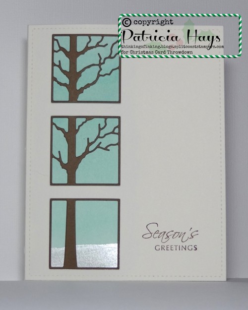
I decided to create a little scene on my card.  To keep it from getting too bulky with layers, I started out by cutting a card base from watercolor paper and painting a wash of aqua on it.  While that dried, I worked on the front panel.  The triptych die fit into the stitched rectangle die I used for the card front, so I was able to simultaneously cut them from a piece of ivory cardstock.  Then I cut the triptych die again from brown cardstock for my tree.  I used white shimmer paint to create “snow” at the base of the watercolor wash, and I stamped a sentiment on the card front.  When the paint was dry, I glued the ivory panel to the front of the card.  Then I carefully inlaid the brown pieces into the ivory panel.  I had run the brown cardstock through my Xyron machine before I die cut it so I didn’t have to try to fiddle with adding adhesive to the intricate tree branches.

52CCT 01-21-2017

Thanks for stopping by today!  Now it’s your turn to show us what you can make with these colors.  If you need more inspiration first, go visit the CCT site and see what the rest of the design team has created.  Be sure to link your card at the CCT site by 7:00 p.m. Eastern time on Friday, February 3.  We look forward to having you join us!

Supplies:
Stamp: Holiday Script (Lizzie Anne Designs for Gourmet Rubber Stamps)
Cardstock: Pure Luxury Ivory (Gina K. Designs); Soft Suede (Stampin’ Up); watercolor paper (Artist’s Loft)
Ink: Soft Suede (SU)
Other: Narrow Tree Triptych die (Poppystamps); stitched rectangle die (Lawn Fawn); Coastal Cabana reinker (SU); Frost White shimmer ink (Tsukineko)
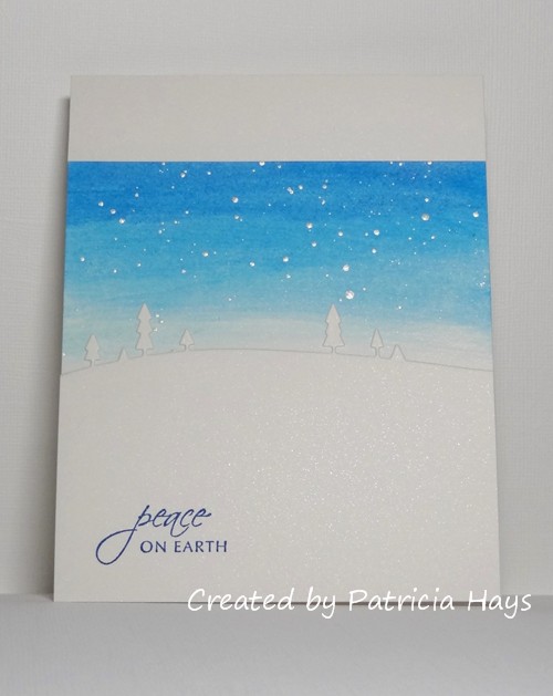
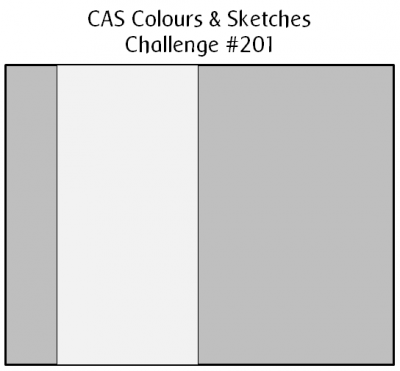
Hello, and Happy Thanksgiving to my American visitors!  It’s time for another challenge at CAS Colours & Sketches and this time we have a very simple sketch for you to try.

I’ve turned the sketch 90° on its side for my card.  I swiped three shades of blue gel sticks onto a card base of shimmery white cardstock and blended the gel sticks with a damp paper towel.  Then I flicked some white shimmery paint over it, thinking it would look like falling snow, but on second thought maybe it looks more like stars in the sky.  I cut a narrow scrap of the shimmery cardstock to neaten up the top border of the blue part of my card.  For the bottom, I die cut a border of trees using another piece of shimmery cardstock.  I added a simple sentiment and then glued the panel to the card.  I had thought about using cardstock shims to raise the white panels over the blue for a little extra dimension, but supporting the trees would have been difficult without cutting more of them and layering the die cuts.  So the white panels are adhered directly to the card base.  Getting the shimmery cardstock to show in the photograph wasn’t easy.  I wanted to brighten up the photo to show the whiteness of the cardstock, but that washed out the shimmery-ness.

CASCAS201

sketch 201

When I started out with this card, I didn’t intend to use the color scheme from last week’s CC&S challenge!  I tried out a few other sunset-inspired color combos with my gel sticks, but I liked the blues the best.

The Paper Players has a CAS Christmas card challenge going, and I’m also planning to enter this card into the Ombre challenge at Addicted to CAS.

What will you create with this sketch?  Share your work with us at the CAS Colours & Sketches site by 7:00 p.m. Eastern time Wednesday, November 30.  Be sure to check out what the other design team members have made, too!  Thanks for stopping by today!

Supplies:
Stamp: Holiday Script (Lizzie Anne Designs for Gourmet Rubber Stamps)
Cardstock: Cryogen White (Curious Metallic)
Ink: Pacific Point (Stampin’ Up)
Other: gel sticks (Faber Castell); Wide Open Spaces die (Memory Box); Frost White shimmer ink (Tsukineko)
Hello!  It’s the fifth Saturday of the month, and that means at 52 Christmas Card Throwdown, it’s “Pick a Previous” week!  This time we’re asking our participants to choose a previous 52CCT sketch and create a card based on it.

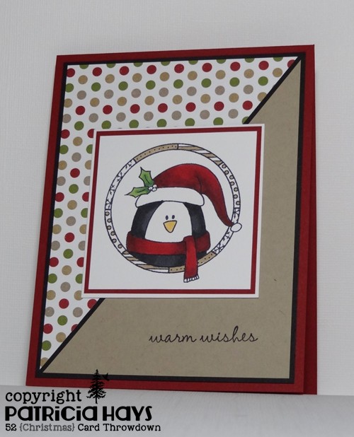
I chose to work with the sketch from January 2015.  I’ve had this little penguin colored and matted, left over from our family’s Christmas cards from a few years ago, and I decided it was time to finally make a card for him.  The penguin panel seemed like it would fit well in place of the star-shaped element of the sketch.  The polka-dotted designer paper worked well with the green leaves and the cherry red hat and scarf, but I felt something else was needed.  So I added some brown coloring to the frame around the penguin to tie in with the kraft-colored dots and used kraft cardstock for the other triangular panel of the sketch.  I added a black mat to tie in with the penguin, and attached the whole card front to a cherry colored card base.  Looking at it now, I realize that I inadvertently flip-flopped the triangular panels, so my card is actually the mirror image of the way the sketch was drawn.  But I think the inspiration is obvious!

52CCT 10-29-2016

Once you’ve been inspired by the design team’s work, make a Christmas or wintry card of your own using one of our previous sketches.  Share it with us by linking it at the 52CCT site by midnight GMT Friday, November 4.  We’d love to have you join us!  Thanks for stopping by today.

Supplies:
Stamps: Cozy Friends (Sweet ‘n Sassy Stamps); Warm Penguin (Lizzie Anne Designs for Gourmet Rubber Stamps)
Cardstock: Cherry Cobbler, Basic Black, Kraft, Season of Style designer series paper (Stampin’ Up); Solar White (Neenah)
Ink: Tuxedo Black (Memento)
Other: markers (Copic)
Hello, and happy Thursday!  It’s time for a new challenge at CAS Colours & Sketches, and this week we have a sketch for you to try.

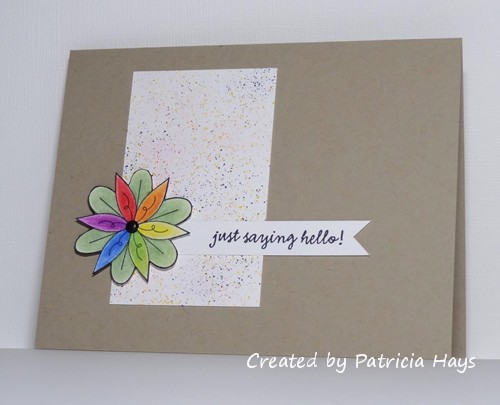
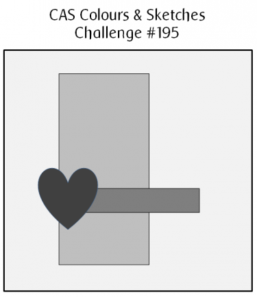
I’ve stretched out the sketch into a landscape-oriented rectangle, and I’ve combined this challenge with the photo inspiration challenge at AAA Cards.  I used my color spritzer tool and red, yellow, and blue markers to make the splatter design on the white panel.  I stamped the flower onto a scrap of cardstock and used a rainbow of colored pencils to color it.  After I fussy cut it out, I added a brad for the flower center and used dimensional adhesive to attach the flower to the card.

CASCAS195

sketch 195


So long as we can see the basic elements of the sketch in your card, it’s all good!  What kind of card will you create with it?  We’d love to see!  Share it with us via the linky tool on the challenge post by 6:00 p.m. Eastern time Wednesday, October 19.  Happy crafting!

Supplies:
Stamps: Le Jardin, Everyday Sayings (Lizzie Anne Designs)
Cardstock: Crumb Cake (Stampin’ Up); Solar White (Neenah)
Ink: Tuxedo Black (Memento)
Other: Real Red, YoYo Yellow, and Brilliant Blue markers, dimensionals (SU); color spritz tool (InkWorkz); Premier colored pencils (Prismacolor); odorless mineral spirits (Hampton Arts); mini brad (Making Memories)

Hello! I hope you’re having a great weekend so far.

This week at 52 Christmas Card Throwdown we are celebrating Christmas with a snow people themed challenge!  The design team has made some great cards with various snowman and snowwoman images. You can go to the 52CCT site to see what they’ve created, and if you love what you see, feel welcome to comment on their work – I know they’d really appreciate it!

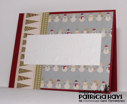
I don’t have any stamps showing multiple snow people, but I remembered I’d bought a brass embossing stencil many years ago that featured several snowmen.  I dug it out and put it to use for today’s card.  I used some washi tape to hold the stencil in place on a piece of white cardstock, and then held it up to a window to trace the stencil with an embossing stylus.  (I don’t have a lightbox.)  I looked through the archived sketches at Operation Write Home and found one that my embossed panel fit into.  I used some snowman print paper to further tie in with the theme of the challenge.  The vertical strip of paper was originally intended to be a Christmas tree design, but I thought that turned on its side, the trees looked like pennant banners.  I debated whether or not to try to color the embossing, but decided it would be difficult to match colors with my designer papers.  Unfortunately, it wasn’t easy capturing the all the details of the embossed image when I was photographing the card.

52CCT 09-17-2016

I’m going to throw this into the ring at Shopping Our Stash, where they are looking for projects that don’t use stamping.

And now it’s your turn to show us what you can create!  We’d love it if you joined our challenge this week.  You have until 7:00 pm Eastern time Friday, September 23 to link your card at the 52CCT site.  Thanks for stopping by today!  I hope you’ll come back again soon.

Supplies:
Cardstock: Cherry Cobbler, Whisper White (Stampin’ Up); designer paper from Winter Wonderland paper pack (Lizzie Anne Designs)
Other: snowmen brass embossing stencil (Lasting Impressions)

Hello!  We’re back to another color challenge week at CAS Colours & Sketches.

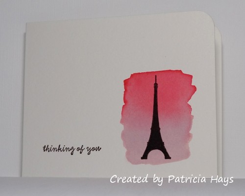
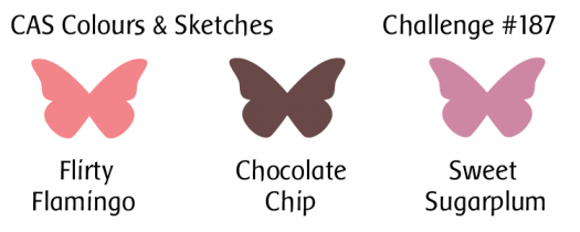
I have to admit that I had a hard time figuring out what to do with these colors, mainly because the chocolate brown was the only one I’ve seen in person.  So I browsed online and eventually found a few blogs where the new Stampin’ Up In Colors were compared to other SU colors.  I think I’ve picked fairly close approximates of the challenge colors for the watercolor wash on my card.  I decided to try to use the colors as a background, rather than for the main image of the card.  Blending the colors fits the current challenge at AAA Cards.  When I was browsing my stamps for silhouette images to use with the background, I came across this Eiffel Tower stamp I’d forgotten I had.  So I decided to use it and join in the current challenge at Less is More.  Once the watercolor wash was dry, I added the sentiment and the silhouette image of the Eiffel Tower in chocolate brown.  I rounded the top corner of the card and decided to call it done.  Very CAS, n’est-ce pas?

CASCAS187

CC&S color187-001

Edited on September 15, 2016 to add:  Thank you to the team of AAA Cards for choosing my card as one of your Top Three for the Blending challenge!

Thanks for stopping by today!  I hope you’ll check out what the rest of the design team members have made, and then share your own creation with us at the CAS Colours & Sketches site!  You have until 6:00 p.m. Eastern time Wednesday, August 24 to link your card.

Supplies:
Stamps: Simply Sweet, Everyday Sayings (Lizzie Anne Designs)
Cardstock: watercolor paper (Artist’s Loft)
Ink: Chocolate Chip (Stampin’ Up)
Other: Regal Rose and Pale Plum reinkers (SU); corner rounder punch (EK Success)

Hello again!  This week at CAS Colours & Sketches we have a simple little sketch challenge up for the offering.

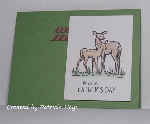
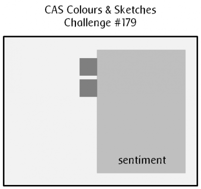
Since Father’s Day was last Sunday here in the United States, I used the sketch to create a card for my husband.  I pulled out my pastel chalks to color the deer image because I wanted a soft look to the coloring.  I hadn’t used those in a very long time!  A couple pieces of ribbon that coordinated with the deer worked for the two small elements of the sketch.  It’s hard to tell in the photo, but I used textured cardstock for the card base, to give it a little extra visual interest.  I attached the focal panel to the card base with dimensional adhesive to accommodate the thickness of the ribbon.  I had chosen the deer image thinking that it looked like a parent and child.  It wasn’t until I was pressing down on the focal panel, making sure it was securely adhered, that I realized that the larger deer is likely a doe rather than a buck… making it not quite the right image for Father’s Day… but oh well.

CASCAS179

sketch 179

What will you do with this sketch?  I hope you’ll try out something and share what you create with us!  Link your work to the CAS Colours & Sketches blog by 6:00 p.m. Eastern time Wednesday, June 29.

Supplies are from Stampin’ Up unless otherwise noted:
Stamps: In the Meadow; Dream Big (Lizzie Anne Designs)
Cardstock: Whisper White, Wild Wasabi textured
Ink: Tuxedo Black (Memento)
Other: Stampin’ Pastels, taupe grosgrain ribbon

Hello!  It’s time for a new challenge at Cards in Envy – where we make cards that fit in envelopes!  Cards for our challenges should have no lumpy, bumpy embellishments more than 1/4″ thick, so that the cards can be mailed at the standard first-class postage rate.

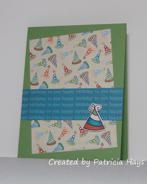
For the next two weeks, we’re focusing on the theme of “Another Year Older.”  Birthday cards are always fun ones to send!  I’ve used some older digital designer papers for my card.  I stamped a party hat onto a scrap of white cardstock and colored it to coordinate with the designer papers. Then I fussy cut it out and attached it to the card with dimensional adhesive.  I’ve used the current CAS(E) this Sketch! challenge for the layout of my card, but turned it upside-down so the triangular element would work better with the party hat.

CIE 04-18-2016

What kind of birthday card will you create?  Will it be masculine or feminine?  For a child or an adult?  Or will it be neutral enough to be given to any person of any age?  No matter what you make, we’d love to have you share it with us at Cards in Envy!  You have until 7:00 p.m. Eastern time Sunday, May 1 to link your card at our challenge post.   Thanks for visiting my blog today!  🙂  Comments are always welcome.

Supplies:
Stamps: Hats Off to You (Lawn Fawn)
Cardstock: Wild Wasabi (Stampin’ Up); Pure Luxury White (Gina K. Designs); Vintage Birthday digital designer paper (Lizzie Anne Designs)
Ink: Tuxedo Black (Memento); printer ink
Other: markers (Copic); dimensionals (SU)

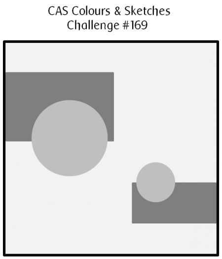
Hello!  It’s time for another sketch challenge at CAS Colours & Sketches.  Any shape can be used in place of the circular shapes on the sketch graphic, but the elements at the top and at the bottom should be distinctly different sizes.  It’s OK to tweak the sketch by turning it on its side or changing it to an A2 sized card.  So long as we can see the basic elements of the sketch in your card, it’s all good.

I will admit that I had a hard time figuring out what I wanted to do with this sketch, other than taking it from a square into a rectangular formatted card.  Finally I spotted this butterfly die that I hadn’t used in a long time and decided to go with that, using the butterflies for the circular shapes.  The butterflies are cut from designer paper that has some very large roses on it.  The design is scaled more for scrapbooking than cardmaking, but I figured cutting the butterflies from the middles of the roses would work to give them a slightly multicolor effect.  I’ve glued the middles of the butterflies down to the card base and popped up the wings for some dimension.  Some tiny rhinestones add a little sparkle.  I used some scraps of very old designer paper for the rectangular elements of the sketch, to give a sense of sky to the card.  I wanted to get another Mother’s Day card made for Send a Smile 4 Kids, so that’s what decided the sentiment I chose.  I’ll be entering this card into their current challenge.  Even though it isn’t one of my favorite cards I’ve ever made, I’m satisfied with how it turned out.

CASCAS169

sketch 169

What will you create with this sketch?  For further inspiration, check out what the rest of the design team and our guest designer have made.  Share your artwork with us at the CAS Colours & Sketches site by 6:00 p.m. Eastern time Wednesday, April 20.  We’d love to have you join us!  Thanks for stopping by my blog today!

Supplies:
Stamps: It’s Good to be Queen (Lizzie Anne Designs)
Cardstock: Marina Mist, Watercolor Wonder designer paper (Stampin’ Up); scraps of designer paper from an unknown source
Ink: Going Gray (SU)
Other: Beautiful Wings die, rhinestones, dimensionals (SU)

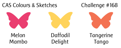
Well hello there!  It’s the first Thursday of the month, which means we have a new hostess of the month over at CAS Colours & SketchesLouise has come up with some neat challenges for us, and we hope you’ll join in to show us what you can do with them.

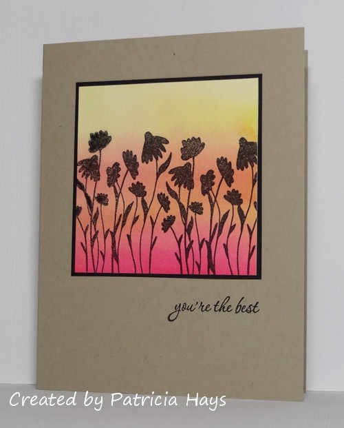
We’re starting off the month with a color challenge, and Louise has chosen some bright colors for it.  I used them to create a watercolored background, so the colors are toned down a bit on my card.  The way the colors blended kind of created a fourth color, but trust me, I used only the three challenge colors for the background.  When it was dry, I stamped some silhouetted flowers to make it look like the flowers are set against a sunset sky.  Or maybe it’s a sunrise.  Use your imagination!  🙂  I added a simple thin black mat to the image to make it stand out from the card base, stamped a sentiment, and called it done. It felt good to use some of my older stamps for this card.

CASCAS168

CC&S color168-001

I’m going to submit this to the current Less is More challenge, where the theme is “white space that isn’t white”.

Go see what the rest of the CC&S Design Team has done with these vibrant colors!  Then make your own card with these colors and share it with us at the CC&S challenge post.  You have until 6:00 p.m. Eastern time Wednesday, April 13 to link your card.  We hope you’ll join us!  Thanks for stopping by today.

Supplies:
Stamps: Serene Silhouettes (Sweet ‘n Sassy Stamps); Everyday Sayings (Lizzie Anne Designs)
Cardstock: Kraft, Basic Black (Stampin’ Up); The Langton Prestige Extra Smooth Hot Press watercolor paper (Daler-Rowney)
Ink: Onyx Black (VersaFine)
Other: Daffodil Delight, Melon Mambo, and Tangerine Tango reinkers (SU)

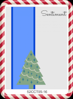
Hello!  It’s the first Saturday in February, and that means it’s time for a new sketch challenge at 52 Christmas Card Throwdown.  April, our challenge hostess, has come up with a rather simple one that should be easy for most people.  Although she’s used a tree on the sketch, any festive shape can be used.

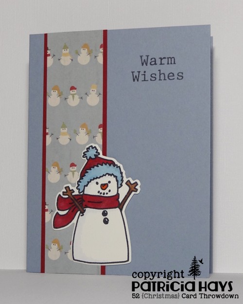
I’ve decided to go wintry rather than specifically Christmassy, so I’ve used one of my favorite snowman images in place of the tree element.  Some cute snowman patterned paper fills in the vertical strip element.  Although I adore this snowman print, I don’t use it too often because it’s difficult matching colors to it.  But I think I came pretty close, and I guess a little contrast isn’t necessarily a bad thing.  I’ve used some shims of scrap cardstock behind the snowman to give him a little bit of dimension off the background of the card.

52CCT 02-06-2016

Check out what the rest of the 52CCT team has created this week.  Then have fun with the sketch and share your own card with us at the challenge site!  You have until 7:00 p.m. Eastern time Friday, February 12 to link your card.  Thanks for stopping by today!

Supplies:
Stamps: Be Jolly (Avery Elle)
Cardstock: Bordering Blue, Cherry Cobbler (Stampin’ Up); Pure Luxury Ivory (Gina K. Designs); designer paper from Winter Wonderland paper pack (Lizzie Anne Designs)
Ink: Tuxedo Black (Memento)
Other: Be Jolly die (Avery Elle); markers (Copic)

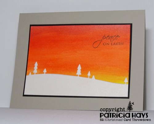
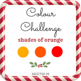
Hi there!  This week is color challenge week at 52 Christmas Card Throwdown.  Deborah, our hostess for the month of January, has chosen a somewhat unusual one for Christmas cards:  she’d like to see shades of orange!

I will admit that this had me stumped for a while because I really don’t use orange very often, mainly just for autumnal cards.  I was browsing through my computer, looking for ways I’d used orange in the past, and rediscovered a card I’d made a few months ago.  I decided to rework it to make it suitable for the holiday season.  I scribbled red, orange, and yellow gel sticks on a piece of white cardstock and blended the colors with a slightly damp paper towel to create my orangey background.  I used shimmery white cardstock to resemble snow covering the ground and trees.  (It’s hard to get a photo that shows off the shimmer really well.)  My son helped me choose the sentiment; he picked this one because he felt the scene looked tranquil.

52CCT 01-16-2016

Thanks for stopping by today!  Be sure to check out the 52CCT blog to see what the rest of the design team has made.  Then link your own card to the challenge post.  You have until 7:00 Eastern time Friday, January 22 to play along with us.  We can’t wait to see what kind of orangey Christmas card you create!

Supplies:
Stamp: Holiday Script (Lizzie Anne Designs for Gourmet Rubber Stamps)
Cardstock: Sahara Sand, Basic Black, Shimmery White (Stampin’ Up); Pure Luxury White (Gina K. Designs)
Ink: Tuxedo Black (Memento)
Other: gel sticks (Faber Castell); Wide Open Spaces die (Memory Box)

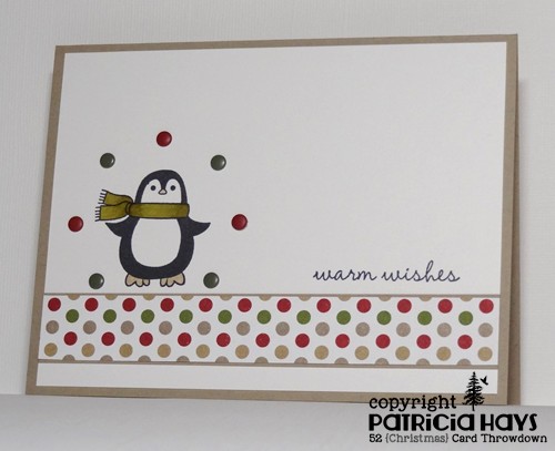
Hello!  It’s time to get back into the swing of challenges again at 52 Christmas Card Throwdown.  The purpose of our challenges is to allow our participants to build up a supply of Christmas cards to have ready to send once December comes around.  Plus, it’s just simply fun to create holiday cards all year long! 🙂

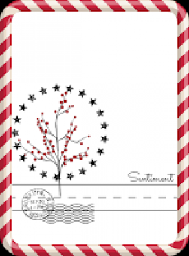
We’re starting off the month with a sketch challenge.  I’ve stretched the sketch from a portrait-oriented rectangle to a landscape-oriented rectangle, but otherwise I’ve kept pretty true to the way the sketch was drawn.  I’ve also kept my card rather clean and simple in design.  I did take the liberty of omitting the embellishment type thing that’s drawn like a postage cancellation stamp.  I couldn’t figure out what to use for that element that wouldn’t detract from the rest of the card.  I guess if I’d used an image other than the penguin I may have come up with something, but I feel like my creativeness is still trying to rebound from the holiday break.

52CCT 01-09-2016

What will you make with this sketch?  Be sure to check out what the rest of the 52CCT design team has made, and meet our newest team members, at the 52CCT blog.  Then link your own card to the challenge post by 7:00 p.m. Eastern time Friday, January 15, 2016.  We’d love to have you join us!  Thanks for stopping by today.

Supplies:
Stamps: Warm Penguin (Lizzie Anne Designs for Gourmet Rubber Stamps)
Cardstock: Crumb Cake, Whisper White, Season of Style designer series paper (Stampin’ Up)
Ink: Tuxedo Black (Memento)
Other: Regals candy dots (SU); markers (Copic)

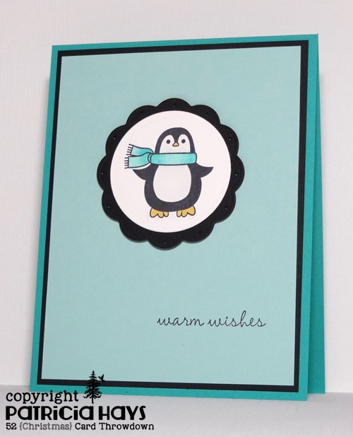
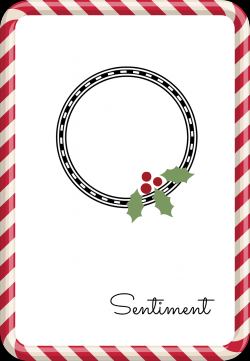
Hello there, and happy Saturday to you! It’s sketch challenge week at 52 Christmas Card Throwdown.  As with all of our sketches, you’re welcome to use the sketch as it’s drawn, turn it on its side, or manipulate it into a square.  So long as we can see the “skeleton” of the sketch, it’s all good!

I’ve added a couple layers to the sketch but otherwise kept my card rather clean and simple in design.  I opted to go for more of a wintry card than one specifically Christmasy.  It’s not easy to see in the photo, but I pierced the scalloped circle for a tiny bit of additional interest.  I attached the focal panel to the card with dimensional adhesive. This card will be going into the stash I’m saving up for Send a Smile 4 Kids.

52CCT 10-03-2015

And now it’s your turn to show us what you can create!  We’d love it if you joined our challenge this week.  You have until 7:00 pm Eastern time Friday, October 9 to link your card at the 52CCT site. Thanks for stopping by today!

Supplies:
Stamps: Warm Penguin (Lizzie Anne Designs for Gourmet Rubber Stamps)
Cardstock: Bermuda Bay, Basic Black, Pool Party (Stampin’ Up); Pure Luxury White (Gina K. Designs)
Ink: Tuxedo Black (Memento)
Other: markers (Copic); standard circle and big scalloped circle Nestabilities dies (Spellbinders); piercing tool (Making Memories); dimensionals (SU)

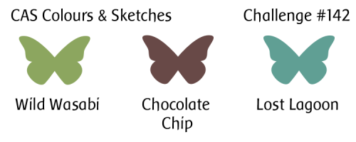
Hello!  This week at CAS Colours & Sketches we have another color challenge for you.  This time we have some great colors from nature, and I’m really looking forward to seeing what our challenge participants do with them.

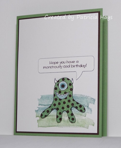
My card combines the color challenge with several other challenges.  The layout for my card is taken from the CAS(E) this Sketch! challenge that will be closing later this morning.  I don’t have any alien/outer space stamps that fit the theme for the current Shopping Our Stash challenge, but I thought this monster stamp worked well with the colors.  Aliens could be monsters, right?  The monster stamp is an oldie but goodie from a set I bought about five years ago.  The background stamp is even older than that.  I used it here to stamp a background for the monster, forming a gradient with the greens, making this card eligible for the current Retro Rubber challenge.  I used dimensional adhesive to pop up the monster over the background.  The sentiment comes from the same stamp set as the monster image.

CASCAS142

CC&S color142-001

11863225_10153986389643465_938983251241994716_n

Be sure to check out what the rest of the CC&S Design Team has done with these colors!  Then share your own card with us by linking it to the challenge post by 6:00 p.m. Eastern time Wednesday, September 23.  We’d love to have you join us!

Supplies:
Stamps: Little Monsters (Lizzie Anne Designs); Single Brushstroke (Hero Arts)
Cardstock: Wild Wasabi, Chocolate Chip (Stampin’ Up); Pure Luxury White (Gina K. Designs)
Ink: Tuxedo Black (Memento); Chocolate Chip (SU)
Other: markers (Copic); Word Bubbles Framelits die, dimensionals (SU)

© 2019 Suffusion theme by Sayontan Sinha