It’s time for the 6th weekly Paper Therapy challenge!  This week was a really tough one for me.  Kristin, the Paper Therapy site owner, picked out an ad for an inspiration challenge.  You’ll have to go to the Paper Therapy challenge board linked in the first sentence to see the ad, which was a *very* interesting photo!  After a lot of thought, I finally decided to create this:

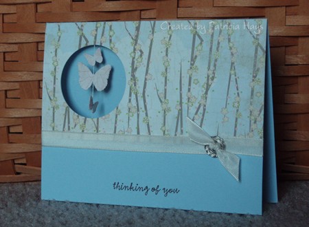
My main objectives were to capture the reflection, the texture, and the colors, especially the black.  My background colors behind the trees ended up more muted than I really wanted, but oh well.  You can’t tell from the photo that the image panel is done on glossy cardstock, which emulates the shine of the ad photo.  I thought the branches of the trees imitated the wispiness of the skirts pretty well.  I have to laugh a little because Kristin used this exact tree image on her challenge card last week! 

Are you wondering how I did the reflection on the image panel?  It honestly wasn’t very difficult.  First I created the background by using a brayer to apply ink from one of my old Stampin’ Up Spectrum multicolored ink pads.  When that was dry, I inked up the stamp with black ink and stamped it on a piece of acetate I use for my Stamp-a-ma-jig imaging sheet, and then used the SAMJ to help position the image onto the panel.  Once the main image was stamped, I took the acetate sheet, turned it over (ink side down), aligned it with the “right way up” image, and then gently pressed the sheet down onto the image panel.  This allowed the ink to smear a tiny bit so the reflection wouldn’t be super-duper crisp.   Because the acetate is such a glossy, smooth surface, the ink hadn’t dried on it.  When I carefully lifted the acetate back up, there was my watery-looking reflection.

So, there it is.   I’ll be hanging onto this card to add to my next package for Operation Write Home

Supplies:
Stamps: Lovely As A Tree, Trendy Trees (Stampin’ Up)
Cardstock: Creamy Caramel textured, Basic Black, Glossy White (SU)
Ink: Taffy Spectrum pad (SU); Onyx Black (VersaFine)
Other: Basic Black grosgrain ribbon (SU); ribbon charm (Making Memories); brayer

Good Monday morning!  Are you ready for this week’s Paper Therapy challenge?  This time the challenge is to make a card with a hole in it. 

I hadn’t made a suspension card in a long time, so I decided to do that for the challenge.  I thought butterflies would work well for the suspended elements, and chose this designer paper to give the impression of butterflies flitting among the woods on a spring day.  Taffeta ribbon and flowery hardware finish off the card.

Join us at Paper Therapy and show off your creative hole-y-ness!  🙂  The other design team members have come up with some really neat stuff for this challenge, too. Their blogs are linked over to the right – give them a little blog love, too. 

Supplies:
Stamps: Everyday Sayings (Lizzie Anne Designs)
Cardstock: Bashful Blue (Stampin’ Up); LilyKate 6″ x 6″ paper pad (Basic Grey)
Ink: Chocolate Chip (SU)
Other: Very Vanilla taffeta ribbon, silver Hodgepodge Hardware (SU); classic butterfly 3-in-1 punch (Martha Stewart); embroidery floss (DMC)

When I learned that this week’s Paper Therapy challenge was to use only scrap pieces of cardstock, designer paper and ribbon, I knew I wanted to make another colorblocked card for it because I’d had a lot of fun making my blocks and bling card a few months ago.  I chose a different colorblocking template this time and used some papers from Basic Grey’s Phoebe collection.  Even the brown scalloped oval was a leftover that I didn’t use on a different project a while back.  I thought about adding some sort of embellishments to it, but finally decided to let the designer papers speak for themselves.

Come show everyone at Paper Therapy what you can do with your scraps!  We’d love to have you join us!

Supplies:
Stamps: Everyday Sayings (Lizzie Anne Designs)
Cardstock: Creamy Caramel textured (Stampin’ Up); assorted papers from Phoebe 6″ x 6″ paper pad (Basic Grey)
Ink: Chocolate Chip (SU)
Other: card colorblocking template 2-C (Deluxe Cuts); petite oval and petite scalloped oval dies (Nestabilities)

This week’s Paper Therapy challenge is a color combination challenge.  We were to use colors similar to Stampin’ Up’s Basic Black, Green Galore, Pumpkin Pie and So Saffron. 

Matching the colors wasn’t a problem for me because I have lots of Stampin’ Up cardstock.  But I decided to substitute Barely Banana for So Saffron because I wanted to use textured cardstock.  Unfortunately, I don’t think the texture shows very well in the photo.  I used an old Splitcoaststampers sketch challenge for the layout. 

Please come join us at Paper Therapy and show us what you can do with these colors!

Supplies:
Stamps: Where You Should Be (Ippity by Unity)
Cardstock: Barely Banana textured, Green Galore, Basic Black, Baja Breeze designer paper (Stampin’ Up)
Ink: Pumpkin Pie, Green Galore, and Basic Black markers (SU)
Other: ticket corner punch (SU); mini brads (Making Memories)

It’s Monday, which means it’s time for a new Paper Therapy weekly challenge!  This week’s challenge is to create something using the first stamp(s) you purchased, or using your oldest stamp if you no longer have the first one.

I still have the first set I bought in 2002, which was retired by Stampin’ Up shortly afterwards.  Because the image and sentiment are pretty small and simple, I decided to go super simple with the layout and follow along with the Lizzie Anne Designs weekly sketch.  I used the Splitcoaststampers color combination challenge for my color scheme.  Quick, easy and simple.  An added bonus is that the relatively flat design will make this card a good one to donate to Operation Write Home for a soldier stationed overseas to send home to a loved one.

One thing I really like about this ribbon is that it can be two-sided. The “back side” that doesn’t show in this photo is polka dotted. If I don’t want the dots to show, like for this card, I can just flip the ribbon over to get the solid color. It’s kind of like having two different ribbons on one roll!

Supplies:
Stamps: Just a Note Mini (Stampin’ Up)
Cardstock: So Saffron, Rich Razzleberry, Tangerine Tango, Whisper White (SU)
Ink: Onyx Black (VersaFine)
Other: Rich Razzleberry grosgrain ribbon (SU); Premier colored pencils (Prismacolor); odorless mineral spirits (Houston Arts)

Here’s the card I made for the second World Cardmaking Day challenge at Paper Therapy.  This time the challenge was to make a Christmas card without using red or green.  Since the cards are going to be donated to Operation Write Home, we also couldn’t use any glitter. 

No glitter was no problem for me. I totally despise using the stuff because of the mess factor.  The tree panel is a chalk ink resist that I made several years ago and never found a use for until now.  I trimmed the corners, added a mat and some half pearls in the corners,  tied a ribbon and stamped a sentiment.  That was easy!  I’m not super happy with the way the bow turned out but I suppose it’s all right.

Supplies:
Stamps: Lovely as a Tree, Madonna & Child (Stampin’ Up)
Cardstock: Bordering Blue, Night of Navy, white glossy (SU)
Ink: Night of Navy (SU); Alabaster and Blue Iris chalk inks (ColorBox)
Other: ticket corner punch (SU); half pearls (Kaisercraft); ribbon (Sheer Creations)

It seems a little odd to be thinking ahead to Christmas already, since it isn’t even Halloween yet. (Well, unless you work in retail and have been putting out Christmas merchandise since Labor Day, I suppose.) But last weekend for World Cardmaking Day, the girls over at Paper Therapy threw out challenges to make Christmas cards to be donated to Operation Write Home.  Anyone who has been reading my blog for a while knows that I have a hard time resisting a challenge, especially when it’s for such a good cause.  There were three different challenges, so over the next week or so I’ll be presenting a different challenge card in each of three posts.

Here’s the card I made for the first challenge.  It was derived off of a Mojo Monday sketch.  I ended up turning the sketch sideways and interpreting the big oval in the sketch a bit differently.  It felt good to use some of my really old Making Memories metal embellishments!  Can you believe I’ve had them since 2003?  Seriously!


Supplies:
Stamps: Build a Bauble (Lizzie Anne Designs)
Cardstock: Soft Sky, Riding Hood Red (Stampin’ Up); “Berry Branch” and “Spearmint” from Fruitcake collection (Basic Grey)
Ink: Riding Hood Red (SU); silver (ColorBox)
Other: metal embellishments (Making Memories); embroidery floss (DMC)

Today I’m excited to present a card for the inaugural Paper Therapy Weekly Challenge!  If you’re not familiar with Paper Therapy, it’s an online papercrafting forum where creative ideas and friendship are shared.  Click on the button in my sidebar to check it out!

This week we have a sketch challenge.  I guess I was in an autumn mood when I chose my color scheme.  I had a hard time figuring out exactly how to finish off the twill tape.  I didn’t really want a bow, I didn’t have any buttons that coordinated with the rest of the card, and none of the metal hardware I have seemed to work.  So I finally decided to ruffle it, and I’m pleased with how that turned out.

I hope you’ll decide to play along with the challenges at Paper Therapy!  Like the name implies… it’s great for one’s mental health!  🙂 Links to the other design team members’ blogs are in my sidebar, so please feel welcome to see what they’ve been creating.

Supplies:
Stamps: Au Naturale, Treasured Trinkets (Lizzie Anne Designs)
Cardstock: So Saffron, Chocolate Chip, Cajun Craze (Stampin’ Up); Autumn Mix digital papers (LAD)
Ink: Chocolate Chip (SU)
Other: twill tape (SU); small scallop border die (Papertrey Ink); standard circle die (Nestabilities); micro brads (Recollections); Premier colored pencils (Prismacolor); odorless mineral spirits (Houston Arts)

I have a happy announcement to make today! I was recently chosen to be on the Paper Therapy design team! 

What is Paper Therapy?  It’s a message board forum dedicated to papercrafting, mainly rubber stamping and scrapbooking.  The owners will be offering weekly challenges starting on October 4, 2010.  At this time I can tell you only that there is a wonderful mix of challenges planned for the next six months… some sketch challenges, some color combination challenges, and a lot of other neat ideas to get your creative juices flowing.  I hope you’ll come check out the challenges and have fun participating in them.  I’m really excited about this and looking forward to it!

The down side is that because of the Paper Therapy schedule of a new challenge every Monday, I’ll need to drop my every-other-day posting schedule at the end of September.  Right now I’m thinking I’ll be switching to a Monday-Wednesday-Friday posting routine.  But don’t be caught off guard if I sneak posts in on other days of the week.  🙂

© 2019 Suffusion theme by Sayontan Sinha