This week I decided to try a new-to-me challenge called Sketch For You To Try.  I thought this was a pretty neat looking layout.  I had fun making a rather girly card with it even though I didn’t use any pink.  I pulled out a set of Amuse clear stamps that I’ve had for a while but never used.  It has some super cute animal images in it, and I especially like the elephants.  I couldn’t fit them both on the card so I chose the elephant with the bow.  I had to turn the sketch on its side to make it work with the images. 

Now that I’m looking at the card more carefully, I think I should have rounded the inner corners of the floral panels.  Oh well.  Too late now.  I don’t want to risk wrecking everything if I try to take the card apart to round them.  What do you think?

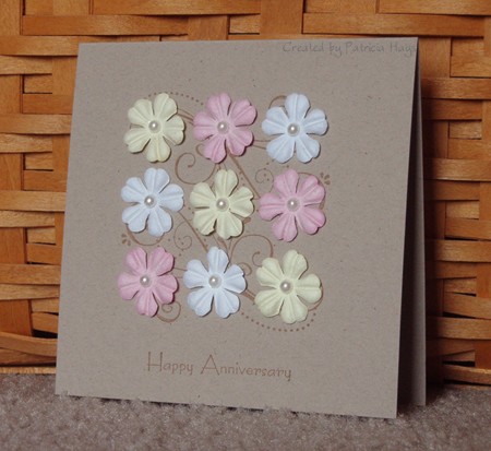
I do have a recipient in mind for this card, but I can’t say who it is yet.  I have to leave the element of surprise intact for when the card arrives at its eventual destination! 
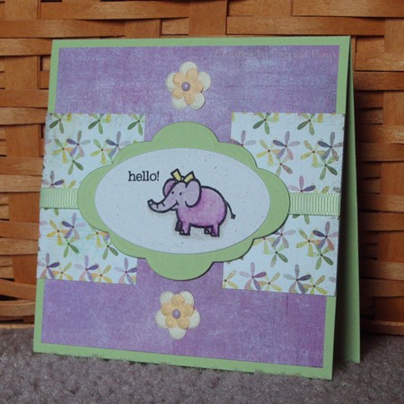
ag.jpg

Supplies:
Stamps: Animal Wishes (Amuse)
Cardstock: Certainly Celery, Naturals Ivory (Stampin’ Up); papers from Kioshi 6″ x 6″ pad (Basic Grey)
Ink: Onyx Black (VersaFine)
Other: Premier colored pencils and blender pencil (Prismacolor); flowers (Prima); Labels Six and petite ovals dies (Nestabilities); micro brads (Recollections); Certainly Celery grosgrain ribbon (SU)

Happy birthday today to my sister!  I won’t embarrass her by saying how old she is… but I have to say, no matter how old she gets, I’ll still be younger!  🙂

Today’s card is the one my family is sending her.  I used this week’s Lizzie Anne Designs sketch challenge for the layout.  The extra twist for the challenge was to use Nestabilities in a creative way to frame the main image.  Well, I don’t consider this to be particularly creative, but I used two different shapes – a petite oval for the image panel itself, layered on one of the shapes from the Labels Six dies.  I made this card 5.5″ square to accommodate the Nesties and the sentiment.  The sentiment stamp is actually set up in one long line, but I broke up the sentences into two lines.

I hope my sister enjoys a day as special as she is (and I don’t mean “special” in the short bus way)!

jcb-birthday-2010.jpg

Supplies:
Stamps: Party Animals (Lizzie Anne Designs)
Cardstock: Creamy Caramel, Very Vanilla (Stampin’ Up); various papers from Phoebe 6″ x 6″ paper pad (Basic Grey)
Ink: Onyx Black (VersaFine)
Other: Premier colored pencils (Prismacolor); odorless mineral spirits (Houston Arts); petite oval and Labels Six dies (Nestabilities); small scalloped border die (Papertrey Ink); Stamp-a-ma-jig

It always seems like summer vacation goes by quickly, doesn’t it?  My older son started marching band practice this week, which is a blunt reminder to us that school will be starting in just three weeks. 

The challenge for the past week at CAS-tastic Challenges has been to create a card inspired by summer.  I had to do some thinking on this one.  Finally last night I decided to use this cute flip flop stamp image and some sandy looking cardstock.  I added a few bright splashes of designer paper and cardstock, drew in a few dots with a white pen, and fashioned a ribbon “sun”.  Quick and easy!  The card base was a leftover from another project, sized 3.75″ x 11″, so I decided I’d just make the card a little more narrow than usual.

I hope you like it, and I hope you enjoy the rest of your summer!

cwc013.jpg 

Supplies:
Stamps: A Little Love (Stampin’ Up)
Cardstock: Naturals Ivory, Tempting Turquoise, Apricot Appeal, Whisper White, Bali Breeze designer paper (SU)
Ink: Basic Black (SU)
Other: Tempting Turquoise, Purely Pomegranate, Whisper White, and Groovy Guava ribbons, markers, dimensionals (SU); plain standard circle and big scalloped circle dies (Nestabilities)

I am not one to go tooting my own horn, so to speak.  But I was genuinely flattered, honored and delighted to be selected for the Lizzie Anne Designs Mix Member Spotlight this month. 

For the occasion, I chose my sentimental favorite stamp of all my LAD Monthly Mix sets.  I just love this tree and bench image.  In fact, it’s what sold me on becoming a Mix member last winter.  I colored the image with watercolor crayons and blender pens.  There’s a narrow strip of Basic Grey paper below the ribbon.  I’ll be honest – I was a little disappointed in how it turned out, so I made another card, nearly identical, but I used my Prismacolor pencils and odorless mineral spirits to color that one.  Want to hear the ironic thing?  The photos of the watercolored card looked much better than the photos of the penciled card.  So, you get to see the watercolored card today.

Thanks again to the Lizzie Anne team for giving me a chance to shine in their spotlight.

lad-mix-1.jpg

Supplies:
Stamps: Singing in the Rain (Lizzie Anne Designs)
Cardstock: Chocolate Chip (Stampin’ Up); Stamper’s Select White (Papertrey Ink); Peapod from Oh Baby! Boy collection (Basic Grey)
Ink: Chocolate Chip (SU)
Other: Chocolate Chip twill ribbon, watercolor crayons, blender pens (SU)

I had the chance to make two cards for this week’s Clean and Simple challenge at Splitcoaststampers, so you’ll get to see two cards in today’s post!  This week we had a sketch to follow. 

For the first card, I followed the sketch pretty closely.  I used some of my older designer paper and an embellishment I’ve had for a while.  It’s nice to use the older supplies.

cas76-masculine-birthday.jpg

Supplies:
Stamps: It’s Your Birthday (Stampin’ Up)
Cardstock: Mellow Moss, Chocolate Chip, Recollections designer series paper (SU)
Ink: Chocolate Chip (SU)
Other: leaf (Prima)

I decided to turn the sketch sideways for the second card, and I used one of my Nestabilities dies to give the designer paper a different shape. I added a little sponging around the edges of the designer paper and to the larger of the stacked flowers.

cas76-heart.jpg

Supplies:
Stamps: Small Sayings (SU)
Cardstock: Basics White (PTI); Bali Breeze designer series paper (SU)
Ink: Chocolate Chip (SU)
Other: flowers (Prima); Chocolate Chip satin ribbon (SU); Labels Nine die (Nestabilities); pearl brad (Creative Imaginations); sponge

I admit it – I like butterflies.  I confess that I bought the Basic Grey Ambrosia 6″x6″ pad mainly for the butterfly paper shown on today’s card.  When I received the Simply Sweet stamp set from Lizzie Anne Designs, I immediately adored the butterfly stamp – not just for the lovely butterfly, but also for the sentiment.  Sometimes I need to remember to just be me, and not what I think other people want me to be.

Today’s card brings those things together.  I used the CPS weekly sketch for the layout.  A couple retired Stampin’ Up In Colors coordinated with the Basic Grey paper. I used Prismacolor pencils with odorless mineral spirits to color the butterfly image.  It’s not my best coloring job because I was in a hurry, but I’m content with the way it turned out.

I hope you like the card. 

cps176.jpg

Supplies:
Stamps: Simply Sweet (Lizzie Anne Designs)
Cardstock: Marigold Morning, Dusty Durango (Stampin’ Up); Vintage Cream (PaperTrey Ink); “Winsome” from Ambrosia 6″x6″ paper pad (Basic Grey)
Ink: Chocolate Chip (SU)
Other: Chocolate Chip satin ribbon (SU); Premier colored pencils (Prismacolor); odorless mineral spirits (Houston Art)

Today’s card uses the same Lizzie Anne Designs sketch challenge layout as the card I posted last Thursday, but I used the mirror image of the sketch.  I didn’t want the shark to look like he was swimming off the edge of the card.  I realized as I was making the card that this is the first time I’ve used Stampin’ Up’s Pacific Point cardstock.  Why haven’t I used that color before?!?  (This is where you imagine me imitating Homer Simpson saying “DOH!”) I really like it with the black and white and grey here. 

I kept CAS-tastic challenge #12 in the back of my mind as I was creating this.  The challenge requirements were to use at least three of the following things to keep it SIMPLE:  Stamped (or digital) image; Inked edges; Masking; Paper piercing; Lace; Embossing.  The shark is my stamped image (kind of obvious, huh), I inked the edges of the shark image panel with black ink, and the long Pacific Point panel is dry embossed with the Cuttlebug “Spots & Dots” folder.  The embossing made the card eligible for the CAS weekly challenge at Splitcoaststampers.

This is going to be a birthday card.  The sentiment inside reads, “Have a KILLER birthday!”  I thought with the image it’s pretty cute!

cwc012-lad134-cps175.jpg

Supplies:
Stamps: Simply Sweet (Lizzie Anne Designs)
Cardstock: Basics White (PaperTrey Ink); Basic Black, Pacific Point (Stampin’ Up)
Ink: Onyx Black (VersaFine)
Other: Spots & Dots embossing folder (Cuttlebug); ribbon (May Arts); Premier colored pencils (Prismacolor); odorless mineral spirits (Houston Art)

I have a friend I haven’t met in person yet.  In the three years I’ve been chatting with her online, I’ve come to know that she is a loving mother, a devoted wife, and a warmhearted, caring soul with a terrific sense of humor.  Last weekend she participated in the Avon Walk for Breast Cancer.  She completed about 25 grueling miles over the Golden Gate Bridge and through the hills of San Francisco, and she personally raised over $3500 for this very worthy cause.  I’m truly amazed by her strength and generosity.

I sent her a little care package this week to let her know how much I admire her, and included today’s card in the package.  I decided on the color scheme by figuring yellow was good for the smiley face guy, and pink for breast cancer awareness.  The layout is borrowed from Splitcoaststampers Sketch Challenge 288.  See the button embellishment?  I couldn’t decide whether to use a pink button or a yellow button on the card.  I had a bunch of buttons laying on my desk and two in particular caught my eye.  I decided to stack them to see how they looked together, and the yellow one nested very nicely inside the pink one.  So I decided to use them both.

I hope my friend realizes what a genuinely fantastic person she is, and that I am both proud and delighted to have her as a friend.

sc288-rock.jpg

Supplies:
Stamps: Jump (Uptown Design Company); Sketched Sentiments (Lizzie Anne Designs)
Cardstock: So Saffron, Pink Pirouette and Whisper White (Stampin’ Up); Creme Brulee, Neapolitan and Strawberry Smoothie from Two Scoops 6″ x 6″ pad (Basic Grey)
Ink: Onyx Black (VersaFine)
Other: watercolor pencil, blender pen (SU); buttons (PaperTrey Ink); pink, yellow and white embroidery floss (DMC); standard circle and petite scalloped circle dies (Nestabilities)

Once again, it’s time for the Lizzie Anne Designs Monthly Mix Blog Hop.  This is an exciting week over at Lizzie Anne Designs!  They are celebrating their anniversary with a sale any sane rubber stamper won’t want to miss!

Wait a minute… who said rubber stampers were sane in the first place?  LOL  Just joking around.  But I know a few of my family members would probably question my own sanity at times. 

Anyway… 

Today’s card uses stamps from the July Monthly Mix, “Simply Sweet”.   I colored the image with Prismacolor pencils and odorless mineral spirits, which is a technique I haven’t done for a long time.  The color scheme is based on this week’s color challenge at Splitcoaststampers but I had to make a couple small modifications to it.  I used an old Stampin’ Up background stamp on the blue cardstock to keep it from looking so plain. The layout is this week’s Lizzie Anne Designs sketch challenge

Thanks for visiting my blog today! 

lad134-cc279.jpg

Supplies:
Stamps: Simply Sweet floral image and sentiment (Lizzie Anne Designs); Just Jeans background (Stampin’ Up)
Cardstock: Riding Hood Red, Buckaroo Blue, Wild Wasabi (SU); Basics White (PaperTrey Ink)
Ink: Onyx Black (VersaFine); Buckaroo Blue (SU)
Other: Premier colored pencils (Prismacolor); odorless mineral spirits (Houston Art); blending stumps; 7/8″ square punch (EK Success)

more of the same, but not really

Comments Off on more of the same, but not really
Jul 132010

I liked last week’s Color Challenge at Splitcoaststampers so much that I made a second card before I had even put away the supplies from the card I shared in Sunday’s post.  The cardstock and designer paper are the same, and so is the stamp set although I chose a different stamp.  This time I used a layout from a different Clean and Simple Challenge.  Easy peasy!

I’m not sure how noticeable it is in the photo, but the largest butterfly is attached only at its body, so it gives some dimension to the card. And I have to confess that I am all but addicted to these self-adhesive half pearls. They are definitely my new favorite embellishment.

cas03-cc278-friend.jpg

Supplies:
Stamps: For a Friend (Stampin’ Up)
Cardstock: So Saffron, Rich Razzleberry, Baja Breeze (SU); “Camelia” from Kioshi 6″ x 6″ paper pad (Basic Grey)
Ink: Rich Razzleberry (SU)
Other: scallop trim border punch (SU); butterfly punches (Martha Stewart); half pearls (KaiserCraft)

There were some really good challenges at Splitcoaststampers.com this week!  The Ways to Use It challenge requirement was to use yellow, and one of the colors in the Color Challenge was So Saffron, so that made it really easy for me to combine the two challenges in one card.  I used a past Clean and Simple challenge sketch for the layout and dug up a stamp set I haven’t used in a while.  I decided to stamp the flower on a scrap of cardstock and cut it out and adhere it to the image. I think that was the most difficult part of the entire card, lol! It’s a rather simple card, scoring low on the frou-frou index, but I’m happy with it.

cc278-ty.jpg

Supplies:
Stamps: For a Friend (SU)
Cardstock: So Saffron, Rich Razzleberry, Baja Breeze, Whisper White (SU); “Camelia” from Kioshi 6″ x 6″ paper pad (Basic Grey)
Ink: Baja Breeze (SU)
Other: corner rounder punch (SU); half pearl (KaiserCraft)

krafty birthday to you...

Comments Off on krafty birthday to you…
Jul 092010

… no, that just doesn’t have the same appeal as the familiar birthday song.  Oh well.

I combined a couple of challenges for today’s card.  I was still in the kraft mood and decided to do another card for the CAS-tastic challenge.  This time I followed the layout for the Lizzie Anne Designs weekly sketch challenge, which was intended to be “monochromatic with a tiny pop of color”.  So I used chocolate chip ink and ribbon to keep the monochromatic scheme, and added just a touch of coral pink with the cupcake wrapper, the candle and the button.  I used Shimmerz on the cupcake icing to give a little extra pizazz.  The card is a unique size – 3″ x 5.5″. 

So, here it is.  Hope you like it!

lad133-cwc011-birthday.jpg

Supplies:
Stamps: Banner Birthday (LAD)
Cardstock: Kraft (SU)
Ink: Chocolate Chip (SU)
Other: Pretty in Pink marker, Chocolate Chip twill ribbon, corner rounder punch (SU); button (Papertrey Ink); Choc-o-lot paint (Shimmerz); sponge

I have been in a crafting challenge mood lately.  I’m not sure why, but I like it!  It means I’ll have more to share over the next few weeks.

Today’s card is one I made to play along with the CAS-tastic weekly challenge.  This week the challenge is to use kraft cardstock.  I’ll admit, I usually have a difficult time with kraft.  I actually had to be talked into buying a package of it, and I don’t use it very often.  But today’s card is the exception to the proverbial rule.  I really enjoyed this one.  I was inspired by a card on the cover of the 2010-2011 Stampin’ Up Idea Book & Catalog.  They used buttons on their card, and I decided to use Prima flowers instead over the stamped image.  I chose the sentiment because my parents will be celebrating their anniversary next week.  Now I don’t have to stress at the last minute about making a card for them, hooray!  LOL

cwc011-anniversary.jpg

Supplies:
Stamps: Priceless, Hugs & Wishes (Stampin’ Up)
Cardstock: Kraft (SU)
Ink: Creamy Caramel (SU)
Other: flowers (Prima); half pearls (KaiserCraft)

I have two sisters.  Both of them are older than I am.  They used to tease me quite a lot when we were growing up.  Eventually I learned to do things to annoy them, too, in retaliation. 

When I saw this stamp in the store, I knew I needed to get it.  I finally put it to use recently on this card, which I sent to one of my sisters along with a newspaper article I thought she’d like.  I wanted to use some of the Razzleberry Lemonade designer paper, so that’s where the color scheme for this came from.  I colored in the flowers framing the sentiment by pressing my Crushed Curry ink pad to a piece of plastic, dipping a blender pen into the ink, and then coloring the flowers with the inked blender pen.

My sisters and I get along all right now as adults.  Now I can tease them about how they have grey hair and I don’t, and that no matter how old we get, they’ll always be older than I am.  Despite all the squabbles we’ve been through, we still love each other like family.

cas70.jpg

Supplies:
Stamps: You’re My Sister (Stampabilities)
Cardstock: Crushed Curry, Pumpkin Pie, Very Vanilla, Razzleberry Lemonade designer paper (SU)
Ink: Pumpkin Pie (SU)
Other: blender pen (SU); orange gingham ribbon (Offray)

The best things in life...

Comments Off on The best things in life…
Jul 032010

The sentiment on today’s card helps put words to why I enjoy papercrafting.  I enjoy taking the time to create something unique and special for the people I care about.  Hallmark and American Greetings may sell a gazillion different ways to try to express one’s thoughts, but it’s just not the same as handmade, IMO. 

Once I got started on this card, it came together pretty quickly and easily.  I decided to try out the Stampin’ Up set Tote-ally Tess.  I had this color combo stuck in my head for a while, and it finally came to life here.  I paper pieced Tess’s clothing from various designer papers and I cut the card she’s holding from a scrap of cardstock, but I colored her hair with watercolor pencils.  I added a little sponging too. 

Thanks for looking at my blog today!

tess.jpg

Supplies:
Stamps: Tote-ally Tess (SU)
Cardstock: Ruby Red, Close to Cocoa, Blush Blossom, Berry Bliss designer paper (for brown slacks), Western Sky designer paper (SU)
Ink: Onyx Black (VersaFine)
Other: watercolor pencils (SU); petite oval die (Nestabilities); Cutterbee scissors

© 2019 Suffusion theme by Sayontan Sinha