I decided to do something a little different for today’s post.  Over the years I’ve been online, I’ve been fortunate to have found some wonderful ladies who I am privileged to consider friends.  They’ve stuck by me during some difficult times I’ve had and have always been willing to lend a listening ear or a virtual hug.  They raise my spirits when I’m down, sometimes simply with kind words, but very often by making me literally laugh out loud hard enough to bring tears to my eyes.  So today, on my birthday, I’m honoring my friends by showing off birthday cards they’ve made for me the last few years.

First off, here are a couple made by Kathy and Elizabeth.  I love the blues, the hardware and the butterfly!

wrose-and-e.jpg

Lois and Marge sent me some pretty flowers.

lois-and-marge.jpg

Next are a couple by Victoria and Karen.  They knew how much I love the now-retired Stampin’ Up color Purely Pomegranate, especially mixed with Chocolate Chip.  They did a gorgeous job coloring their flowers!

v-and-erk.jpg

Amber and Taylor took the pomegranate/chocolate love a bit further by adding cake!  Yum!  🙂

amber-and-taylor.jpg

Finally, here is a really fun card made by Helen.  She made it look like a little designer purse!  She put so much attention to the little details, such as sponging the brown cardstock to make it resemble leather.  She even personalized it for me!

helen.jpg

To all my friends:  I *heart* you very much and am so glad to have you in my life! 

Today’s post showcases a gift card holder that I made at stamp club a while ago.  It’s simply a 4.25″ square card with an extra insert to hold a credit card style gift card, like to a restaurant or a store or an iTunes card.  It was super easy to make.

Here’s the front of it.  The front is shorter than the back so that the pink cardstock shows below the punched edge when the card holder is closed.

jan-10-3-outside.jpg

Inside, I added a piece of pink cardstock that was punched with the same border punch as the front of the card. It doesn’t show in the photo, but the pink was attached with dimensional adhesive to accommodate the bulk of a gift card.  I chose to stamp a sentiment inside too.

jan-10-3-inside.jpg

See – I told you it was super easy!  🙂

Supplies: (All from Stampin’ Up)
Stamps: Wings of Friendship
Cardstock: Naturals White, Pretty in Pink
Ink: Pretty in Pink, Close to Cocoa, Certainly Celery
Other: eyelet border punch, Sweet Pea felt embellishment

I finally had a chance to try this week’s sketch challenge from Lizzie Anne Designs.  I used a lot of retired products on this card, from the stamp set to the designer papers to the ribbon.  To make the scalloped edge on the striped paper, I popped the alignment guide off my corner rounder punch and used the punch without it. I have to admit I’m happy with the finished product. 

lad-139.jpg

Supplies:
Stamps: In the Treetop (Lizzie Anne Designs)
Cardstock: Bashful Blue, Close to Cocoa, Very Vanilla, Petal Patch designer paper (Stampin’ Up)
Ink: Close to Cocoa, Certainly Celery (SU)
Other: Certainly Celery twill ribbon, corner rounder punch (SU)

This summer I’ve been enjoying finding new blogs and sites and participating in their challenges.  I recently found yet another, In Style Stamps

I love sketch challenges because for me, figuring out a layout is often the most difficult part of creating a card.  So I decided to take part in the ISS sketch challenge.  This one had an extra twist – to turn the sketch into an easel card.  So I thought about it and finally came up with an idea.  I turned the sketch on its side because I felt my idea worked better that way. 

This card ended up being a mix of old and new stuff.  I’d never made an easel card before, but I found a really helpful tutorial online and figured it out.  I also hadn’t used this shape of Nestabilities dies yet and decided it was time to put them to use.  The patterned paper is from one of my oldest Basic Grey 6″ x 6″ pads; I’ve had it for a couple of years.  The cardstock for the card base is even older. And it seems like forever since I’ve used any of my stamps from eat cake graphics.  I used something else new to color the image – Copic markers that I received as an early birthday present from my husband.  I still have a lot of practicing to do with the Copics, but aside from my ink smudging a little bit, I’m pretty satisfied with my coloring job here.  I left the bottom panel blank so I can write a message to whoever receives the card.

I’ll admit that as I was working on the separate pieces of this card, I wasn’t liking it very much.  It felt like too much of a hodgepodge of things that didn’t seem to work together.  But now that the card is assembled and complete, I like it.  It’s still not one of my favorites, but I’m happy with it.  Sorry for the kind of dark photo.  It’s been trying to rain here all afternoon so I didn’t have a lot of good light for it.

iss-aug10-sketch.jpg

Supplies:
Stamps: Abagail’s too late for cake, Am I too late for cake, short present (eat cake graphics)
Cardstock: Mauve Mist, Kiwi Kiss (Stampin’ Up); Basics White (Papertrey Ink); papers from Gypsy 6″ x 6″ pad (Basic Grey)
Ink: Onyx Black (VersaFine)
Other: markers (Copic); Dahlia die (Nestabilities)

Saturday my husband asked me if I could make a card for him to send a former coworker of his, who is getting married soon.  I assured him I could.  To try to get some idea to work from, I asked my husband what the wedding invitation looked like.  He said, “Um, I threw it away already.  But it was red and gold.  And they won’t care what it looks like.” 

So I kept that in the back of my mind and searched through the gallery at Splitcoaststampers for some inspiration.  Ta-da.  I try not to blatantly “CASE” other people, but this card seemed to be just what I was looking for and my husband said it looked nice.  I changed it up a bit by adding a narrow layer of gold cardstock between the white and red layers, and using a gold pen to highlight the centers of the embossed flowers.  I gave the largest butterfly some dimension by slightly bending up the wings and gluing down only the center of its body. 

It was a quick and easy card to make.  And anyone who’s been reading my blog for a while knows that I loved the chance to do something with butterflies!  🙂

butterfly-congrats.jpg

Supplies:
Stamps: Americratika congratulations (Purple Onion Designs)
Cardstock: Real Red, Brushed Gold, Whisper White (Stampin’ Up)
Ink: Real Red (SU)
Other: Elegant Bouquet embossing folder, Beautiful Wings die (SU); gold Painty pen (Zig)

It recently dawned on me that I should keep a few belated birthday cards on hand for those occasional “oooops!” moments.  Today’s post is a quick and easy one I made last night.  I used this week’s CPS Sketch for the layout.  The sentiment inside the card reads, “I’m a little slow… happy belated birthday!”

cps180.jpg

Supplies:
Stamps: Party Animals (Lizzie Anne Designs)
Cardstock: Sahara Sand, Whisper White, Fall Flowers designer series paper (Stampin’ Up)
Ink: Onyx Black (VersaFine)
Other: Watercolor wonder crayons (SU); diamond die (Dies Direct)

Really, there isn’t much to say about today’s card.  It’s my rendition of this week’s Lizzie Anne Designs sketch challenge.  Something about it makes me think “older lady”, like you’d send this to your 70-year-old aunt or somebody like that.  I don’t know.  What do you think?

lad-138.jpg

Supplies:
Stamps: Banner Birthday (Lizzie Anne Designs)
Cardstock: Sage Shadow, Naturals White (Stampin’ Up); French Floral Pretty Papers (LAD)
Ink: Sage Shadow (SU)
Other: Very Vanilla taffeta ribbon, Scallop Trim border punch (SU)

Ever since I made my purple elephant card, I’ve been wanting to make a more boyish one to kind of go along with it.  This morning I finally did.   

I thought it would be more fun to make both the cards whimsical rather than realistic.  As with the purple card, I have a certain person in mind to send this card to.  I understand that green is that person’s favorite color, which is why I chose it for the elephant and the long panel.  I paired some papers from the Basic Grey “Oh Baby! Boy” collection with this week’s Sketch For You To Try

sfytt-green-elephant.jpg

Supplies:
Stamps: Animal Wishes (Amuse)
Cardstock: Naturals White (Stampin’ Up); Garic, Ivy and Blue Bonnet from Oh Baby! Boy collection (Basic Grey)
Ink: Onyx Black (VersaFine)
Other: Premier colored pencils and blender pencil (Prismacolor); Small and Large Labels dies (Nestabilities); Spots & Dots embossing folder (Cuttlebug)

Hi there!  If you’re here for the Lizzie Anne Designs Monthly Mix Blog Hop, thanks for peeking in!  I hope you’ll like what you see and come back again, and that you’ve been enjoying seeing what the other Monthly Mix Club members have been creating.  Even if you’re not here for the blog hop, thanks for coming by! 

For today’s card I used stamps from the June Monthly Mix set, Life is Good, and the layout for this past week’s Lizzie Anne Designs sketch challenge.  This is one of the simplest cards I’ve made in a while. Can you believe I didn’t use *any* embellishments? No ribbon, no half pearls, no brads, no Shimmerz, no buttons – nothing.  I didn’t even use Nestabilities.  It’s been a while since I’ve done anything like that!  But I like it.  Then again, I like just about anything with butterflies.  🙂

lad-137.jpg

Supplies:
Stamps: Life is Good (Lizzie Anne Designs)
Cardstock: Kraft/Crumb Cake, Real Red, Summer Sun, Pacific Point, Whisper White (Stampin’ Up)
Ink: Real Red, Summer Sun, Pacific Point (SU)

I haven’t used this tree stamp for a long time.  It’s from one of my oldest Stampin’ Up sets.  I thought it would fit well with this week’s CPS sketch so I decided to dust it off and ink it up.  I added some sponging to the panel that the tree is on so it wouldn’t look so stark against the mat and the card base.  The only thing about this card that isn’t a Stampin’ Up product is the button, which was an extra that came with some article of clothing a long time ago and had stashed away. 

cps179.jpg

Supplies:
Stamps: Lovely as a Tree, It’s Your Birthday (Stampin’ Up)
Cardstock: Close to Cocoa, Always Artichoke, Very Vanilla (SU)
Ink: Close to Cocoa, Always Artichoke
Other: corner rounder punch, linen thread (SU); sponges; miscellaneous button

I’ll admit it.  As much as I try, I’m not as organized as I’d like to be.  I’d love to be able to quickly and easily find everything I need for crafting.  Sometimes I manage that, and sometimes I don’t.

Today I’ll be showing off before and after pictures of my recently revamped cardstock storage. Nearly all of my cardstock is from Stampin’ Up.  I like how their colors coordinate with their inks, and it’s really good quality stuff.  I’ve also had a pretty easy time matching Stampin’ Up colors to one of my papercrafting weaknesses, Basic Grey patterned papers.  In the last few years, I’ve come to appreciate Papertrey Ink’s white and cream cardstock for its sturdiness compared to SU’s white and vanilla cardstock. 

So soon after I started out in stamping in 2002, I bought an accordian-file style organizer from Creative Memories.  I repurposed some old file folders that weren’t very worn, put one color of cardstock in each folder, and arranged the folders in the organizer – neutrals in front, then the rest in ROYGBIV order.  Because the organizer became expanded and heavy once it was filled with 50-plus folders of cardstock, I kept it on the floor of my craft room.  It looked like this:

cm-organizer-2.jpg

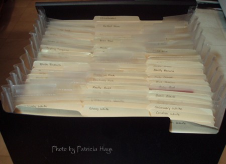
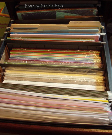
Truthfully, it worked pretty well… so long as I didn’t overload it with entire packs of cardstock.  As SU increased their color selection with their overhaul in 2005, the introduction of In Colors each year starting in 2006, and with their latest revamping this summer, the organizer just wasn’t quite large enough to handle more expansion.  I started putting the In Colors and packages of cardstock in one of my desk drawers, along with a folder of scratch paper kept nice and handy up front:

desk-drawer-before-2.jpg

Well, I finally realized I needed to figure out something better.   I decided it was time to clean out the top drawer of the lateral file cabinet, which has been used as a “junk drawer” for about the last 12 years (and I’m embarrassed to share this photo, but I figure I might as well be candid):

lateral-file-before-2.jpg

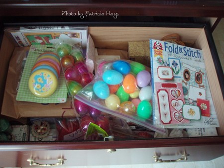
Pretty scary, yes?  But I found new homes for all that stuff, either in a more appropriate place in the house or in the trash. 

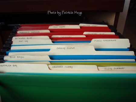
I decided to put all the retired colors of Stampin’ Up cardstock in the lateral file:

lateral-file-after-2.jpg

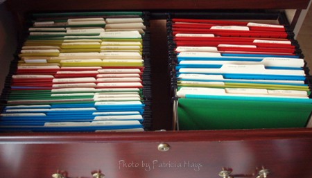
The retired “regular” colors are on the left, and In Colors are on the right.  I kept each color in its old repurposed file folder, and put two folders in each of the new hanging file folders (except in the case of a few colors, where I still have a full or nearly full pack of cardstock for some of those colors).  Each of the different SU color families is in a different color hanging folder – blue for Bold Brights, green for Earth Elements, etc.  The different years of In Colors are each in a different color hanging folder, too.  Here’s a closeup of the In Colors side:

lateral-file-closeup-2.jpg

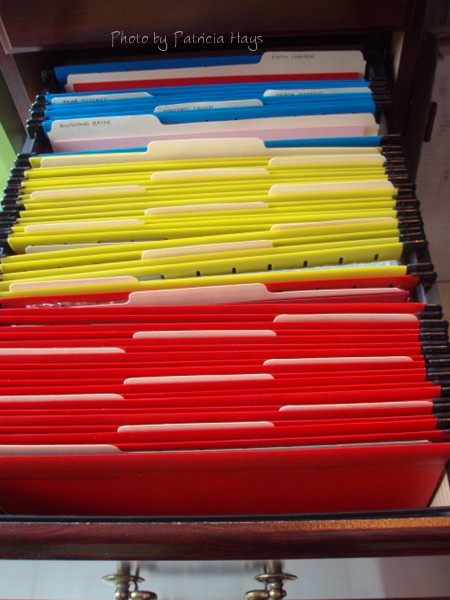
All the current SU colors, along with my PTI white and vanilla cardstock, have been relocated to two file drawers in my desk.  Once again, I’ve used a different color of hanging file for each SU color family.  Each color is in its own hanging file folder, along with a manila folder to hold half-sheets and smaller scraps.  I kept my scratch paper folder at the front of the top drawer, but I decided I could move about 2/3 of its contents to the recycling pile. 

top-desk-drawer-2.jpg

 bottom-desk-drawer-2.jpg

Ta-da!  Neat and organized.  Well, except for one thing.  I haven’t yet decided exactly how fancy I’m going to get in labelling the new folders – whether I’ll simply handwrite the color names on the labels, or include a small swatch of the color, or use my label maker to print them really neatly.  At any rate, I feel this is definitely a step in a good direction.

This is the card I alluded to one day last week.  Three different patterns, fairly bright colors – definitely not my usual thing.  But in a way I sort of like it. 

I got the slightly variegated effect on the word “friends” by sponging three different colors of ink onto the stamp.  The Melon Mambo and Rich Razzleberry inks ended up overpowering the Crushed Curry, but oh well.  The layout is a Lizzie Anne Designs sketch challenge from a few weeks ago that I finally got around to doing.

So, what do *you* think?  Too bright?  Too busy?  Too ugly, lol?

  lad-134.jpg

Supplies:
Stamps: Simply Sweet (Lizzie Anne Designs)
Cardstock: Basics White (Papertrey Ink); Rich Razzleberry, Razzleberry Lemonade designer paper (Stampin’ Up)
Ink: Rich Razzleberry, Melon Mambo, Crushed Curry (SU)
Other: Rich Razzleberry ribbon, ticker corner punch (SU); sponges

For today’s card, I started off by choosing the polka-dotted ribbon to use for this week’s CAS challenge at Splitcoaststampers.  I’ll admit it – I’ve never really cared much for polka dots.  I think my general apathy toward them is why I was so determined to make something for this challenge.  The ribbon helped me decide the color scheme, which made me think of this card I made four years ago.  That got me to thinking how I hadn’t used those Avery labels for a long time.  So I pulled them out along with a stamp set I hadn’t used in a long time.  The card base is another older supply, one of the Long Notes that Stampin’ Up offered several years ago.

So here’s how I pulled all the older materials together for a little blast from the past.

cas78.jpg

Supplies:
Stamps: Paint Prints, On Your Birthday (SU)
Cardstock: Ballet Blue, Cool Caribbean Long Note (SU)
Ink: Ballet Blue, Cool Caribbean, Green Galore (SU)
Other: corner rounder punch (SU); labels (Avery); ribbon (source unknown)

I think my creative spirit from last month went out the window a few days ago.  Today’s card is all right for a quick and easy card, I suppose, but I don’t consider it to be one of my better creations.

This one uses Lizzie Anne Designs weekly sketch #136 for the layout.  I thought the diagonal lines were cool.  I used a narrow strip of designer paper to set a monochromatic color scheme.  The cupcake frosting is painted with Shimmerz, but unfortunately the photo doesn’t show that very well. 

lad-136.jpg

Supplies:
Stamps: Turn Toward the Sun (Lizzie Anne Designs)
Cardstock: Pretty in Pink, Rose Red, Whisper White, Raspberry Tart designer paper (Stampin’ Up)
Ink: Rose Red (SU); Onyx Black (VersaFine)
Other: Opal Shimmerz paint (Shimmerzpaints.com)

Sorry today’s post is later than usual being published.  Late last night I started on a card for this post, but I didn’t finish it until this morning.  Then I thought it looked like one of those projects that seems good when you’re a little sleep deprived late at night, but then the next day you look at it and start wondering “What was I thinking?”  Know what I mean?  LOL  I guess it’s not a bad card, but it’s not really my usual style.  But I think that card is going to wait for another day when I’m stuck without crafting time and need something to post. 

I originally planned to post this card on Thursday, closer to my mother in law’s birthday.  By then she should have received it.  So if she does happen to peek here before USPS delivers it to her, well, um, surprise! 

The layout for this card is this week’s Card Positioning Systems sketch.  I’ve been wanting to try this ruffled ribbon technique for a while, but because I had to mail the card, I didn’t want the ruffles to be too puffy.  So they are stuck down with glue dots pretty well.  I guess that gives the ribbon more of a pleated effect than ruffled, but for my first attempt, I thought it turned out all right.  This is sort of the “back side” of the ribbon. The other side is polka dotted but I thought that would be too busy with the designer paper, so I turned it over so the solid side would show.  

So without any further chitchat, here it is.

abh-birthday-2010.jpg

Supplies:
Stamps: Warmest Regards (Stampin’ Up)
Cardstock: Melon Mambo, Crushed Curry, Whisper White, Razzleberry Lemonade designer series paper (SU)
Ink: Melon Mambo (SU)
Other: Rich Razzleberry ribbon (SU); Ribbon Tags Trio die (Nestabilities)

© 2019 Suffusion theme by Sayontan Sinha