another quick birthday card

Comments Off on another quick birthday card
Sep 292010

Today’s card is one I made a while ago and just realized I never posted. It’s another really simple, quick and easy one. I sponged the ink onto the stamp to give a softer look and to blend the two shades of plum ink. I added a simple sentiment, sponged around the edges of the focal panel, added a mat and a decorative brad, and assembled it… quick and easy!

Supplies:
Stamps: Medallion, Fundamental Phrases (Stampin’ Up)
Cardstock: Pale Plum, Perfect Plum, Very Vanilla (SU)
Ink: Pale Plum, Perfect Plum (SU)
Other: silver Hodgepodge Hardware (SU); sponge

Last week In Style Stamps hosted a Birthday Bash challenge to help Operation Write Home celebrate their birthday.  Anyone who made a birthday card to donate to Operation Write Home and linked it to the In Style Stamps blog by Sunday afternoon (Sept. 26) would be eligible to win a great prize from In Style Stamps.  ISS was generous enough to even provide a free digital image called Birthday Chloe to use on the cards!  I thought, “This is GREAT!  I can get a super cute image to use on my card for the challenge, and just maybe I’ll be lucky enough to win the prize!” 

Unfortunately, due to circumstances beyond ISS’s control, there was a delay in getting the free image out to the people who requested one.  Birthday Chloe didn’t arrive in my email inbox until Friday morning.  Because of work, helping out with our high school’s marching band at Friday night’s football game and a competition on Saturday, and spending time with my family, I didn’t have a chance to work on a card until yesterday afternoon.  I was relieved to see that ISS had extended their original deadline… but then, I don’t know if I’d misread the information on their blog early yesterday, or what, but suddenly I realized I had only 50 minutes to make my card, photograph it, upload it online, and then link it to the ISS blog.  ACK! 

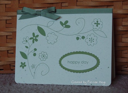
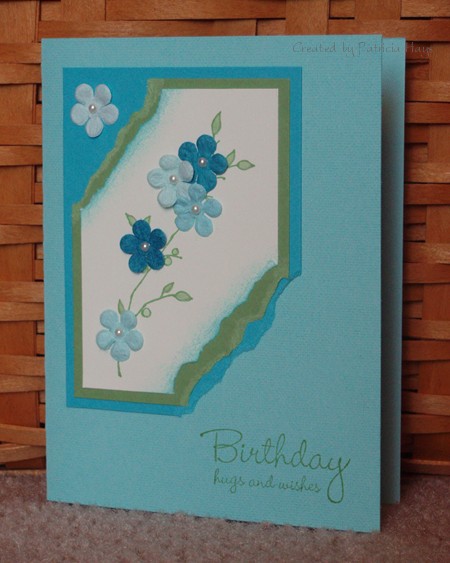
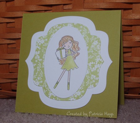
I’d already printed out the image and had a vague idea for my card layout.  Because of the time constraint, I knew I had to keep the color scheme pretty simple.  I don’t know why, but I felt a strong pull to use green on the card.  I hastily flipped through my Basic Grey papers and found a green floral.  I matched it to some SU cardstock, grabbed my Prismacolor pencils and started coloring.  I ran some Nestabilities dies through my Big Kick, assembled all the layers, and there it was – a simple, super quick 4.25″ square card.  I snapped a couple photos of it (literally – usually I take 4 or 5 photos to compare and upload the best), rapidly chose one of the two to use online, and uploaded it to my Splitcoaststampers.com gallery in a hurry so I could get it linked to the In Style Stamps blog.

I made it with 4 minutes to spare.  Whew!

Even if I don’t win the prize offered by In Style Stamps, the real winner here is Operation Write Home.  I’m happy to be able to help their worthwhile cause. 

And now, here’s the card.

Supplies:
Digital Image: Birthday Chloe (In Style Stamps)
Cardstock: Kiwi Kiss (SU); Basics White (Papertrey Ink); green floral print from LilyKate 6″ x 6″ pad (Basic Grey)
Other: Labels Nine and Petite Oval Nestabilities dies; Premier colored pencils (Prismacolor); odorless mineral spirits

I have a happy announcement to make today! I was recently chosen to be on the Paper Therapy design team! 

What is Paper Therapy?  It’s a message board forum dedicated to papercrafting, mainly rubber stamping and scrapbooking.  The owners will be offering weekly challenges starting on October 4, 2010.  At this time I can tell you only that there is a wonderful mix of challenges planned for the next six months… some sketch challenges, some color combination challenges, and a lot of other neat ideas to get your creative juices flowing.  I hope you’ll come check out the challenges and have fun participating in them.  I’m really excited about this and looking forward to it!

The down side is that because of the Paper Therapy schedule of a new challenge every Monday, I’ll need to drop my every-other-day posting schedule at the end of September.  Right now I’m thinking I’ll be switching to a Monday-Wednesday-Friday posting routine.  But don’t be caught off guard if I sneak posts in on other days of the week.  🙂

I decided to let the designer papers be the star of today’s card.  The birthday hat and  “happy birthday to you” patterns are some new digital papers from Lizzie Anne Designs.  Aren’t they neat?  The colors used in them just happened to fit this week’s Splitcoaststampers Color Combination challenge.  I used the layout for this week’s SCS Sketch Challenge and a sentiment stamp and ta-da… a quick and easy card. 

Supplies:
Stamps: All About U (Stampin’ Up)
Cardstock: Baja Breeze, Cajun Craze (SU); Vintage Birthday digital papers (Lizzie Anne Designs)
Ink: Wild Wasabi (SU)
Other: brads (Making Memories); sponge

Today’s card started off from this week’s Clean and Simple challenge at Splitcoaststampers.com.  Although I used the color scheme for the challenge I’m not so sure it still qualifies as “clean and simple”.  What do you think?  The layout is this week’s Lizzie Anne Designs sketch challenge.

Thanks for visiting today!  I have some exciting news to share with you this weekend… I can’t wait!  🙂

lad-143.jpg

Supplies:
Stamps: Au Naturale, Simply Sweet (Lizzie Anne Designs)
Cardstock: Kraft (Stampin’ Up); Vintage Cream (Papertrey Ink)
Ink: Chocolate Chip (SU)
Other: premier colored pencils (Prismacolor); Chocolate Chip satin ribbon (SU); Bordeaux grosgrain ribbon (Offray), petite oval die (Nestabilities); sponge

Today’s card is just a super quick and easy creation.  There’s no stamping on it!  The designs and sentiment are all rub ons.  Gotta love those when you just want something quick and easy.  I decided to give the sentiment a little extra attention by matting it.  The ribbon just adds a little finishing touch.

olive-happy-day.jpg

Supplies:
Cardstock: Confetti Cream, Old Olive (Stampin’ Up)
Other: Love & Happiness rub ons, Spring Moss grosgrain ribbon, corner rounder punch (SU), petite oval and petite scalloped oval dies (Nestabilities)

It’s finally Friday!  Hooray!  It’s been a kind of busy week and my creativity is lagging, so today’s card is just a fairly simple one.  Once again I used this week’s CPS sketch layout.  This time I stayed more true to the sketch. 

This is my first attempt at coloring an anime style image.  It’s one that I was able to choose for free for winning the In Style Stamps color challenge last month. 🙂 (The other image I chose for free was shown in Monday’s post.)  I guess I didn’t do too bad with coloring it – then again, if it *was* bad, I wouldn’t be sharing it, LOL!  I know I need more practice with my coloring skills.

cps184-jacob.jpg

Supplies:
Stamps: Treasured Trinkets (Lizzie Anne Designs)
Digital Images: Jacob (In Style Stamps)
Cardstock: Baja Breeze, Dusty Durango (Stampin’ Up); Basics White (Papertrey Ink); “Alternative” from Offbeat 6″ x 6″ pad (Basic Grey)
Ink: Dusty Durango (SU)
Other: Premier colored pencils (Prismacolor); odorless mineral spirits (Houston Arts); petite oval and petite scalloped oval dies (Nestabilities)

It’s the 15th, so that means it’s time for another Monthly Mix Blog Hop with the ladies of Lizzie Anne Designs.  This month, I used the current LAD sketch challenge and stamps from two different Monthly Mix stamp sets.  I just felt this sentiment from the July 2010 set worked really well with this image from the September 2010 set.  I’ll admit that I was happy to use some of my really old Stampin’ Up buttons to embellish this card.  How old are they?  Well, the color is labelled as Bliss Blue, so that means I bought them before the 2005 color revision.  I do believe it’s time to use them up!

As I was waiting for the black ink to dry before coloring the quilt, I browsed through the LAD Sketchbook.  There’s a lot of fantastic stuff in there!  I noticed, however, that the sentiment stamp I used today isn’t inking the same as the projects in the Sketchbook were showing.  I looked more closely at my stamp and saw that it has a few little indentations in the “R”, the “i”, and the “N” that prevent the ink from contacting the cardstock.  It did the same thing on my “What was I thinking?” card back in August but back then I just reasoned it was because I’d sponged the ink onto the stamp.  How about that?  I kind of like it this way because it gives the letters a more eclectic look.  I think it’s pretty cool.  And it’s more unique!  🙂

Thanks for stopping by today!  If you have time, I strongly suggest visiting the Sketchbook linked above to see what awesomeness Lizzie Anne fans have been creating!  Or, if you only have a little bit of time, go visit the other Blog Hop participants’ blogs listed here and give them a little blog love. 

lad-142-sept-mix.jpg

Supplies:
Stamps: Treasured Trinkets, Simply Sweet (Lizzie Anne Designs)
Cardstock: Whisper White, Barely Banana textured (Stampin’ Up)
Ink: Bliss Blue, Certainly Celery (SU); Onyx Black (VersaFine)
Other: Bliss Blue buttons, Certainly Celery twill ribbon (SU); Premier colored pencils (Prismacolor); white embroidery floss (DMC); classic scalloped rectangle die (Nestabilities)

Sep 132010

Did you like swinging on the playground when you were a child?  I always enjoyed it.  I remember sometimes I’d close my eyes and imagine that instead of swinging I was riding on the back of a pegasus, or being rushed up and down hills on a roller coaster, or soaring through the air with outstretched wings.

The image on today’s card brought back those fond memories to me when I saw it.  It’s a digital image called “Melanie” from In Style Stamps.  After I colored her, I decided to cut her out and adhere her to the floral paper, to make her look like she’s swinging among a bunch of flowers.  The top of the “rope” is attached directly to the floral paper, but the rest of the image is raised from the background with dimensional adhesive.  The layout is this week’s CPS sketch.  I thought the word stamp was an appropriate sentiment to put on this card, because doesn’t she look like she is having fun?

Melanie’s shirt and hair color are a little nod to my alma mater’s football team – the James Madison University Dukes, who came out with a very unexpected upset victory over the Virginia Tech Hokies last Saturday.  Go DUKES!

cps184.jpg

Supplies:
Stamps: Small Script (Stampin’ Up)
Digital Images: Melanie (In Style Stamps)
Cardstock: Baja Breeze (SU); papers from Kioshi 6″ x 6″ pad (Basic Grey); Basics White (Papertrey Ink)
Ink: Chocolate Chip (SU)
Other: markers (Copic); Hodgepodge Hardware (SU)

My August 11, 2010 post on cardstock organization got me to thinking about doing a feature every month on the way I organize some of my crafting materials.  Since that post went live on the 11th, I thought I’d keep that day of the month for the feature.  So if the people involved with the movie “Ocean’s Eleven” will forgive me for taking liberties with their title, here’s the next installment of Organization’s Eleven. 

Today I’m sharing how I organize my Stampin’ Up 12″ x 12″ designer paper.  (Confession time – I haven’t quite gotten my Basic Grey 12″ x 12″ paper into this system yet.)  When I was visiting my friend Lois I noticed that she had her designer paper packages in some great translucent plastic envelopes made by Generations.  I bought my envelopes at Michael’s; a package of 10 costs about $12.99 but you can get a better deal with a weekly coupon or when they put the scrapbooking storage items on sale.  The ones I purchased have a snap closure, but I’ve also seen them online with a string-tie closure.  

I put each package of designer paper in its own envelope.  I keep full sheets of paper toward the back of the envelope and smaller pieces toward the front.  That way if I just need a small piece I can find it pretty easily without having to dig through the entire envelope. 

dp-envelope.jpg

I used Microsoft Word to type up a label for each envelope.  (You could also handwrite the label.)  On the label I note the name of the designer paper package, that it’s made by Stampin’ Up, and I list the cardstock colors that coordinate with those papers. 

dp-label.jpg

Then, I needed to figure out a way to corral all these envelopes together.  Rather than buying something new, I looked around the house to see if I already had something that would work.  Ah… yes.  I used to be a Longaberger basket consultant, so I have, um, quite a few baskets in my house.  The Large Boardwalk basket was the perfect size to keep my envelopes all together in one place.  It stays on a shelf for easy access.

dp-basket.jpg

Because I’ve labelled each envelope, it’s easy for me to store them in alphabetical order by the designer paper package name.  Then, for instance, if I want to create something with my Razzleberry Lemonade papers I can look toward the back of the basket for them instead of hunting through the whole basket.

I have room for a few more envelopes in the basket in case I want to expand my designer paper selection.  Or maybe it’s good that I can’t add much more unless I use a lot of what I already own, LOL!

About 8 years ago, my good friend became a Stampin’ Up demonstrator.  She invited me to a Stampin’ Up Open House she was holding.  I went, I really liked the products, and it didn’t take me long to agree to sign up for a stamp club and get totally hooked on rubber stamping.  Since then, I’ve accumulated a lot of rubber stamps from a lot of companies, but the majority of them are still from Stampin’ Up.

So, what’s Throwback Thursday?  It’s a time to revisit a Stampin’ Up stamp set that has been retired for at least 5 years.  I’m planning to feature one of my long-retired sets the first Thursday I have a blog post planned each month.

Today’s card features the set Painted Garden.  It was one of the first Sell-a-bration stamp sets I earned back in early 2003 and was never offered again after the Sell-a-bration period.  I decided to go super quick and easy with this card.  I inked the flower with markers to get some gradual shading.  The sentiment is from another older SU set. The stamp actually reads “thanks for your kindness” but I simply wanted to say “thanks” so I inked only that word.

coral-painted-garden-thanks.jpg

Supplies:
Stamps: Painted Garden, Simple Sayings II
Cardstock: Cameo Coral (SU); Paper Basics White (Papertrey Ink)
Ink: Cameo Coral, Mellow Moss (SU)
Other: Mellow Moss, Cameo Coral, and Blush Blossom markers (SU)

Today’s card is my take on Lizzie Anne Designs sketch challenge #141.  I literally turned it upside down!  I decided to incorporate the circle elements into the stamped image, rather than using embellishments for them.  I hadn’t used my embossing gun for a long time so it was neat to play with that again.  Even after 8 years of stamping, I still think it’s really cool to watch embossing powder melt into an image.  OK, so I’m a goof.  LOL

The color scheme for this card is taken from the current InStyle Stamps InSpiration challenge.  I really like the look of the light blue and brown together so I focused on that aspect of the inspiration photo. 

And here it is.

lad-141-iss-aug10-inspiration.jpg

Supplies:
Stamps: In the Meadow, Treasured Trinkets (Lizzie Anne Designs)
Cardstock: Naturals White, Soft Suede, Soft Sky (Stampin’ Up)
Ink: Craft White (SU)
Other: twill tape, Hodgepodge Hardware (SU); white embossing powder (Stampendous)

We’re finally enjoying some cooler weather here this weekend!  According to The Weather Channel, the trend is supposed to continue through the next week.  It’s wonderful to have sunny days with temperatures only in the 80s. 

InStyle Stamps has been hosting a color challenge with some cool, refreshing colors that are just as nice as our weather.  Even though I don’t have any InStyle stamps (yet ;)) I wanted to play along.  I decided to go floral with a Stampin’ Up set I haven’t used for a while and some Primas.  I used a background stamp on the card base, but because I stamped it with VersaMark it’s very subtle.  I wish I could say that I came up with the layout on my own, but I can’t.  I borrowed it from a card at Splitcoaststampers.com

iss-aug10-color.jpg

Supplies:
Stamps: Artfully Asian, Linen, Hugs & Wishes (Stampin’ Up)
Cardstock: Cool Caribbean, Tempting Turquoise, Wild Wasabi, Very Vanilla (SU)
Ink: Wild Wasabi (SU); VersaMark
Other: flowers (Prima Marketing); half pearls (KaiserCraft); blender pen (SU); sponge

I don’t know about you, but I’m starting to feel tired of the hot weather and I’ll be glad when the temperatures start getting a little cooler.  I thought that maybe making a card with autumn-like colors would help my attitude a little.

Today’s card layout is this week’s Lizzie Anne Designs sketch challenge.  I still had this stamp set on my desk from using it last week and thought this tree could pass as a sugar maple with leaves that have already turned yellow and orange.  I didn’t originally intend to sponge the sentiment panel so much, but I like how it turned out. 

lad-140.jpg

Supplies:
Stamps: In the Treetop (Lizzie Anne Designs)
Cardstock: Summer Sun, Pumpkin Pie, Very Vanilla (Stampin’ Up), “Fresh Squeezed” from Ambrosia 6″ x 6″ paper pad (Basic Grey)
Ink: Summer Sun, Pumpkin Pie, Chocolate Chip (SU)
Other: petite ovals plain and Labels One dies (Nestabilities); sponge

During August I was thinking of ways to try to make my blogging more fun and hopefully more interesting for my readers.  I decided I’d try occasional “themes” on different days of the month.  Keep tuned in throughout the month to see what’s going to be new here!  🙂

I felt that the first day of a new month was a good time to show off new-to-me techniques.  On today’s card I used a technique that I just tried for the first time a few days ago.  It’s called Wax Paper Cuttlebug Resist.  It’s pretty simple:  Put a piece of wax paper in an embossing folder, and run it through your Cuttlebug/Big Kick/Big Shot/similar machine.  Take the embossed wax paper out of the folder. Set the folder aside and layer the wax paper between two pieces of glossy cardstock (glossy sides touching the wax paper).  Carefully iron the cardstock/wax paper “sandwich”.  Yes, that’s right, I actually said “iron”.  LOL  I put the cardstock between layers of a folded dish towel when I iron it so nothing gets scorched. The heat will transfer the wax onto the glossy cardstock.  Then, after the cardstock has cooled, use a sponge to adhere dye ink to the design on the cardstock.  You can use one color or multiple colors.  You could also try brayering the ink onto the cardstock.  The wax will resist the ink.  You may want to buff off excess ink with a tissue or a paper towel.  Then, you can use the cardstock with its lovely design as you wish on your project – either as a background, or cut into a smaller shape for an embellishment, or whatever your imagination comes up with!

This technique was one of the Splitcoaststampers Virtual Stamp Night challenges last weekend, and here’s the card I made for the challenge.  The scalloped border panels are my Wax Paper Cuttlebug Resist pieces.  I used two colors of ink on them.  I chose the sympathy sentiment just so I could have a sympathy card on hand in case I need one suddenly.  The layout is a Lizzie Anne Designs sketch challenge sketch from several months ago.

aug10vsnc.jpg 

Supplies:
Stamps: Spring Garden, Warmest Regards (Stampin’ Up)
Cardstock: Orchid Opulence, Whisper White, Glossy White (SU)
Ink: Orchid Opulence, Mellow Moss (SU)
Other: Victoria embossing folder (Cuttlebug); small scallop border die (Papertrey Ink); wax paper; sponges

© 2019 Suffusion theme by Sayontan Sinha