butterfly of hope, healing and peace

Comments Off on butterfly of hope, healing and peace
Oct 302010

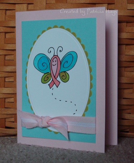
Today’s card uses a color combo that I feel is a little unusual, but I think it holds a great meaning. I created this card for one of the Splitcoaststampers.com Hope You Can Cling To challenges.  For this particular challenge, we were to use the colors pink, aqua and olive… pink symbolizing breast cancer awareness, aqua to represent healing and hope, and olive for peace.  The butterfly is a digital image from In Style Stamps, created especially for breast cancer awareness.  (Check out the link in the previous sentence to find out how you can get this image for free until October 31, 2010.)  I think in general a butterfly is a wonderful symbol of hope, because of the way it seems lifeless in its chrysalis before emerging as a lovely creature. 

The card itself is pretty simple.  I colored the butterfly, added a few layers, and wrapped the focal panel with ribbon tied in a knot bow.  I didn’t think any sentiment was necessary.

Supplies:
Digital Image: Hope Butterfly (In Style Stamps)
Cardstock: Pink Pirouette, Cool Caribbean, Kiwi Kiss (Stampin’ Up); Basics White (Papertrey Ink)
Ink: n/a
Other: markers (Copic); Pink Pirouette ribbon (SU); petite oval and petite scalloped oval dies (Nestabilities)

Here’s another card I created for Operation Write Home.  Once again, I used an image from In Style Stamps with a sentiment from Lizzie Anne Designs to make a card that I thought one of our military members might like to send home to his or her son.  I pulled out another colorblocking template for the layout.  My Basic Grey papers don’t exactly match my coloring, but I think it’ll be OK. 

Supplies:
Stamps: Bobby (In Style Stamps); Everyday Sayings (Lizzie Anne Designs)
Cardstock: Going Gray (Stampin’ Up); Basics White (Papertrey Ink); designer papers from Boxer 6″ x 6″ paper pad (Basic Grey)
Ink: Onyx Black (VersaFine)
Other: card colorblocking template 3-C (Deluxe Cuts); Premier colored pencils (Prismacolor); odorless mineral spirits (Houston Arts)

When I learned that this week’s Paper Therapy challenge was to use only scrap pieces of cardstock, designer paper and ribbon, I knew I wanted to make another colorblocked card for it because I’d had a lot of fun making my blocks and bling card a few months ago.  I chose a different colorblocking template this time and used some papers from Basic Grey’s Phoebe collection.  Even the brown scalloped oval was a leftover that I didn’t use on a different project a while back.  I thought about adding some sort of embellishments to it, but finally decided to let the designer papers speak for themselves.

Come show everyone at Paper Therapy what you can do with your scraps!  We’d love to have you join us!

Supplies:
Stamps: Everyday Sayings (Lizzie Anne Designs)
Cardstock: Creamy Caramel textured (Stampin’ Up); assorted papers from Phoebe 6″ x 6″ paper pad (Basic Grey)
Ink: Chocolate Chip (SU)
Other: card colorblocking template 2-C (Deluxe Cuts); petite oval and petite scalloped oval dies (Nestabilities)

This month, Splitcoaststampers.com has been hosting a different Hope You Can Cling To challenge every day. The cards made for this challenge will be donated to the MD Anderson Cancer Center. Each challenge has had a different theme.

My friend Victoria hosted one of the challenges. It required the crafter to make a card inspired by something s/he sees on a walk. I decided to take a trip down memory lane for my walk, and made a card inspired by my memories of walking in my grandparents’ apple orchard when I was growing up. My sisters and I could hardly wait for the apples to ripen enough to eat – and often, we didn’t wait, LOL. We didn’t mind helping to pick the apples because we knew our mom and our grandma would use them to make apple pies, applesauce, apple cobbler, and apple kolache. YUM!

My uncle inherited my grandparents’ farm, and we’ve continued to enjoy the apples from the orchard although most of the trees were uprooted during Hurricane Isabel in 2003. Sadly, the last remaining apple tree was destroyed in a storm this summer. Even though I’m going to miss those apples, I’ll always have the fond memories of the good times and yumminess.

Supplies:
Stamps: Turn Toward the Sun (Lizzie Anne Designs)
Cardstock: Riding Hood Red, Confetti White (Stampin’ Up)
Ink: Onyx Black (VersaFine)
Other: markers (Copic); standard circle and big scalloped circle dies (Nestabilities)

I thought that the swooping design of this week’s Lizzie Anne Designs sketch challenge was really neat, and I’ve had time to make two cards with it already. I’ll share them with you today. They both use the Vintage Birthday stamp set, which is one of Lizzie Anne Designs’ newest sets. I normally don’t get into the vintage theme but I really do like this set and I can see myself using it often. I chose to keep these cards pretty simple, without bling or bulky embellishments, so I can add them to the package I’m getting together for Operation Write Home.

The first card also uses some LAD digital paper. I spent a lot of time searching through my supplies trying to find a shade of blue cardstock to coordinate with the digital paper. Finally I decided to try something completely different and went with a sunshiny yellow instead. Everything seemed to fall into place after that.

The second card is a little simpler, with one less layer. I wanted to keep this one monochromatic, kind of like the vintage sepia-tone photographs. I decided to make this one as a mirror image of the original sketch, just for something a little different. The sentiment, “Birthdays are nature’s way of telling us to eat more cake”, makes me smile every time I read it. Seriously.

Supplies – balloon card:
Stamps: Vintage Birthday (Lizzie Anne Designs)
Cardstock: Daffodil Delight, Whisper White (Stampin’ Up); Vintage Birthday digital paper (LAD)
Ink: Onyx Black (VersaFine)
Other: Premier colored pencils (Prismacolor); petite oval and petite scalloped oval dies (Nestabilities)

Supplies – cake card:
Stamps: Vintage Birthday (LAD)
Cardstock: Naturals Ivory, Chocolate Chip, Afternoon Tea designer paper (SU)
Ink: Chocolate Chip (SU)
Other: petite oval and petite scalloped oval dies (Nestabilities); sponge

This week’s Paper Therapy challenge is a color combination challenge.  We were to use colors similar to Stampin’ Up’s Basic Black, Green Galore, Pumpkin Pie and So Saffron. 

Matching the colors wasn’t a problem for me because I have lots of Stampin’ Up cardstock.  But I decided to substitute Barely Banana for So Saffron because I wanted to use textured cardstock.  Unfortunately, I don’t think the texture shows very well in the photo.  I used an old Splitcoaststampers sketch challenge for the layout. 

Please come join us at Paper Therapy and show us what you can do with these colors!

Supplies:
Stamps: Where You Should Be (Ippity by Unity)
Cardstock: Barely Banana textured, Green Galore, Basic Black, Baja Breeze designer paper (Stampin’ Up)
Ink: Pumpkin Pie, Green Galore, and Basic Black markers (SU)
Other: ticket corner punch (SU); mini brads (Making Memories)

Here’s another Birthday Chloe card.  I just think she’s darling.  This time I used the CPS weekly sketch for the layout. I decided to paper piece her dress and her gift so the card would meet one of the Hope You Can Cling To challenges at Splitcoaststampers.   

Supplies:
Digital Image: Birthday Chloe (In Style Stamps)
Cardstock: Pretty in Pink, Almost Amethyst, Tea Party designer series paper (Stampin’ Up)
Ink: Pretty in Pink (SU)
Other: Premier colored pencils (Prismacolor); odorless mineral spirits (Houston Arts); sponge; Small Labels die (Nestabilities)

It’s time for another Lizzie Anne Designs Monthly Mix Blog Hop! Tricia and Meridith, the company owners, have been kind enough to let the Monthly Mix members join in with their Design Team in posting cards made with Monthly Mix stamps on the 15th of the month.  This time they’ve surprised me by tagging me as a “guest Design Team stamper” for the day.  I’m feeling genuinely honored!  Their Design Team is an incredibly talented group of ladies!  If I’d known in advance I would have tried to make something more original and less simple.  But I’m still very flattered to be considered an honorary LAD Design Team member today.  

My card uses this week’s Lizzie Anne Designs sketch challenge, some of my favorite colors, and a stamp and sentiment pair that always makes me smile. This shark always seems just too friendly to me to be a killer for real. He’s part of the July 2010 Monthly Mix set. For this card, I stamped him on a scrap of designer paper and cut him out before adhering him to the circle. Oh – this is actually a mirror image of the sketch – I thought it looked better this way, so the shark wouldn’t seem like he’s swimming off the edge of the card, kwim?  This card is going to be donated to Operation Write Home so I wanted to keep it pretty simple and easy to mail.

Be sure to visit the Lizzie Anne Designs blog for links to the other participants’ blogs.  Check out what the other ladies have been doing and give them some blog love, too!

Supplies:
Stamps: Simply Sweet (Lizzie Anne Designs)
Cardstock: Basics White (Papertrey Ink); Soft Sky, Sahara Sand, Fall Flowers designer paper, Spring Flowers designer paper (Stampin’ Up)
Ink: Onyx Black (VersaFine)
Other: Soft Sky ribbon (SU); standard circles dies (Nestabilities); brad (Making Memories)

Today’s card is another one I created for Operation Write Home.  I thought one of our soldiers overseas might like to send it home to his or her son.  I combined two of In Style Stamps’ challenges for this one – the September color challenge for the color scheme and the October sketch challenge for the layout.  Even though I liked the original long, narrow layout of the sketch, I knew that reworking it into a 5.5″ x 4.25″ card would go easier for the OWH people.  The boy is a digital image, but the sentiment is a stamp. I had just the right size scrap of red print designer paper to cover the chipboard heart – I love when things work out like that! I added a little sponging around the edges of the heart.

Supplies:
Stamps: Everyday Sayings (Lizzie Anne Designs)
Digital Images: Jacob (In Style Stamps)
Cardstock: Creamy Caramel textured, Garden Green, Western Sky designer paper (Stampin’ Up); Basics White (Papertrey Ink)
Ink: Onyx Black (VersaFine); Ruby Red (SU)
Other: markers (Copic); heart die (Sizzix); chipboard; sponge

It’s Monday, which means it’s time for a new Paper Therapy weekly challenge!  This week’s challenge is to create something using the first stamp(s) you purchased, or using your oldest stamp if you no longer have the first one.

I still have the first set I bought in 2002, which was retired by Stampin’ Up shortly afterwards.  Because the image and sentiment are pretty small and simple, I decided to go super simple with the layout and follow along with the Lizzie Anne Designs weekly sketch.  I used the Splitcoaststampers color combination challenge for my color scheme.  Quick, easy and simple.  An added bonus is that the relatively flat design will make this card a good one to donate to Operation Write Home for a soldier stationed overseas to send home to a loved one.

One thing I really like about this ribbon is that it can be two-sided. The “back side” that doesn’t show in this photo is polka dotted. If I don’t want the dots to show, like for this card, I can just flip the ribbon over to get the solid color. It’s kind of like having two different ribbons on one roll!

Supplies:
Stamps: Just a Note Mini (Stampin’ Up)
Cardstock: So Saffron, Rich Razzleberry, Tangerine Tango, Whisper White (SU)
Ink: Onyx Black (VersaFine)
Other: Rich Razzleberry grosgrain ribbon (SU); Premier colored pencils (Prismacolor); odorless mineral spirits (Houston Arts)

Here’s the card I made for the second World Cardmaking Day challenge at Paper Therapy.  This time the challenge was to make a Christmas card without using red or green.  Since the cards are going to be donated to Operation Write Home, we also couldn’t use any glitter. 

No glitter was no problem for me. I totally despise using the stuff because of the mess factor.  The tree panel is a chalk ink resist that I made several years ago and never found a use for until now.  I trimmed the corners, added a mat and some half pearls in the corners,  tied a ribbon and stamped a sentiment.  That was easy!  I’m not super happy with the way the bow turned out but I suppose it’s all right.

Supplies:
Stamps: Lovely as a Tree, Madonna & Child (Stampin’ Up)
Cardstock: Bordering Blue, Night of Navy, white glossy (SU)
Ink: Night of Navy (SU); Alabaster and Blue Iris chalk inks (ColorBox)
Other: ticket corner punch (SU); half pearls (Kaisercraft); ribbon (Sheer Creations)

It seems a little odd to be thinking ahead to Christmas already, since it isn’t even Halloween yet. (Well, unless you work in retail and have been putting out Christmas merchandise since Labor Day, I suppose.) But last weekend for World Cardmaking Day, the girls over at Paper Therapy threw out challenges to make Christmas cards to be donated to Operation Write Home.  Anyone who has been reading my blog for a while knows that I have a hard time resisting a challenge, especially when it’s for such a good cause.  There were three different challenges, so over the next week or so I’ll be presenting a different challenge card in each of three posts.

Here’s the card I made for the first challenge.  It was derived off of a Mojo Monday sketch.  I ended up turning the sketch sideways and interpreting the big oval in the sketch a bit differently.  It felt good to use some of my really old Making Memories metal embellishments!  Can you believe I’ve had them since 2003?  Seriously!


Supplies:
Stamps: Build a Bauble (Lizzie Anne Designs)
Cardstock: Soft Sky, Riding Hood Red (Stampin’ Up); “Berry Branch” and “Spearmint” from Fruitcake collection (Basic Grey)
Ink: Riding Hood Red (SU); silver (ColorBox)
Other: metal embellishments (Making Memories); embroidery floss (DMC)

October is Breast Cancer Awareness Month, and in honor of that, Splitcoaststampers.com is offering up a month’s worth of “Hope You Can Cling To” challenges.  The cards created for the challenges will be donated to the UT MD Anderson Cancer Center to benefit those affected by breast cancer.  Since breast cancer touches so many lives, I plan to participate in as many of these challenges as I can to try to give hope or at least a brief smile to someone.

One of the challenges that was presented a few days ago was to make a card primarily using pink and brown.  I hadn’t yet made a card for the In Style Stamps September sketch challenge so I decided to combine the two.  I’ll confess that took the easy way out on the In Style challenge, though.  Although the participants were encouraged to make a T-slide card for it, I didn’t feel that I had the patience for it.  And since I don’t know who is going to end up being the sender or the recipient of the card because I’m donating it, I felt that it would be better to keep it simple and easy to send.  So I did a simplified, scaled-down version of the sketch to end up with a 4.25″ square card. 

This little Chloe image makes me smile.  I hope the person who eventually receives this card will smile, too.

Supplies:
Digital Image: Birthday Chloe (In Style Stamps)
Cardstock: Pretty in Pink, Close to Cocoa, Berry Bliss designer paper (Stampin’ Up); Basics White (Papertrey Ink)
Ink: printer ink
Other: Premier colored pencils (Prismacolor); odorless mineral spirits (Houston Arts); flower (Prima); mini brad, piercing tool (Making Memories); petite standard oval die (Nestabilities)

Today I’m excited to present a card for the inaugural Paper Therapy Weekly Challenge!  If you’re not familiar with Paper Therapy, it’s an online papercrafting forum where creative ideas and friendship are shared.  Click on the button in my sidebar to check it out!

This week we have a sketch challenge.  I guess I was in an autumn mood when I chose my color scheme.  I had a hard time figuring out exactly how to finish off the twill tape.  I didn’t really want a bow, I didn’t have any buttons that coordinated with the rest of the card, and none of the metal hardware I have seemed to work.  So I finally decided to ruffle it, and I’m pleased with how that turned out.

I hope you’ll decide to play along with the challenges at Paper Therapy!  Like the name implies… it’s great for one’s mental health!  🙂 Links to the other design team members’ blogs are in my sidebar, so please feel welcome to see what they’ve been creating.

Supplies:
Stamps: Au Naturale, Treasured Trinkets (Lizzie Anne Designs)
Cardstock: So Saffron, Chocolate Chip, Cajun Craze (Stampin’ Up); Autumn Mix digital papers (LAD)
Ink: Chocolate Chip (SU)
Other: twill tape (SU); small scallop border die (Papertrey Ink); standard circle die (Nestabilities); micro brads (Recollections); Premier colored pencils (Prismacolor); odorless mineral spirits (Houston Arts)

It’s a gorgeous day here – blue skies, sunshine – and it’s a day to celebrate the happiness that a handmade card can bring to someone’s day. For me, I get as much enjoyment from making cards to give to others as I do receiving cards. The old saying “it’s the thought that counts” really seems to ring true when you keep a certain person in mind and make a card especially for him or her.

This is starting to ramble and not make much sense, and if by now my sister has read this far on her Facebook news feed, her eyes are probably rolling at the thought of World Cardmaking Day (she’s not a papercrafter). So I think I’d better go ahead and get to the card for today. I made it the other night to give my husband, since tomorrow is our 18th wedding anniversary. After all these years he still makes me smile.

Supplies:
Stamps: Simply Sweet (Lizzie Anne Designs)
Cardstock: Kiwi Kiss, Chocolate Chip, Riding Hood Red, Confetti White (Stampin’ Up); Autumn Mix digital papers (LAD)
Ink: Chocolate Chip (SU)
Other: ribbon (Making Memories); markers (Copic); Swiss Dots embossing folder (Provo Craft for Cuttlebug)

© 2019 Suffusion theme by Sayontan Sinha