The weekend is here once again, and today is another challenge introduction day at 52 Christmas Card Throwdown!  This week we have a technique challenge for our participants:  Mixed Media.  Use a variety of techniques, textures, and materials on your festive card.  There’s really no “wrong” way to do it!

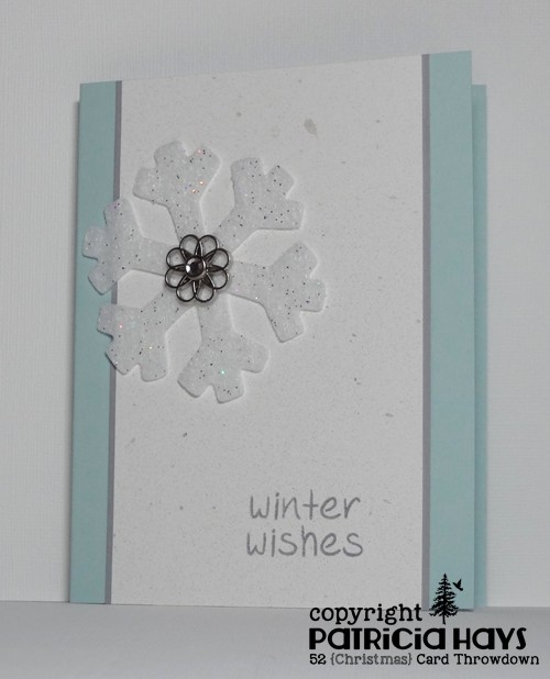
I have to admit that the term “mixed media” makes me balk.  I can’t explain why, but it always sounds pretty daunting to me.  But really, it’s not that difficult.  I haven’t gone all out for my card, but I did incorporate several things that I don’t often use.  The focal point of my card is a glittered felt snowflake.  I’ve dressed it up with a metal embellishment held in place with a clear crystal brad.  The main panel is white cardstock that I’ve spritzed liberally with both pearl and pewter colored mist sprays.  Unfortunately, I wasn’t able to capture the sparkle of the glitter, the shine of the crystal, and the shimmer of the mist sprays all in one photograph.  The sentiment was put together with alphabet stamps.  The layout for this card follows the current Freshly Made Sketches challenge, and the mist sprays and clean and simple design qualify it for the current Happy Little Stampers CAS challenge.

52CCT 06-27-2015

And now it’s your turn to show us what you can create!  We’d love it if you joined our challenge this week.  You have until 7:00 pm Eastern time Friday, July 3 to link your card at the 52CCT site. Thanks for stopping by today!

Supplies:
Stamps: Jessie’s ABCs (Lawn Fawn)
Cardstock: Soft Sky, Smoky Slate (Stampin’ Up); Pure Luxury White (Gina K. Designs)
Ink: Smoky Slate (SU)
Other: glittered felt snowflake (Creatology); Filigree embellishment (SU); crystal brad (Recollections); pewter and pearl Perfect Pearls Mists (Ranger)

Hi there!  It’s Thursday, which means it’s time for a new challenge at CAS Colours & SketchesLizy, our challenge hostess for June, has drawn up a nice little sketch for us to work with this week.

I stayed true to the sketch for my card, and I considered several different ideas for what images to use.  In the end, I decided to follow along with the Paper Players theme of “Summer Treats” and chose this cute little pea pod image.  My family has been enjoying the peas from our garden over the last few weeks, and I’ve been freezing packages of them for us to eat throughout the winter.  Home-grown veggies are definitely a treat in my opinion!  For my card, I originally planned to stamp the card base with a background stamp, but I didn’t like the way that looked.  So I decided to scrap that idea and just keep it plain.  A simple knot bow with the ribbon will smush flat enough to keep this card eligible for Operation Write Home.

CASCAS130

sketch 130

What will you do with this sketch?  There are so many possibilities!  Be sure to go see what the rest of the Design Team has made.  I hope you’ll try out something and share what you create with us!  Link your work to the CAS Colours & Sketches blog by 6:00 p.m. Eastern time Wednesday, July 1.  Thank you for stopping by today!  Comments are always welcome and appreciated!

Supplies:
Stamps: Punny Fruits & Veggies (Sweet ‘n Sassy Stamps)
Cardstock: Pear Pizzazz, Garden Green (Stampin’ Up); Pure Luxury Ivory (Gina K. Designs)
Ink: Tuxedo Black (Memento)
Other: markers (Copic); grosgrain ribbon (SU)

Hello!  Once again, it’s time for a new challenge at 52 Christmas Card Throwdown.  This time we have a theme for you to follow:  Christmas Elves.  Feel free to check out the 52CCT site to see what the rest of the design team has made.

I don’t own any elf stamps, so I looked online for some digital images.  I found this darling little girl elf at a site called Whimsie Doodles – and best of all, she was free!  I did have to draw in the shelf on which she’s sitting – kind of like those “Elf on a Shelf” dolls that have become popular during the holiday season.  Since I think the idea of having the elf watching you all.the.time. is kinda creepy, I opted for a more friendly sentiment that makes this a more generic “any occasion during the season” card for Operation Write Home.  I figured there’s enough Christmas vibe going on with the color scheme of the card.  The layout for this card is the current Freshly Made Sketches challenge turned 90° on its side.  (I have no idea why the FMS graphic is showing a black background.  I copied and pasted it from the FMS site as usual.  ???)

52CCT 06-20-2015

How will you interpret the Christmas Elves theme?  Share your card with us via the linky tool on the 52CCT challenge post by 7:00 p.m. Eastern time Friday, June 26.  We’d love to have you join in the fun and creativity!

Supplies:
Digital Image: Elves Watching Girl (Whimsie Doodles)
Sentiment Stamp: Sophie’s Sentiments (Lawn Fawn)
Cardstock: Gumball Green, Real Red Core’dinations (Stampin’ Up); Pure Luxury White (Gina K. Designs)
Ink: printer ink; Tuxedo Black (Memento)
Other: markers (Copic)

Hello!  It’s the third Thursday of the month, which means it’s color challenge time again at CAS Colours & Sketches.  Once again, Lizy has selected a color combo using some of Stampin’ Up’s newest In Colors.  If you don’t have the new colors, it’s OK – just use whatever colors you have that closely match.

Since Father’s Day is coming up this Sunday, that decided the theme of my card this week.  The layout of my card is very similar to our CC&S sketch challenge last week, but it’s actually taken from The Crooked Stamper Sketch Challenge.  I colored a scrap of watercolor paper with some mustard yellow and rich green ink, let it dry, and die cut the leaves from it.  The word “Father’s” on the stamp is an outline image, and I’ve colored it in with a marker to use more of the green in our color challenge.  The leaves count as foliage for the current Shopping Our Stash challenge.  Since it’s a clean and simple styled card, it also works for the current challenge at Addicted to Stamps and More.

CASCAS129

Now it’s your turn to create a clean and simple styled card using these colors, and share it with us at the CC&S site!  You have until 6:00 p.m. Eastern time Wednesday, June 24 to link your card.  We hope you’ll join us!

Supplies:
Stamp: Delightful Dozen (Stampin’ Up)
Cardstock: More Mustard, Naturals White, Basic Gray (SU); watercolor paper (Artist’s Loft)
Ink: Basic Gray (SU)
Other: More Mustard and Garden Green reinkers, Garden Green marker (SU); Stitched Leaves die (Lawn Fawn)

Hello!  Here in the United States, Flag Day was yesterday, and the Fourth of July is coming up soon, so at Cards in Envy we’re getting into the spirit with a Red, White, AND Blue color challenge.  Cards made for this challenge don’t need to be of a patriotic theme, but they do have to feature those three colors.

I will admit that my brain wasn’t in one of its most creative modes when I was figuring out what to make for this challenge.  So I tweaked the basic idea of a card I’d made last year and went with that.  It’s a quick and easy design with some bold, eye-catching blocks of color.  The sentiment makes this a great any occasion card to include in the box I’m filling for Operation Write Home.

CIE 06-15-2015

Because we have a fifth Monday in June, this challenge will run for three weeks, closing on Sunday, July 5 at 7:00 p.m. Eastern time.  We’d love to have you join us!  Just remember that cards for all of our CIE challenges need to be A2 sized and flat enough to mail in an envelope at the standard first class postage rate.

Supplies:
Stamps: none
Cardstock: Sahara Sand, Whisper White, Real Red, Pacific Point (Stampin’ Up)
Ink: none
Other: Simply Said Hello die (Avery Elle); Bracket Edge die (My Favorite Things)

Hello!  It’s color challenge week at 52 Christmas Card Throwdown, and this week we have a fun one that allows for a lot of creative possibilities!  We’re asking our challenge participants to create Christmas or wintry cards using the colors black, white, and one additional color that each participant can choose for herself (or himself).

After some mental debate, I finally selected green as my additional color.  The first card I created looked better in my imagination than it did once I put it all together.  So I checked out this week’s challenge at CAS(E) this Sketch! and immediately thought, “Hey, I can do this!”  Four die cut squares, a stamped and punched ornament, a simple sentiment, a few card layers, and a sparkly rhinestone later, here’s the result:

52CCT 06-13-2015

I’m also submitting this card into the Holiday theme challenge at Addicted to Stamps and More.

Which color will you choose to add to our challenge scheme?  We’d love to see what you select!  Share your card with us at the 52CCT blog by 7:00 p.m. Eastern time Friday, June 19.  Be sure to check out what the rest of the Design Team has made, too.  Thanks for stopping by today!

All supplies for this card are from Stampin’ Up except the square die.
Stamps: Delightful Decorations, Christmas Greetings
Cardstock: Gumball Green, Basic Black, Whisper White
Ink: Gumball Green
Other: ornament punch, rhinestone; Small Stitched Square Stackables die (Lawn Fawn)

Hello there!  It’s time for another sketch challenge at CAS Colours & Sketches.  You’re welcome to manipulate the sketch, or change the small squares to another shape, so long as we can still easily recognize the main elements of the sketch.

As I mentioned in last week’s post, many high schools are closing out the school year now, and it’s been “graduation season” for us.  I’ve needed to make several graduation cards this year.  I used our CC&S sketch for two of them.  The colors are taken from the graduates’ schools’ colors – purple and golden yellow for one, and black and orange for the other.  For the purple and gold card, I turned the sketch on its side.  This is a larger than usual card for me, 5″ x 7″.  I did that for two reasons – because I wanted to include some photos in the card, and because of the size of the mortarboard stamp.  By positioning the stamp differently on each square, I was hoping to convey the idea of the cap being tossed into the air.  I didn’t really think about it until I was formatting the photo, but the diamond shapes in the argyle embossing somewhat mimic the mortarboard shape. It felt good to use some retired cardstock colors for this card!

CASCAS128 Amanda

I stayed true to the original sketch for the orange and black card, and kept it the usual A2 size.  The orange cardstock is stamped with a background stamp to give it some visual texture.  After I inked the background stamp, I stamped it off once onto a scrap piece of paper before stamping the cardstock, to lighten it up a bit.  A few areas of the stamp didn’t quite take to the scrap paper, so they showed up darker on the orange cardstock.  I think it turned out like a serendipitous accident to give a little more interest.

CASCAS128 Bradley

And here’s the sketch graphic:

sketch 128

Both of these cards are eligible for the current Retro Rubber challenge to use ribbon or twine.  Although the “Hats Off to You” stamp set I used on the purple and yellow card is one of the first Lawn Fawn sets I bought back about 4 years ago, this is the first time I’ve used the mortarboard stamp.  The “So Much to Say” set used on the orange and black card is newer but I’ve had it  for about 18 months.  And the “Just Jeans” background stamp there is an oldie but goodie from Stampin’ Up; I’ve had it for nearly 10 years!

RRCB16

Since the orange and black card went to a young man, I’m also submitting it into this week’s Masculine theme challenge at The Paper Players.

Thanks for stopping by today!  Be sure to see what the rest of the CC&S Design Team has done with the sketch.  Then show us your own take on it by linking your card at the CC&S site by 6:00 p.m. Eastern time Wednesday, June 17.  We’d love to have you join us!

Supplies for the purple and yellow card:
Stamps: Hats Off to You (Lawn Fawn)
Cardstock: Eggplant Envy, Summer Sun (Stampin’ Up); Pure Luxury White (Gina K. Designs)
Ink: Tuxedo Black (Memento)
Other: Small Stitched Square Stackables die (Lawn Fawn); markers (Copic); Argyle embossing folder (Darice); white twill ribbon (source unknown)

Supplies for the orange and black card:
Stamps: So Much to Say (Lawn Fawn); Just Jeans (Stampin’ Up)
Cardstock: Tangerine Tango, Basic Black (SU); Pure Luxury White (Gina K. Designs)
Ink: Tuxedo Black (Memento); Tangerine Tango (SU)
Other: Small Stitched Square Stackables die (Lawn Fawn); markers (Copic); white grosgrain ribbon (SU)

Our older son’s girlfriend graduated from high school on Saturday.  I used the current sketch at Freshly Made Sketches to create our card for her.  The school’s official colors are blue and white, but the marching band and the athletic teams also have a lot of black on their uniforms, so black is considered an “unofficial” school color.  I tried to color the image to look like our graduate looked in her cap and gown, with a gold tassel and stole, and with a hint of pink to represent the pink cords she wore as a music honors student.  I also added bangs and some length to the hair on the image.  I think she was pleased when we gave her the card yesterday!

FMS189

Thanks for stopping by today!

Supplies:
Digital Image: Pure Innocence 028 (Heather Ellis)
Stamp: Everyday Sayings (Lizzie Anne Designs)
Cardstock: Brilliant Blue, Basic Black, Glimmer Silver (Stampin’ Up); Pure Luxury White (Gina K. Designs)
Ink: printer ink; Tuxedo Black (Memento)
Other: markers (Copic); Nesting Starburst dies (QuicKutz)

Hello there, and happy Saturday to you! It’s sketch challenge week at 52 Christmas Card Throwdown.  As with all of our sketches, you’re welcome to use the sketch as it’s drawn, flip it mirror image, or turn it on its side.  You may also change the shape of the tag area.  So long as we can see the “skeleton” of the sketch, it’s all good!

The only changes I made to the sketch were to add a few layers.  I decided to go with a snowflake theme.  Once I chose my designer paper, the card came together pretty easily, except for figuring out what sentiment to use.  Because I already have a bunch of holiday specific cards for Operation Write Home that say “Christmas” or “Happy Holidays”, now I’m trying to use sentiments that could be used throughout the winter.  I finally decided on this one that seemed to go well with the snowy theme, even though it’s actually from an ice cream themed stamp set.  The sentiment and the snowflake image are both heat embossed to add a little shine to the card.  I wanted something to reinforce the hole in the tags, but thought that a standard eyelet would be too small.  Then I remembered about 10 years ago I purchased a set of Stampin’ Up Metal Magic tags that had these little washer-like discs in it.  So yay – I finally got to put one to use!

52CCT 06-06-2015

Go see what the rest of the 52CCT design team has done with this sketch, and then show us your own take on it!  We’d love to have you link your card at the 52CCT site.  The challenge deadline is 7:00 p.m. Eastern time Friday, June 12.  Please join in the fun and creativity!

Supplies:
Stamps: Mini Blueprints (Tim Holtz); Here’s the Scoop (Lawn Fawn)
Cardstock: Kraft, Brushed Copper (Stampin’ Up); “Glisten/Avalache” designer paper from Fruitcake collection
Ink: Copper (ColorBox)
Other: copper embossing powder (Ranger); copper cording, Metal Magic washer (SU)

Hello hello!  I hope the month of June has gotten off to a good start for you.  Here in my area, families with school-aged children are gearing up for the last few days of school.  Now that my boys are older, we know a lot of students who are celebrating graduating from high school.  It’s a busy but fun and joyous time of year!

As usual at CAS Colours & Sketches, we start off the month with a color challenge.  Our hostess for June is Lizy, and she’s chosen a color combo using some of Stampin’ Up’s newest In Colors.  Now, we realize many people may not own cardstock and ink in these colors yet, but that’s OK – just use whatever product you have that most closely matches.

Since I don’t have access to the new colors yet, I’ve substituted other colors, thanks to an In Color Comparison chart created by my friend Helen.  The stamp I used is one of my newest purchases.  One of our CC&S challenge participants used it recently and I fell in love with her card, so I was glad to be able to order the stamp through Amazon.  It just arrived the other day and WOW – I guess the dimensions of the stamp didn’t really sink in with me, because this image is BIG!  It doesn’t quite all fit on an A2 sized card front.  But I still think it’s really cool.  I’m not quite sure what type of flowers these are supposed to be, but they remind me of calochortus.  (Calochortuses?)  Anyway, I stamped the image on watercolor paper and used watercolor crayons smoothed out with blender pens to add color to it.  For the pink petals, I used a mixture of Cameo Coral and Rose Red.

CASCAS127

CC&S color127-001

Be sure to stop by the CAS Colours & Sketches blog to see what the rest of the Design Team has created, and to give a warm welcome to Jan, our Guest Designer for the month of June!  Then make your own card using the challenge colors and share it via the linky tool by 6:00 p.m. Eastern time Wednesday, June 10.  We’d love to have you join us!

Supplies:
Stamps: Charming (Penny Black); Everyday Messages (Stampendous)
Cardstock: Sahara Sand, Sage Shadow (Stampin’ Up); watercolor paper (Artist’s Loft)
Ink: Tuxedo Black (Memento)
Other: watercolor crayons, blender pens (SU)

Hello there, and welcome!  Today marks the beginning of a new challenge at Cards in Envy.  We’re following up our “Hey Dude!” challenge with “Girls, Girls, Girls”.  Cards for this challenge should be A2 sized (4.25″ x 5.5″) and be thin enough to be mailed at the standard postage rate – and be suitable to send to a girl of any age.

Even though Operation Write Home will stop accepting cards after August 1, 2015, I’m still working on filling up a box to send them in July.  So I decided to make a “miss you” themed card that one of our military men or women could send home to their daughter.  I think this little girl image is really cute.  When she’s colored with dark hair, she reminds me of Boo from the movie “Monsters, Inc.”  OK, so the eyes are really different, but the hair style is exactly the same.  I used the current Splitcoaststampers.com sketch challenge for layout inspiration, turning the sketch on its side to give me more space for the sentiment.  It felt good to use up a few scraps of some of my oldest Basic Grey papers for the banners.

CIE 06-01-2015

So now it’s your turn! Check out the Cards in Envy site for all the challenge details and to see what the rest of the design team has made. Then share your girly creation(s) with us by 7:00 p.m. Eastern time Sunday, June 14. We’d love to have you play along with us!

Supplies:
Stamps: In My Heart (Mama Elephant)
Cardstock: Baja Breeze, Pink Pirouette (Stampin’ Up); Pure Luxury White (Gina K. Designs); scraps from Blush 6″ x 6″ paper pad (Basic Grey)
Ink: Tuxedo Black (Memento)
Other: markers (Copic); stitched circle die (Lawn Fawn)

© 2019 Suffusion theme by Sayontan Sinha